

When discussing design, color is often treated as a purely emotional or psychological aspect, and it can be hard to quantify. There are a few places where certain uses of color convey meaning in an easily understood way. A group of colors almost universally understood are Stoplight or Traffic Signal colors.
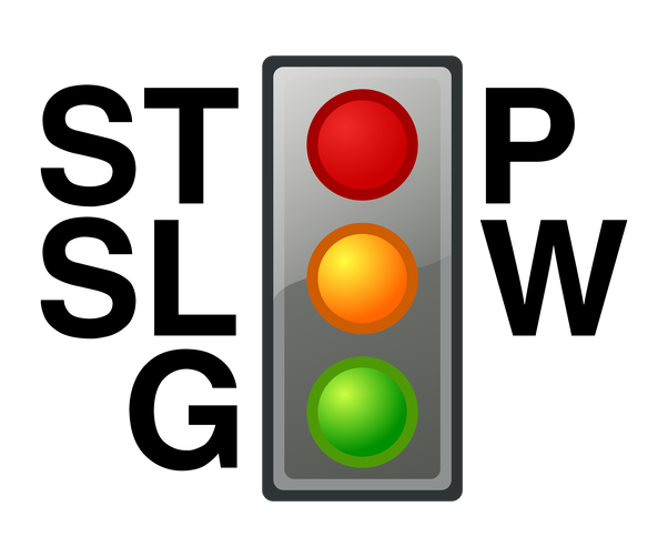
My daughter would sing "Twinkle Twinkle Traffic Light" in school (to the tune of Twinkle Twinkle Little Star) and proclaim "Red means stop; Green means go; Yellow means very nice and slow!" When preschoolers understand it, you have a core semantic color set. In interfaces, we use red for errors and critical messages, green for success and other positive messages, and yellow for warnings and cautions.
These colors have baked-in meaning, but color is dangerous when relied on alone.
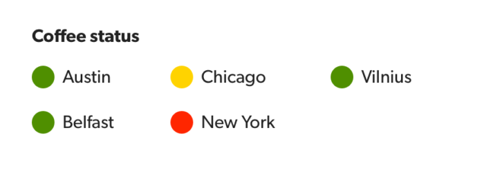
Imagine a page listing the status of items or services. In any effort to make the page more simple, we might put a colored circle next to the title to indicate status, using Stoplight colors. This is more common than it should be, because our metaphor is broken for anyone who cannot differentiate between the colors. It is inaccessible because we exclude color blind users.
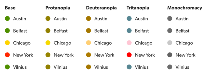
We've all heard about color blindness, and you probably know several people with it—even if they don't know it. Color blind is a bit of a misnomer. Color vision deficiency is just that… one or more element (a cone that interprets a specific color) in your eye is either missing or malfunctions, and thus a core part of your color spectrum is less apparent or misrepresented. The three main types of CVD deal with specific hues being affected or missing: Deuteranopia (green), Protanopia (red), and Tritanopia (blue). These three also vary in intensity, from a mildly affected color spectrum, to a color spectrum entirely missing a color hue, even all the way to monochromatism, where the person cannot effectively differentiate any color. The science of our eyes is complex, far too complex for a newsletter. You can read more about color vision deficiency here.
We can use labels, shapes, and textures in addition to color to ensure users can differentiate items.
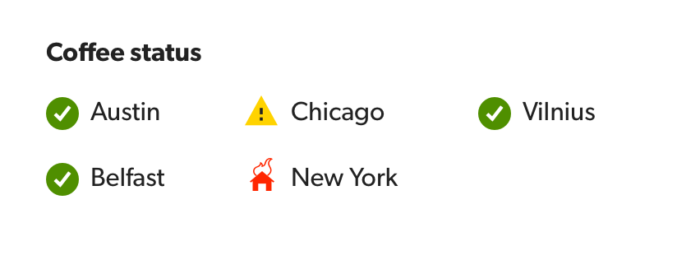
The previous example of status dots can be solved for the CVD problem by using distinct shapes for each status in association with the color. Or even better, include labels to remove the ambiguity.
Not thinking inclusively about our use of color is dangerous. The status example is just the tip of the iceberg… imagine how these or other colors would impact our dashboards and reports. The wise selection of accessible color sets and use of other differentiating factors (shape, texture, labels) ensure our UI is accessible. And our customers deserve a clear, understandable service, regardless of their abilities.