March 4, 2019

Can they see it?

Creating accessible color contrast

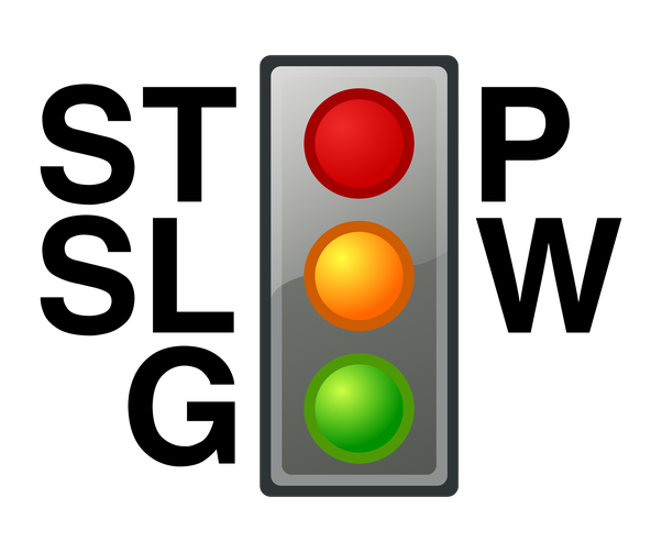
A while back, I wrote about how color blindness can affect the implied meaning in our usage of color. The use of stoplight colors for status is less meaningful if your eyes aren't helping you distinguish between red and green. We got around this problem through the use of meaningful shapes in addition to the colors.

A grid of the coffee status in 5 offices, using color and shape to create status icons that are accessible to users with color vision deficiencies.

These steps are important for ensuring our meaning exists when the color isn't a guarantee. But what about when we're using color in ways not necessarily tied to a specific meaning? It's not so much of a problem, right? A color blind user — or really anyone — doesn't actually need to decipher the exactly color value of a green button, or a blue link, right? Of course not… assuming they can actually see it.

A phone with a heavy glare from a sunny day. There is yellow text on a white background in diminishing sizes, reading "Can you read me?" and smaller "How about now?"
Color choices may look fine to your eyes in your work environment, but how will it look on a device on a sunny day?

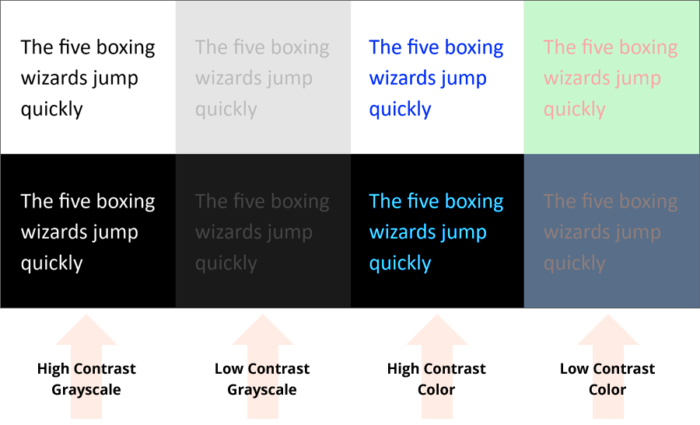
To ensure text, controls, and other vital pieces of information are intelligible, we need to understand the contrast ratio between the foreground and background colors. If the ratio is too low, it becomes harder for people with even perfect eyesight to read.

From an aesthetic perspective, there is a tendency to think of high contrast as (on a good day) bold or (on a bad day) garish. But  if we don’t meet a minimum threshold, we can’t ensure users can read the text, or understand an object is interactive.

Examples of high / low contrast in greyscale and color

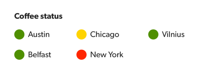
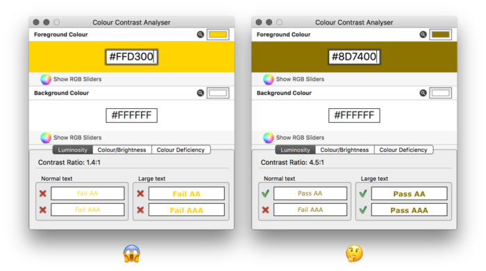
Think about our Stoplight colors used before. What if we wanted to use those colors for a set of text labels (ignoring for a moment the implications with color blindness)? What jumps out as a problem? Yep… that yellow (#FFD300, for reference) on a light background would be extremely difficult to read. But how do we know when the contrast is high enough to be read by most people? Do we just darken it until we can read it? Until a few people around your desk can read it? If people in a meeting can read it? Oh, this is getting hard.

The W3C is here to help. As part of the Web Accessibility Initiative, they've written some detailed, dense guidelines on everything related to a digital experience (including things you might not expect, like timing and motion). These are called the Web Content Accessibility Guidelines, or WCAG. There are varying grades of support, from a bare minimum (A), to an acceptable level of accessibility (AA), and topping out at the gold-standard accessible experience (AAA). In AA, "normal" text — like the body of this article — should have a contrast ratio of 4.5:1 between the font color and the background. For larger text — bigger headers and metrics — it's 3:1.

When a color isn't quite to the AA standard, we can do some work to get it closer. The first step is to ensure the color will only be used on a certain set of background colors. We need to constrain the situation to get control of the variables at play. If we used the Stoplight yellow on a black background, it would actually be compliant. But in our case we have a light background. But how light is it? Is it white? Or will we be using some table rows and containers with a light grey background? Is there an informational banner with a light blue background using this text color? We need to know where this will be used to ensure the contrast meets the bar in each case, and test against the darkest (or lightest) allowed color. For our example, though, we'll stick with a white background.

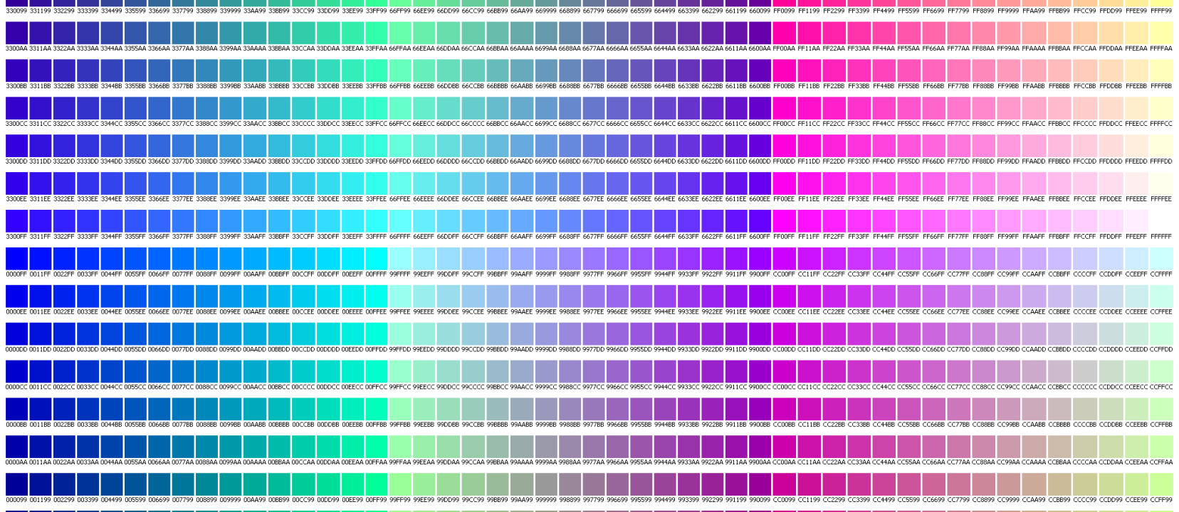
There are two properties we can adjust on a color picker to still use the same Hue (the core color value) but get our color closer to compliant. We can adjust the Saturation and the Brightness. There is a color notation (similar to RGB) called HSB (you'll see that in some tools) or HSV. This is Hue, Saturation, and Brightness / Value. There's a similar notation in CSS called HSL, but the values are different. You can read more about the difference between HSL and HSB. I'll focus on HSB / V because it's used in most design tools (you can convert these values to any notation after that).

A macOS color picker window showing HSB sliders
Using the macOS color sliders to edit the HSB vaues.

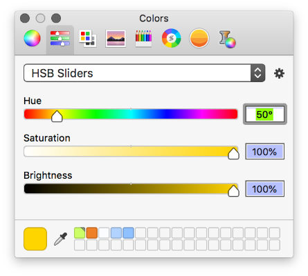
If we need higher contrast with white, it means we need to RAISE the Saturation and / or LOWER the Brightness. We won't touch the Hue, as it defines the core aspect of the color and not the the resultant contrast directly. This takes some finesse, but if the color has a high Saturation (the i.e., closer to 100%), we'll have to lower just the Brightness, and vice versa. Using color contrast tools like Stark or Colour Contrast Analyser can help when fiddling with the colors.

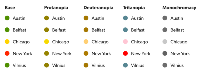
Working with the Stoplight colors, the green and red were close to 4.5:1, and will get a little less bright, but still look like green and red while achieving AA contrast. The yellow, however, was an invisible 1.4:1, and with adjustment ends up #8D7400, a sort of muddy brown. This is not at all like our previous yellow… but you could read it, right?

Two Colour Contrast Analyser windows, one showing the yellow value failing contrast, and the other showing the compliant, yet muddy, brown

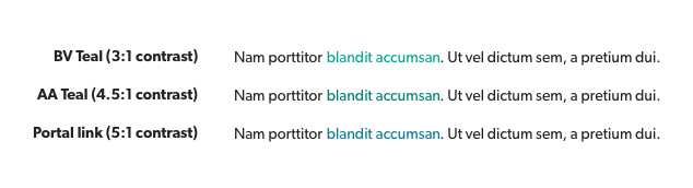
Sometimes you can't adjust a color to improve the contrast without making a noticeable change. The yellow has to change so much it makes an aesthetic impact, one that begs the question "Why are we using this color?" Of course, our choice of yellow was extreme and absurd, but these sort of shifts happen all the time. Bazaarvoice's brand teal is bold and iconic, but has a contrast ratio against white of 3:1, which makes it okay for bigger words like headlines, but for regular text it does not meet the AA standard, which is why we don't use the color for links and buttons inside Bazaarvoice Console. Adjusting the color with the previous technique yields a color that was deemed just divergent enough, leading us to use a lighter version of BV Navy blue instead.

Comparison of Bazaarvoice's teal, a AA compliant adjusted color, and the blue we ended up using instead
(Portal was renamed Console since writing this)

Working with color can seem like an artistic exploration to some, an ephemeral task invoking muses and impulse. But to really work with color in an inclusive manner takes effort, dedication… and some math. It takes balancing the aesthetic tastes of those with a keen eye and the needs of the everyday person just trying to figure out what to tap next. Luckily, we have guidelines to help us get there.

March 4, 2019

Color Vision Deficiency

When discussing design, color is often treated as a purely emotional or psychological aspect, and it can be hard to quantify. There are a few places where certain uses of color convey meaning in an easily understood way. A group of colors almost universally understood are Stoplight or Traffic Signal colors.

The words "Stop. Slow. Go" stacked, with a red, yellow, green stoplight composing the letter O of each word
(Except for part of Japan, where the green is essentially blue)

My daughter would sing "Twinkle Twinkle Traffic Light" in school (to the tune of Twinkle Twinkle Little Star) and proclaim "Red means stop; Green means go; Yellow means very nice and slow!" When preschoolers understand it, you have a core semantic color set. In interfaces, we use red for errors and critical messages, green for success and other positive messages, and yellow for warnings and cautions.

These colors have baked-in meaning, but color is dangerous when relied on alone.

A grid of office locations (Austin, Belfast, Chicago, New York, Vilnius) with a color dot next to each to indicate the coffee status.

Imagine a page listing the status of items or services. In any effort to make the page more simple, we might put a colored circle next to the title to indicate status, using Stoplight colors. This is more common than it should be, because our metaphor is broken for anyone who cannot differentiate between the colors. It is inaccessible because we exclude color blind users.

The same office status list, but displayed in unaltered color, and then colors adjusted to show Protanopia, Deuteranopia, Tritanopia, and Monochromacy.
Our status color dots break down for color blind users.

We've all heard about color blindness, and you probably know several people with it—even if they don't know it. Color blind is a bit of a misnomer. Color vision deficiency is just that… one or more element (a cone that interprets a specific color) in your eye is either missing or malfunctions, and thus a core part of your color spectrum is less apparent or misrepresented. The three main types of CVD deal with specific hues being affected or missing: Deuteranopia (green), Protanopia (red), and Tritanopia (blue). These three also vary in intensity, from a mildly affected color spectrum, to a color spectrum entirely missing a color hue, even all the way to monochromatism, where the person cannot effectively differentiate any color. The science of our eyes is complex, far too complex for a newsletter. You can read more about color vision deficiency here.

We can use labels, shapes, and textures in addition to color to ensure users can differentiate items.

The coffee status grid updated to use both color and differing icons to display status: A green check for positive, a yellow warning sign, and a red house on fire.
Won't somebody think of New York?!

The previous example of status dots can be solved for the CVD problem by using distinct shapes for each status in association with the color. Or even better, include labels to remove the ambiguity.

Not thinking inclusively about our use of color is dangerous. The status example is just the tip of the iceberg… imagine how these or other colors would impact our dashboards and reports. The wise selection of accessible color sets and use of other differentiating factors (shape, texture, labels) ensure our UI is accessible. And our customers deserve a clear, understandable service, regardless of their abilities.

January 4, 2019

Lessons from the playground

(This article was written for the Bazaarvoice User Experience newsletter, b:focused. Cover Photo by Kelly Sikkema.)

One of the biggest hurdles to overcome when beginning to design and develop inclusive products and services is the fear that including everyone is an impossible task. There are so many things people to consider that it can feel insurmountable.

Changing how we think about the problem

When we consider the scale of including everyone, we need to change our mindset. Instead of the daunting "I need to cover every possible condition and set of needs," we can instead focus on the smaller steps to take. Instead of focusing on how high the mountain is we're climbing, we instead focus on the steps in front of us, occasionally checking the map. The problem changes from "solve for everyone" to "recognize when we're excluding someone."

In her seminal work, Mismatch: How Inclusion Shapes DesignKat Holmes suggests that we learn how to start designing inclusively by considering playgrounds:

"Think back to the objects and people that occupied your play space. Try to remember what worked well for you. It's likely there were moments when you were happy to play alone […and others] when you played together with many children. Can you describe what it was that made those spaces inclusive? It's also likely […you] felt left out, either because there was an object you couldn't use, or because you were ostracized by people around you. What was it that made these spaces exclusionary?"

Kat Holmes, "Mismatch: How Inclusion Shapes Design"

Kat went so far as to work with children's playground designers to see how they approach inclusion, learning about inclusion through gently sloping ramps to the highest lookouts, and sound features such as the harmonious ringing gamelan, an instrument often installed where "you can't play a bad tune."

A child plays a multicolored gamelan in a park, using two mallets to strike pipes of differing lengths.
A child playing with sound on a gamelan in a park

She shared a powerful quote from the playground designer Susan Goltsman:

"We interviewed kids with various levels of disability, and the more severe the disability, the more vicarious the play. So the child who could not move very much was playing full-on in their brain, using other kids out on that play area to play through. So access means a lot of different things to a lot of different people."

Susan Goltsman, from the book "Mismatch: How Inclusion Shapes Design" by Kat Holmes

This struck me, as a parent of a 5 year old and my experience with different playgrounds. When I was a child, playgrounds were still made of steel and wood, monkeybars and platforms. As a kid with balance issues, I never felt comfortable climbing to the top of a steel geodesic dome at my playground—it got too hot in the summer, and I couldn't maintain a good grip and steady myself. I'd watched a friend, more dextrous than I, lose his grip and fall 15 feet, breaking his arm. They don't build 'em like that any more, because of exclusion (and simple liability).

Learning from the unintentional exclusion of others

A jungle-gym style playset, shaped like a steam train, in a sunny park
Playground train at Play for All Park

Taking my daughter to the Play for All Park in Round Rock was a radical departure from my childhood expectations. The park is a case of true inclusion, but even as a pinnacle of accessibility, they are still learning, and in recent years they redesigned and expanded the park, providing more play opportunities for children (and adults) of all abilities.

Swing sets are crucial for playgrounds. As an infant, my daughter watched kids swing with rapt attention; she grew and then started swinging as soon as she could sit up—thanks to the now ubiquitous full bucket swing.

A red full bucket swing, with leg holes and wrap around support for pelvis/torso of a small child.
A bucket seat swing

Now that she's bigger, she can swing in the normal style swing seats. The full bucket swing is a case of designing to fix a mismatch, to fix a certain type of exclusion. At the Play for All Park, however, they have an even broader selection of swing seats, including group swings and larger plastic locking swings for small children and larger kids that need help staying in the seat. But the coup-de-grace is their wheelchair swing, dedicated to a segment of kids (and adults) who may have longed to swing, but had always been excluded.

A swing set with a large fullback harness swing, a traditional seat swing, a smaller full harness swing, and a swing with a platform to accommodate wheelchairs
Four types of swings to fit the needs of different people at play

These change in playgrounds didn't happen overnight. No one sat down and magically considered every play scenario and every moment of exclusion. They learned, and they listened, and they took the steps to improve, to include, and to make it fun for everyone.

We're lucky that this process of gradual, iterative improvement is worlds easier with software than it is with the literal hardware of playgrounds. But like playgrounds, we don't have to relearn from the same mistakes of exclusion every time we build something. We can reference the core wisdom and guidelines of our predecessors, and then take our steps up the mountain by continuing to listen and learn from the needs of the people we will unintentionally exclude.

July 13, 2018

Inclusive by design

The following is an article I wrote for my company's R&D newsletter, and the perspective is angled to that reader.

I was asked one day "is accessibility still a selling point?" I blinked. I'd never considered that ensuring our customers can use our product was a selling point; it's just what they expect when they use it. Others have asked if accessibility isn't just "a checklist of things and tests to do for screenreaders?" People tend to misunderstand the term as being simply a set of expensive things to do so that blind people don't sue you.

Accessibility is a result. Inclusion is an action.

Being accessible is something you ship. It's the end goal. But what does that mean? Matt May, head of Inclusive Design at Adobe and co-author of O'Reilly's Universal Design defined accessibility as

"the goal to ensure that products support each individual user’s needs and preferences".

That's a lot broader than whether a screen-reader can parse your UI. It sounds more like a CSAT score, and with good reason. To achieve an accessible product, we must practice inclusive design. Inclusive Design has been defined as "design that considers the full range of human diversity with respect to ability, language, culture, gender, age and other forms of human difference".

When you do so, a the customer is more satisfied with your product (i.e., higher CSAT score) because they didn't hit a wall built by ignorance of their needs.

For a fair selection everybody has to take the same exam: Please climb that tree.

Exclusion hurts everyone

I recently went on a trip with my 4-year-old daughter. Infants are pacified with a rattle or food; toddlers have expectations. My daughter expected access to an iPad loaded with games. On the flight, she got frustrated. "It not work!" she said as she tapped at the game's loading spinner. I tried quitting the game and restarting. Nothing worked. Later I would discover that the app only worked with an internet connection. This game had no internet features, no social aspects or in-game updates, but it wouldn't work without an internet connection. This isn't something you can explain to a toddler. There were tears and my scramble to find something to placate her (namely jelly sharks and watching Big Hero 6 on my phone).

A crying toddler with parent on airplane

"I demand satisfaction!"

We've all had that moment: something broke or frustrated you due to an aspect you had no control over. With that game, the developers had insisted on connecting to a server before the

Microsoft's Inclusive Design impairment matrix

Microsoft's Inclusive Design guide provide's examples of how major impairment types range across a wide variety of situations.

game would load. I have no idea why—maybe it was an anti-piracy concern—but it made perfect sense to them while building the app. Quite possibly they didn't even know the app did this… a bug left over from development. But it meant that game did not work and the whole plane got to hear about it. I wanted to scream at the game company, but without a wifi on the flight, I had to wait and forgot about it when I was calm.

Inclusive design helps us avoid these types of problems. By looking beyond ourselves and our expectations, we are able to avoid or rectify situations and patterns that cause our customers grief or block them from using our product. I've read posts about "designing for everyone" and, while I work daily on a client tools that serve business users, it's easy to see the writing as slanted entirely toward consumer apps, where the audience can be wildly broad. "Surely that doesn't apply… I'm just working on a product picker or reporting mechanism for someone in a cubicle somewhere," it can be tempting to think. "And anyway, we don't have the time to design for everyone! I have a deadline!"

Include your customers

How Inclusive Design differs from "design for everyone" or "universal design" is that it accepts that being inclusive of all your users' needs and expectations is a journey, not a deliverable. Part of that is scoping expectations, but always trying to be inclusive of more customers' needs as you go. To climb a mountain, your goal is to move upward, one step at a time.

Example of CVD affecting a pie chart

Color Vision Deficiencies, commonly referred to as "color blindness", can have drastic impact on how you perceive data.

One key aspect that makes Inclusive Design more realistic is focusing on your customers—that is, the customers in your market. Designing for toddlers and designing for business users are two different things; you don't have to explain dropdown menus and buttons, for instance. But just because a business user at retailer or brand is a (hopefully) literate adult, it does not mean that they are you. They may speak a different language, may have different expectations around providing their name, or might not want to provide their email address. Yes, they very well could have vision or motor impairments. Or they could be someone using a 5 year old computer in a poorly lighted and distractingly noisy office environment. They may not have 20 minutes to complete the workflow you built, because they answer calls and have meetings all day.

[tweet 65857204221251584 align='center']

We should not expect that our customers will use our product exactly as we designed; We should expect that our customers are a diverse mix of people who just want to get work done.

"When you call something an edge case, you’re really just defining the limits of what you care about." – Eric Meyer

We're living in a world where every day, people do things without considering the consequences. From Uber to Facebook to politicians to you throwing a plastic bottle in the trash, we're facing consequences for taking the easy road and skipping our ethics. In his ⁠Design Ethics manifesto, Mike Monteiro wrote,

"Every human being on this planet is obligated to do our best to leave this planet in better shape than we found it. [You] don't get to opt out."

We don't strive for inclusion and accessibility because they are trendy, legally required, or selling points; we do them because they are the Right Thing To Do™.

June 18, 2016

Mastering hexadecimal color codes

Let's understand what those 6 character codes we've been putting in our spec and CSS actually mean.

Read more