
Auctane Design Language and the Stamps.com Rebrand
Auctane – Core Product Designer, Accessibility SME, Componentry
Unifying Auctane's products, design systems, and overall feel while applying rebranded basics provided from a 3rd-party.
I'm just here for the visuals… jump to design results!
Pardon the brevity, but here's a peek into how I helped lead the effort to create a unified design system for Auctane's disparate house of brands. By leveraging the rebranding initiative as an opportunity to streamline and standardize design elements across products, we were able to eliminate unnecessary duplication of work and create a more cohesive user experience.
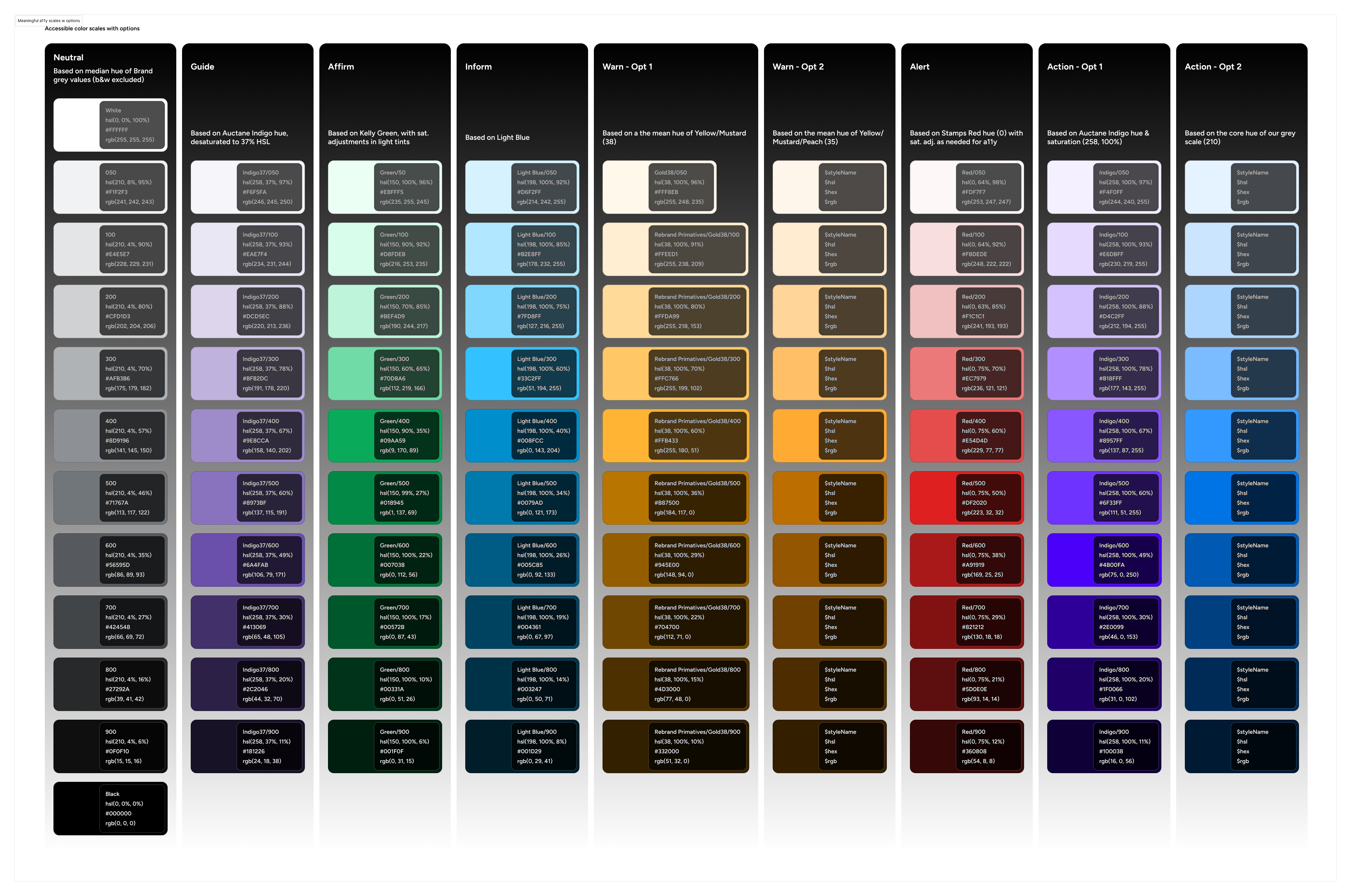
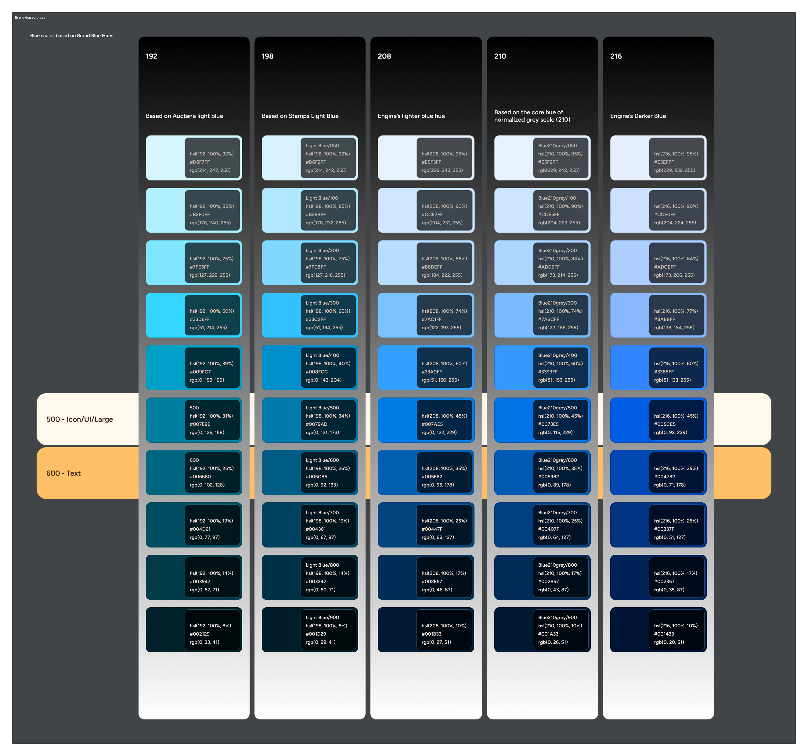
I focused on defining a core set of accessible color primitives based on the unified color palette of the rebrand. By analyzing the hue, saturation, and lightness values of each color, I created a scalable color system that could be easily applied across all products. This not only ensured consistency in branding but also helped meet accessibility guidelines for text and button contrast ratios.
To see the stylistic and usability mess that Stamps.com was in, please check out my Heuristic Evaluation of the web experience (PDF).
Team makeup
2 other core product designers (Station & Engine), Brand design ACD, Engineering leads
Technical specifics
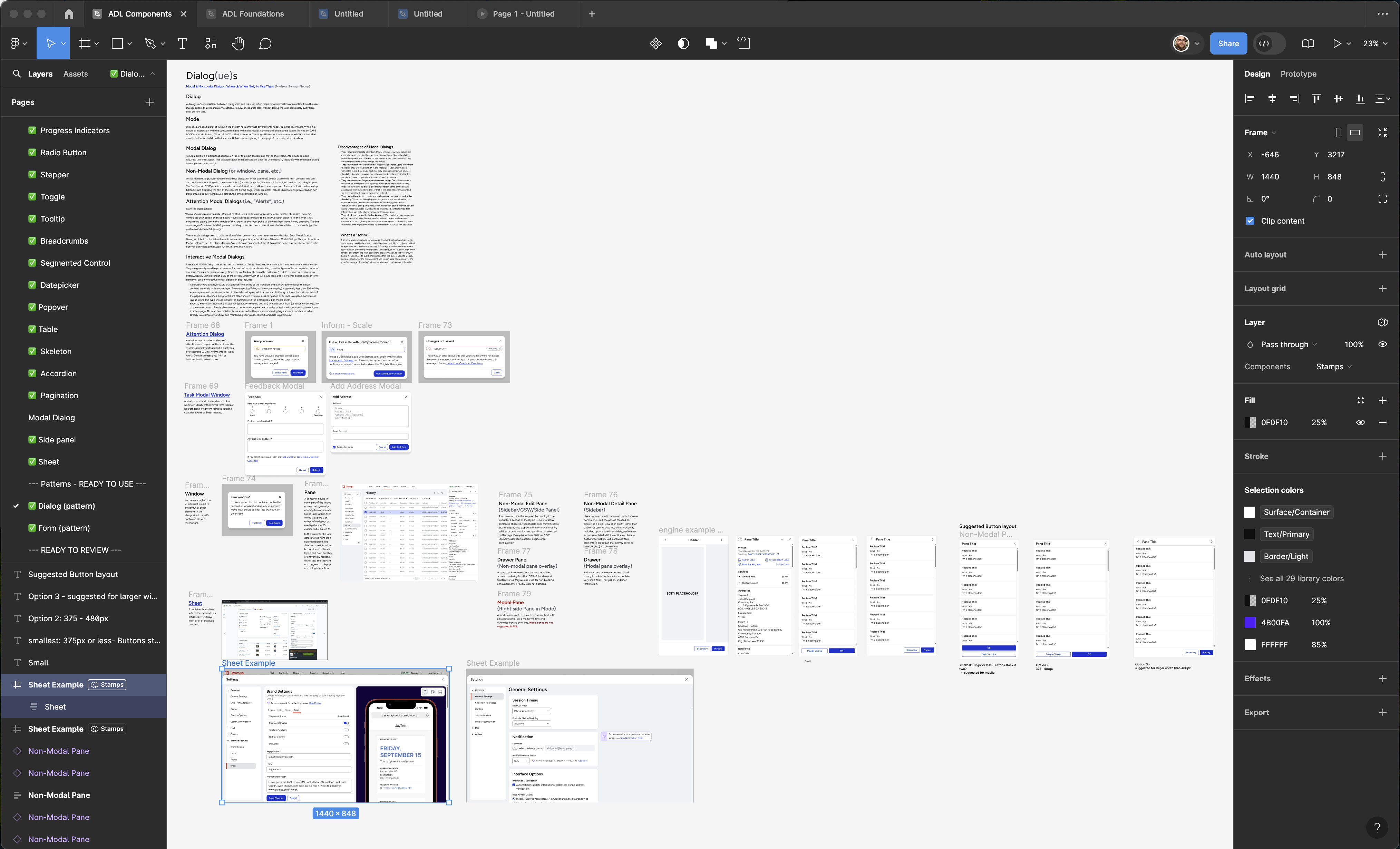
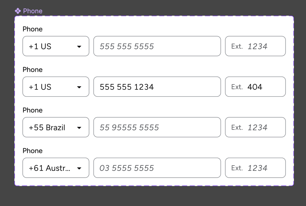
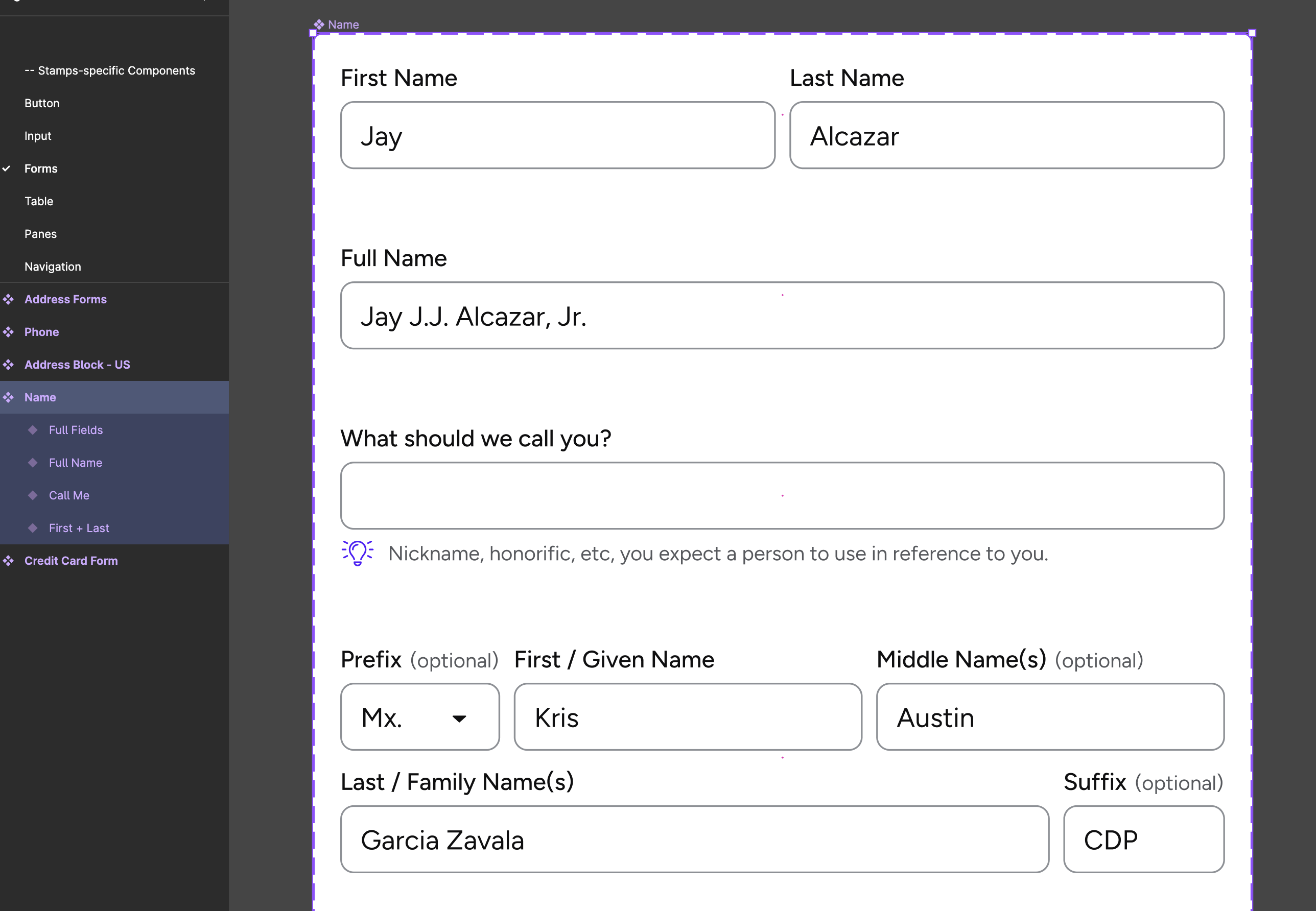
Multi-brand design language supporting shared componentry and product specific brandable elements. Designed and managed in Figma.
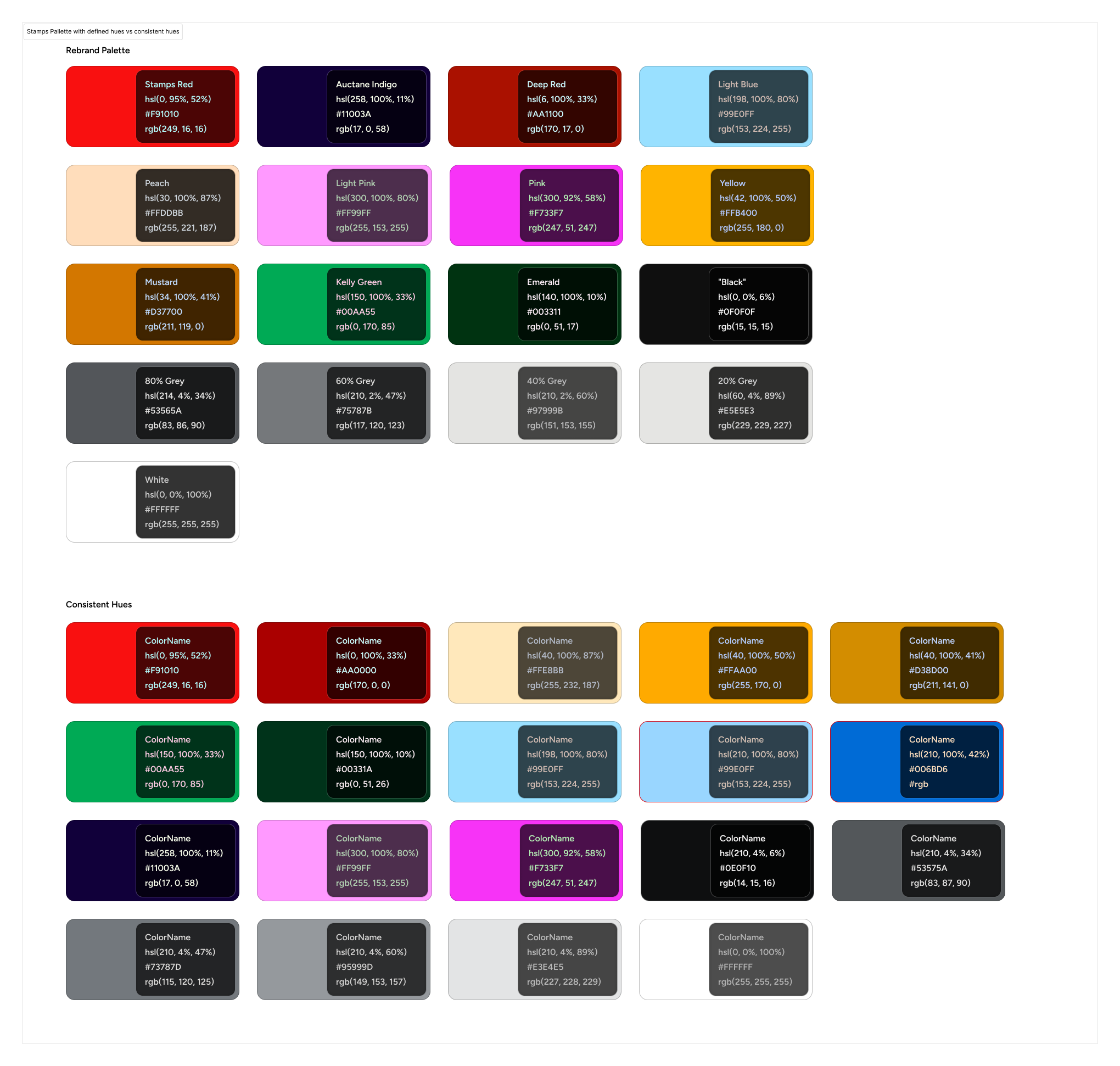
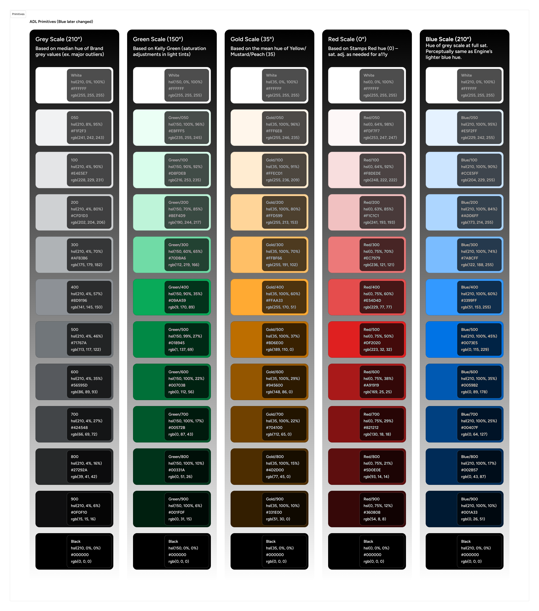
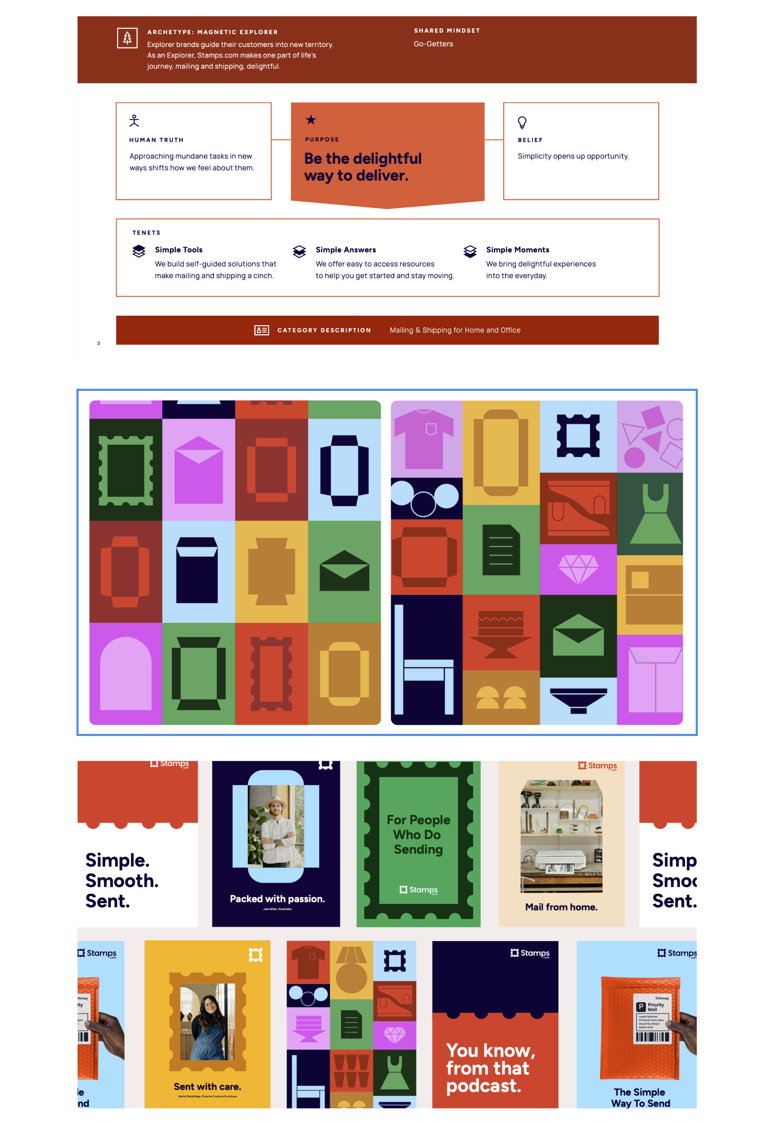
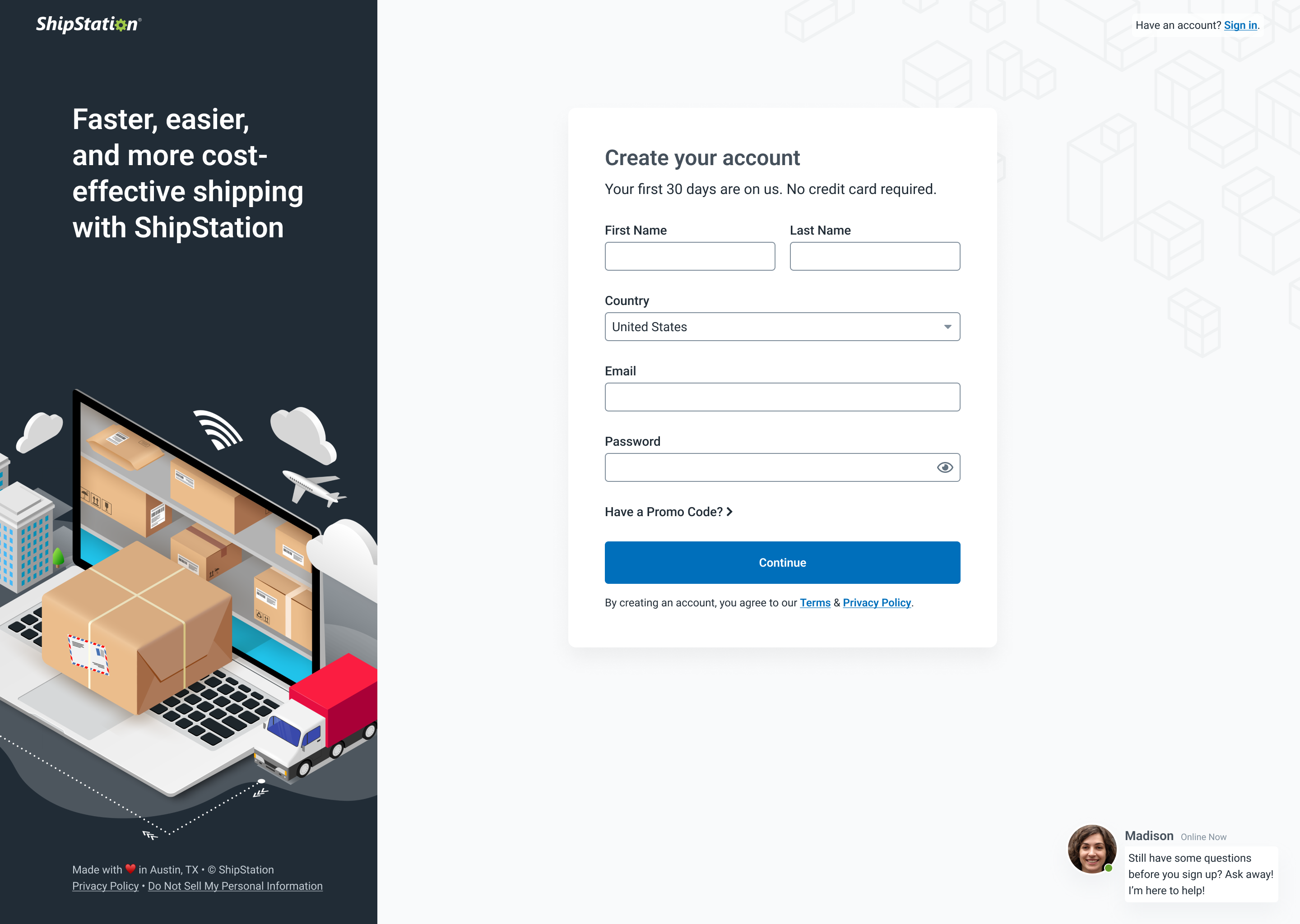
Above: An example of the Stamps.com assets from the Auctane-wide rebrand material we were given to work from. Left: a visual timeline of the process of distilling the rebrand colors into accessible primitive color scales to use across all app UIs.
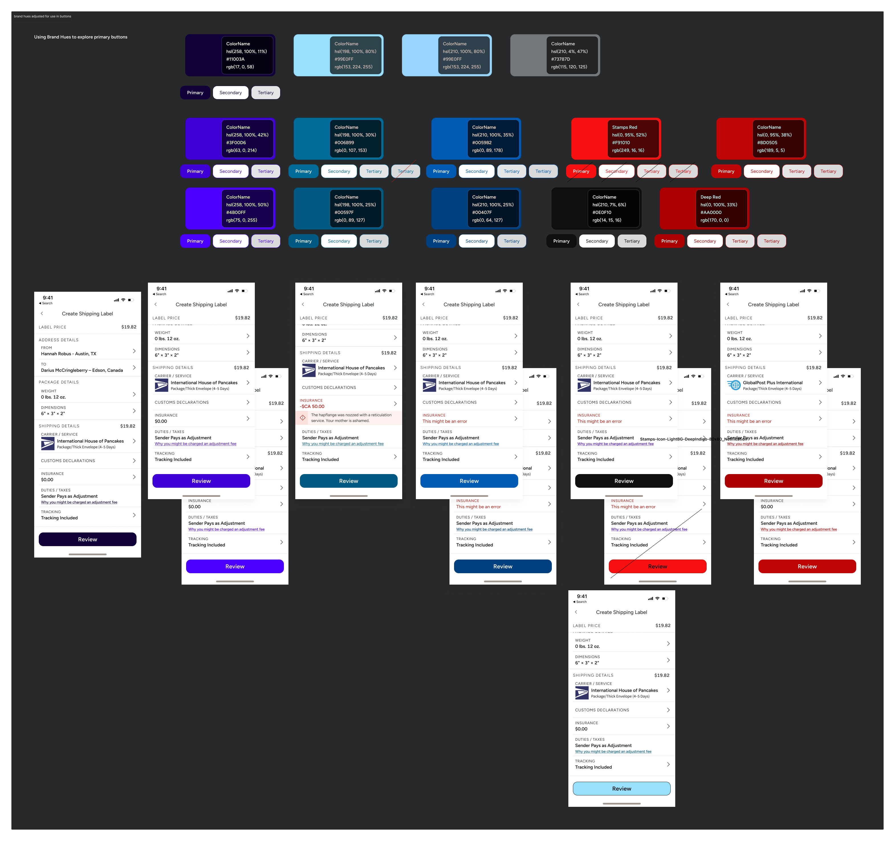
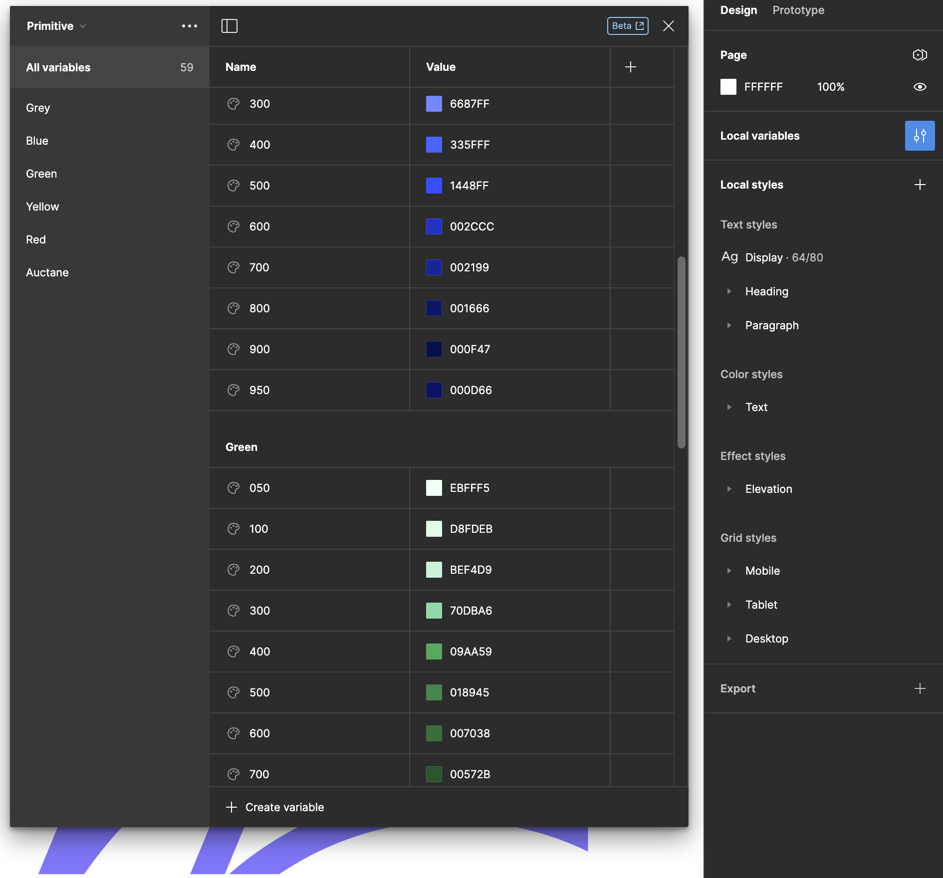
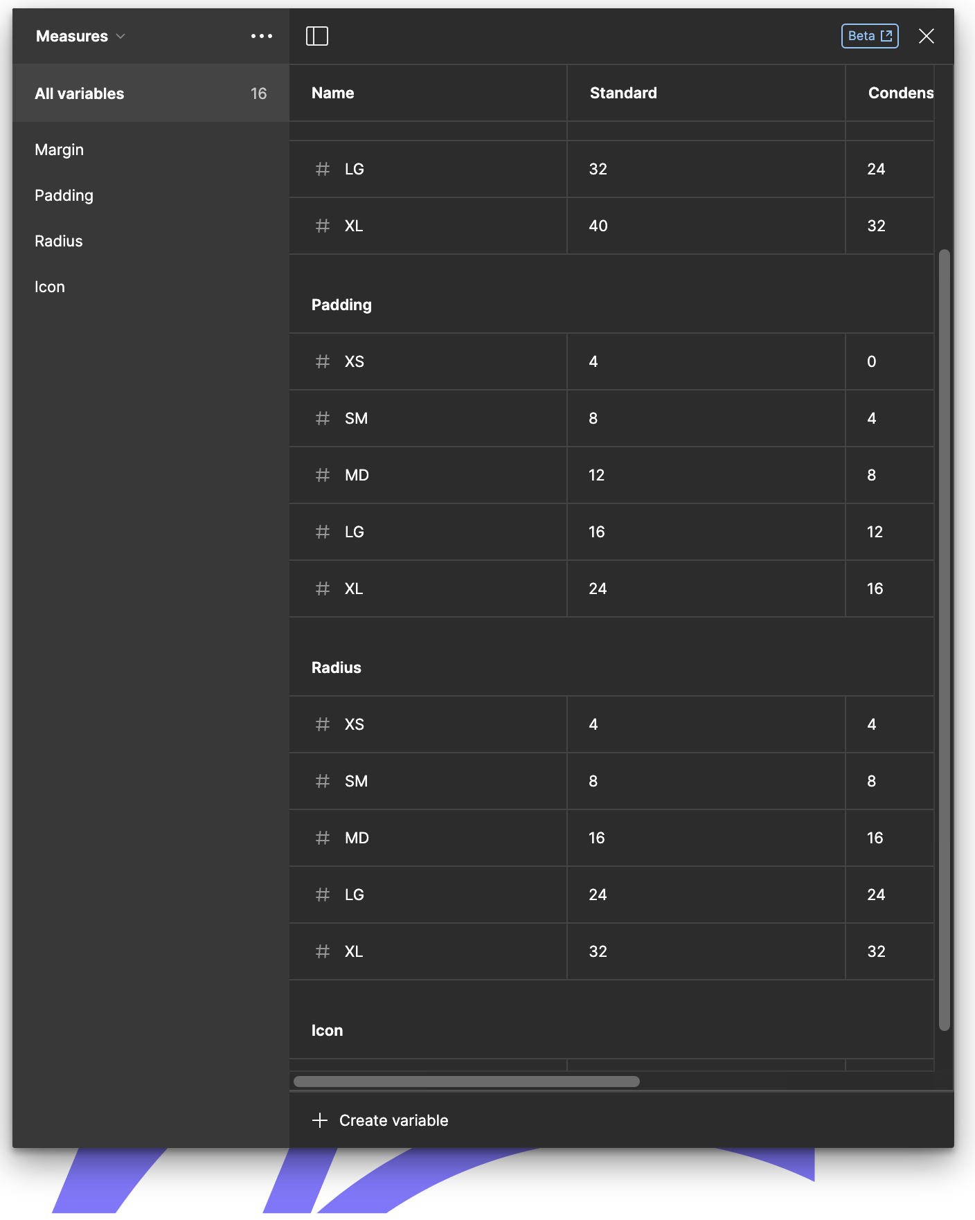
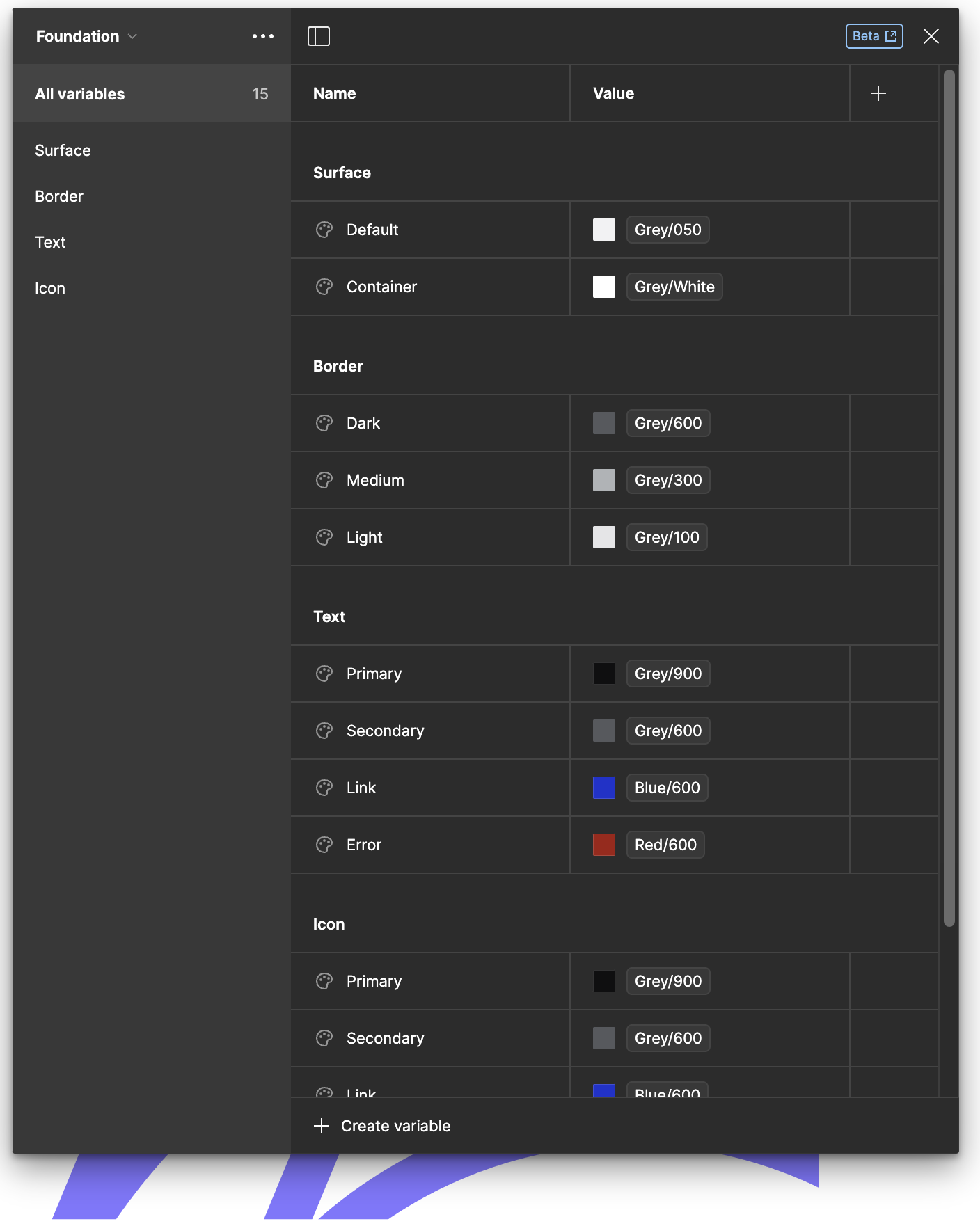
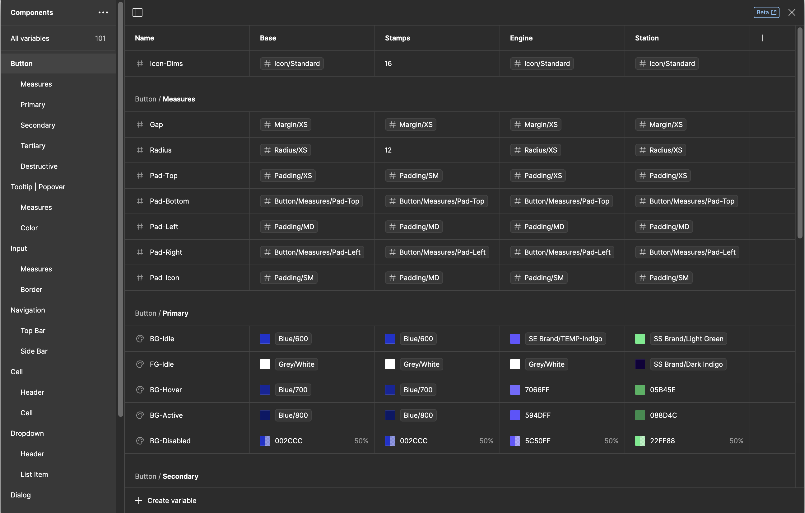
The core design team collaborated to create a centralized "Foundations" file in Figma, which defined the primitive colors, spacing, typography, and other design elements. By utilizing Figma's new variables and modes features, we were able to create components that could adapt to different brand specifications with ease. This approach enabled a seamless workflow for designers, allowing them to quickly create new designs without having to manually adjust each component.
Through rigorous testing and collaboration, we were able to create a set of components that were not only functional but also user-friendly. By prioritizing scalability and flexibility in our design system, we laid a solid foundation for future growth and expansion within Auctane.
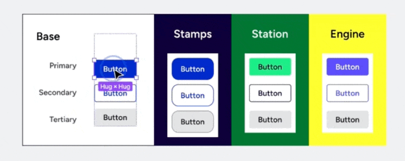
Left: Examples of how variables were used in both the core Foundations file and the Components library, in addition to example molecules through patterns defined across ADL as well as brand specific usecases. Above: using modes to create quickly assignable themed components..
Overall, this project exemplifies my ability to work with cross-functional teams, analyze complex design challenges, think in both macro and micro scales, and implement scalable solutions that improve the overall user experience. My focus on creating a unified design system not only enhanced visual consistency across products but also streamlined the design process for the entire organization.
ADL in action (Video Walkthroughs)
How I made brandable components with variables and modes in Figma
Reusing patterns across brands quickly and easily
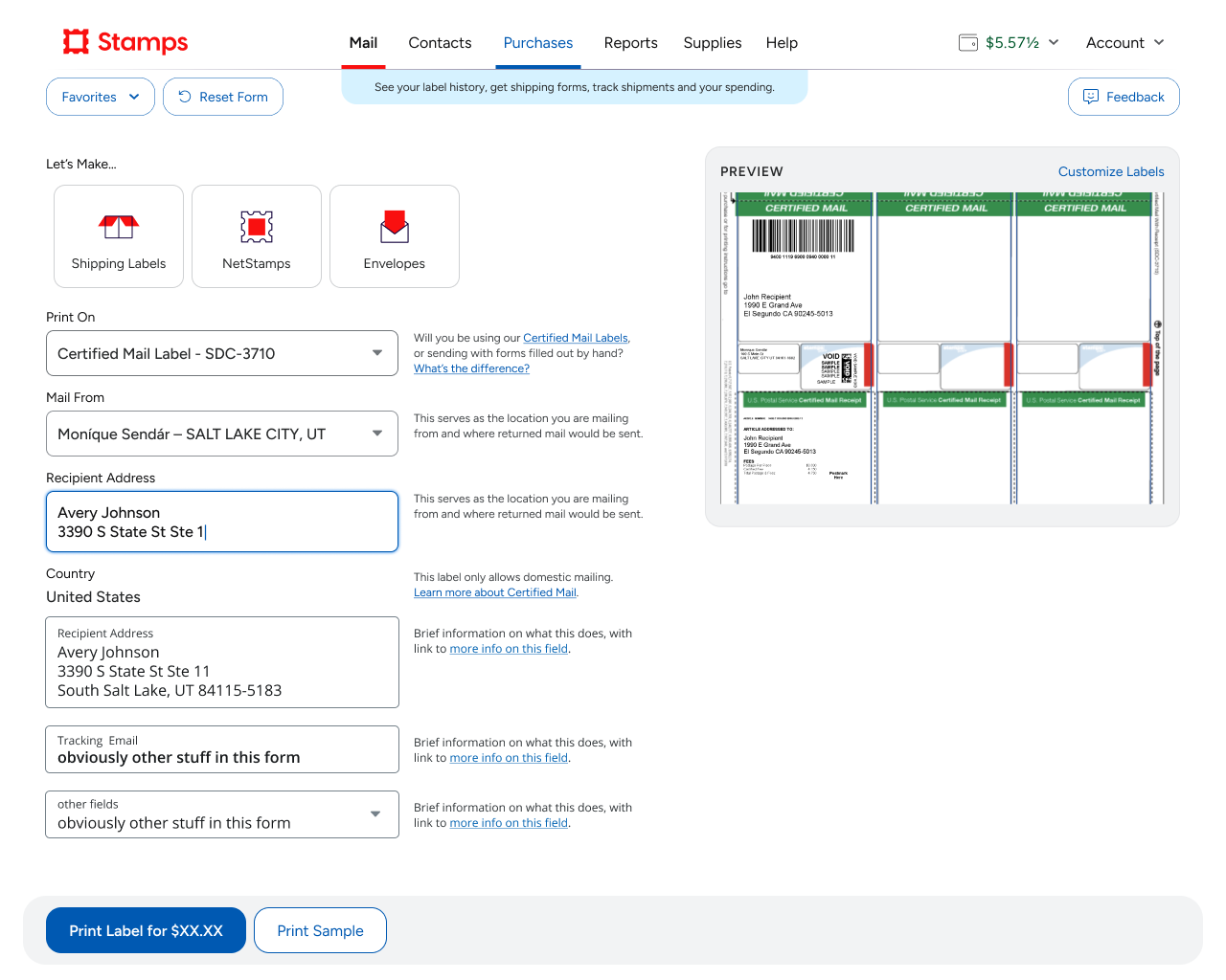
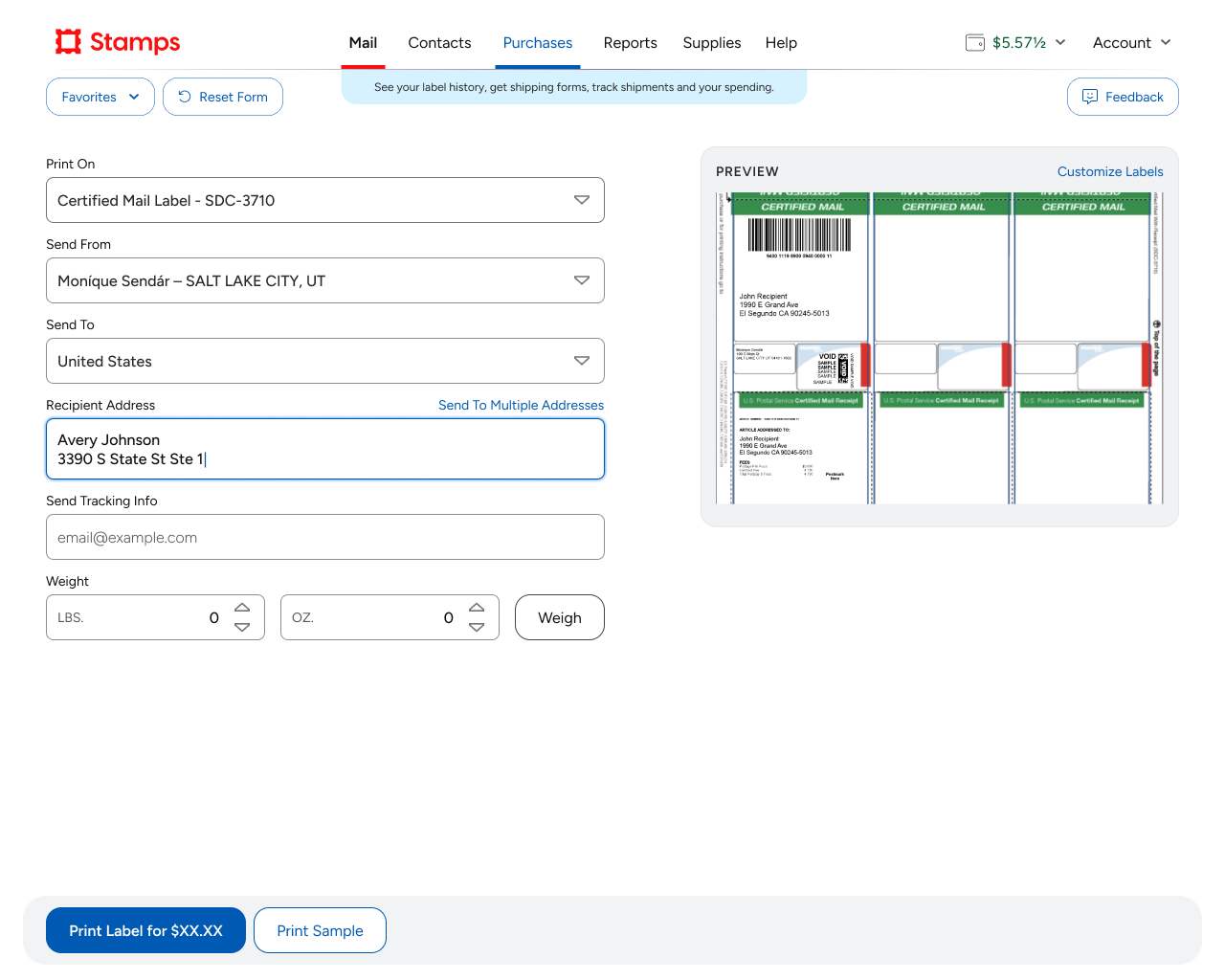
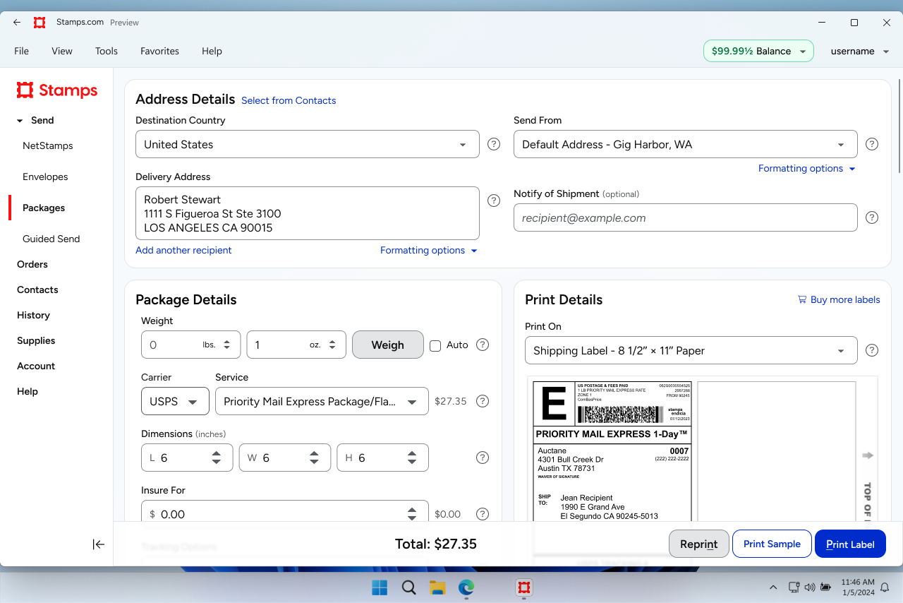
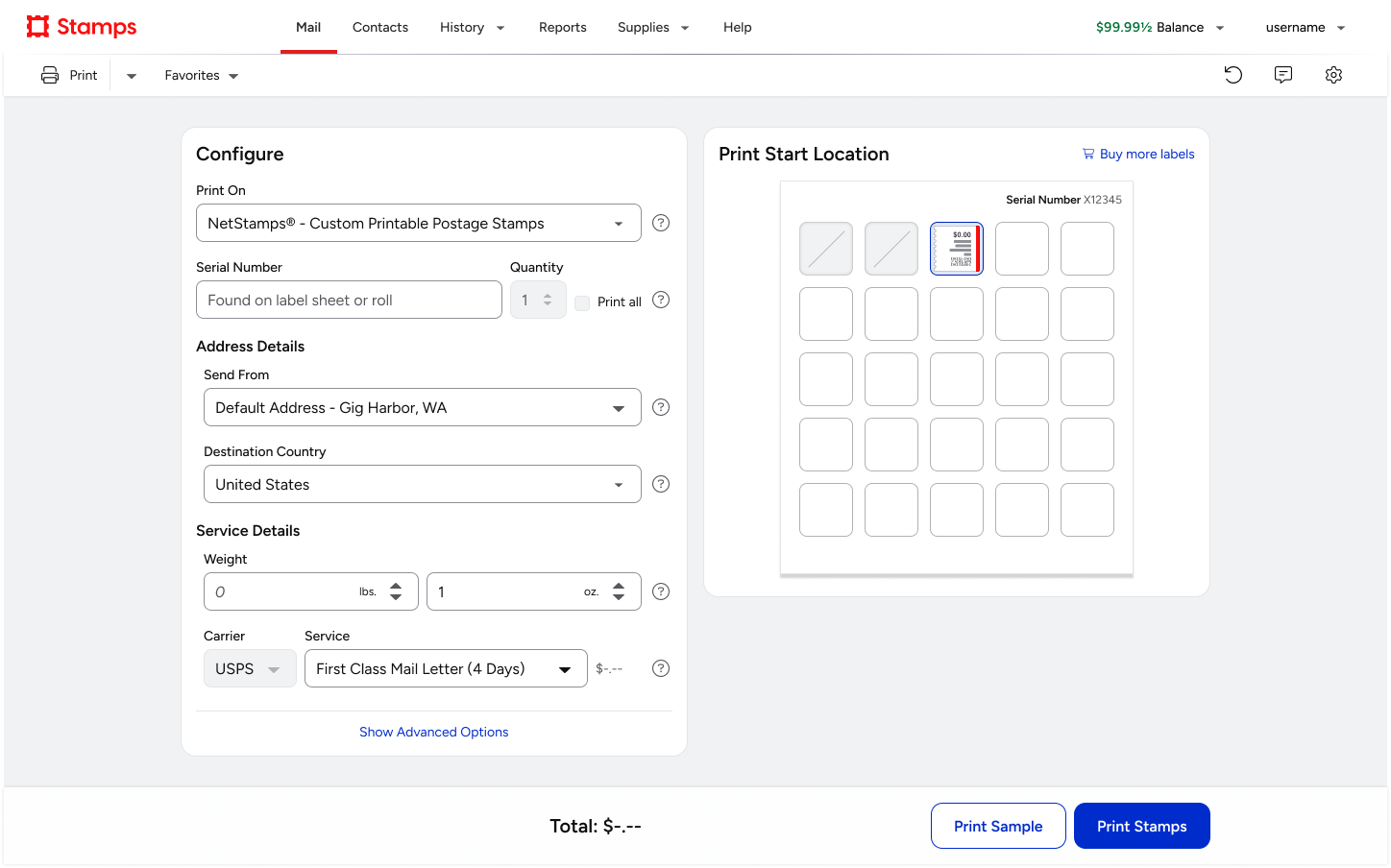
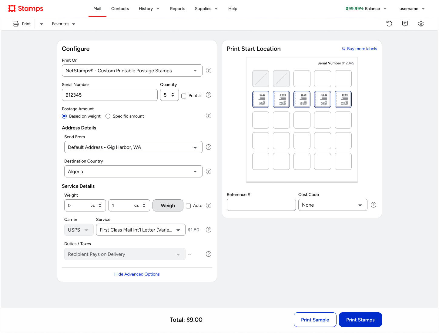
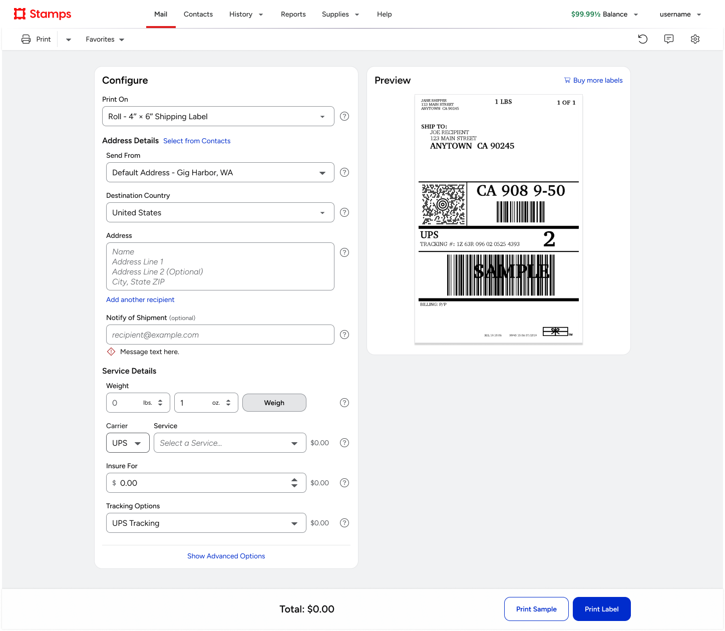
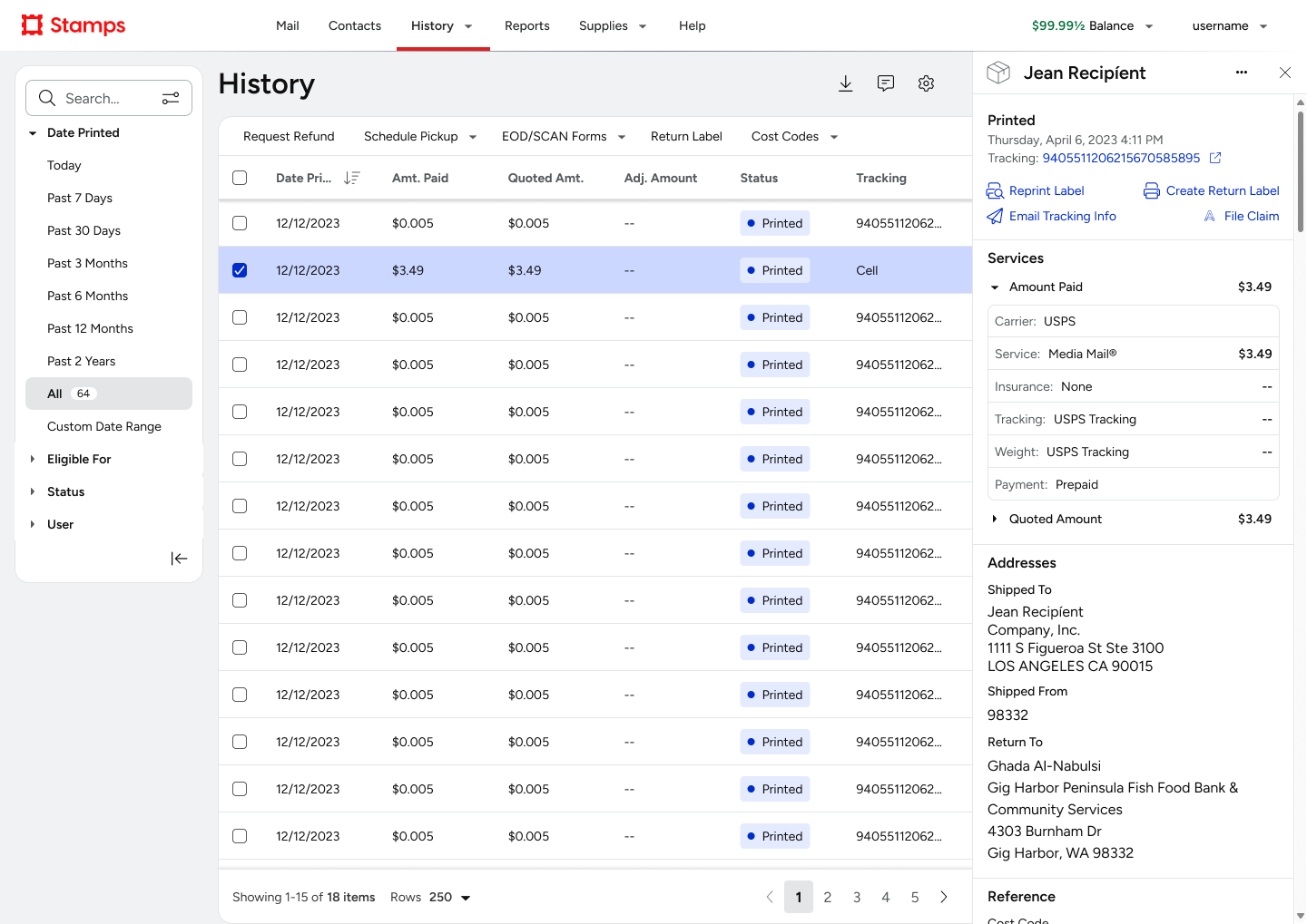
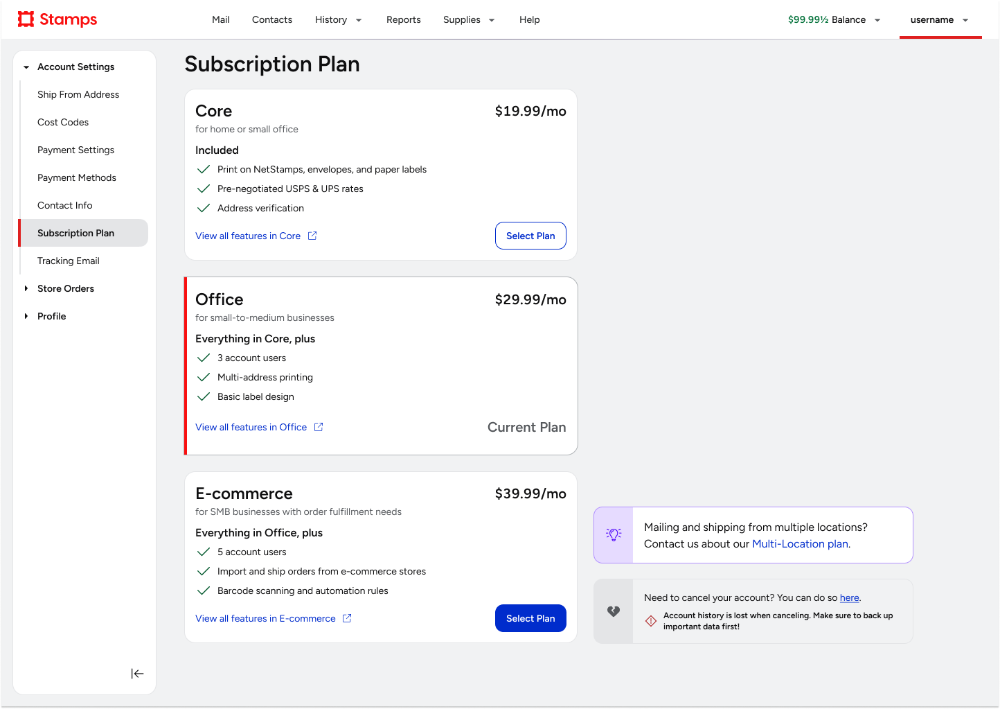
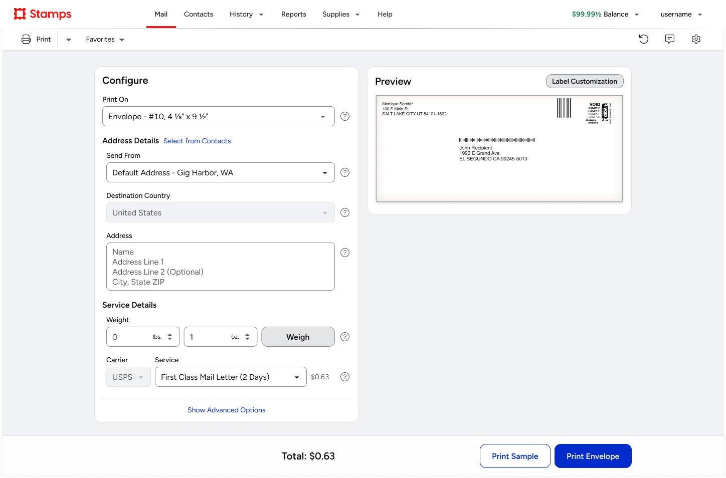
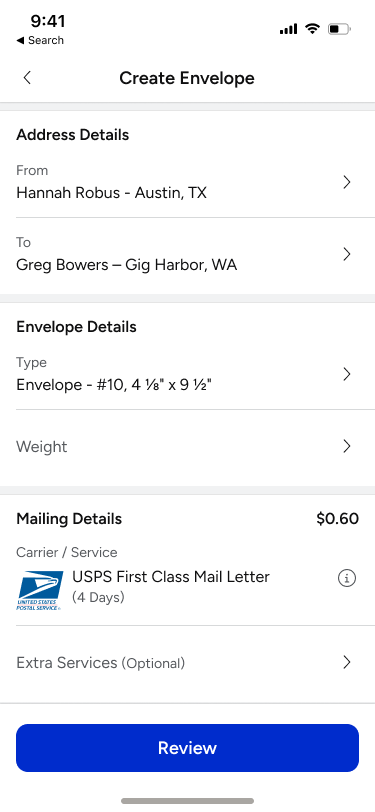
ADL applied to Stamps.com apps
Other Projects
ShipStation OnboardingGrowth & Team Leadership
ShipStation InsightsData Visualization

Amazon Restaurants order managementUX workflow and research for tablet PoS app
Product Catalog ManagementInnovation and user efficiency
Pixel Health and MonitoringSupport and efficiency