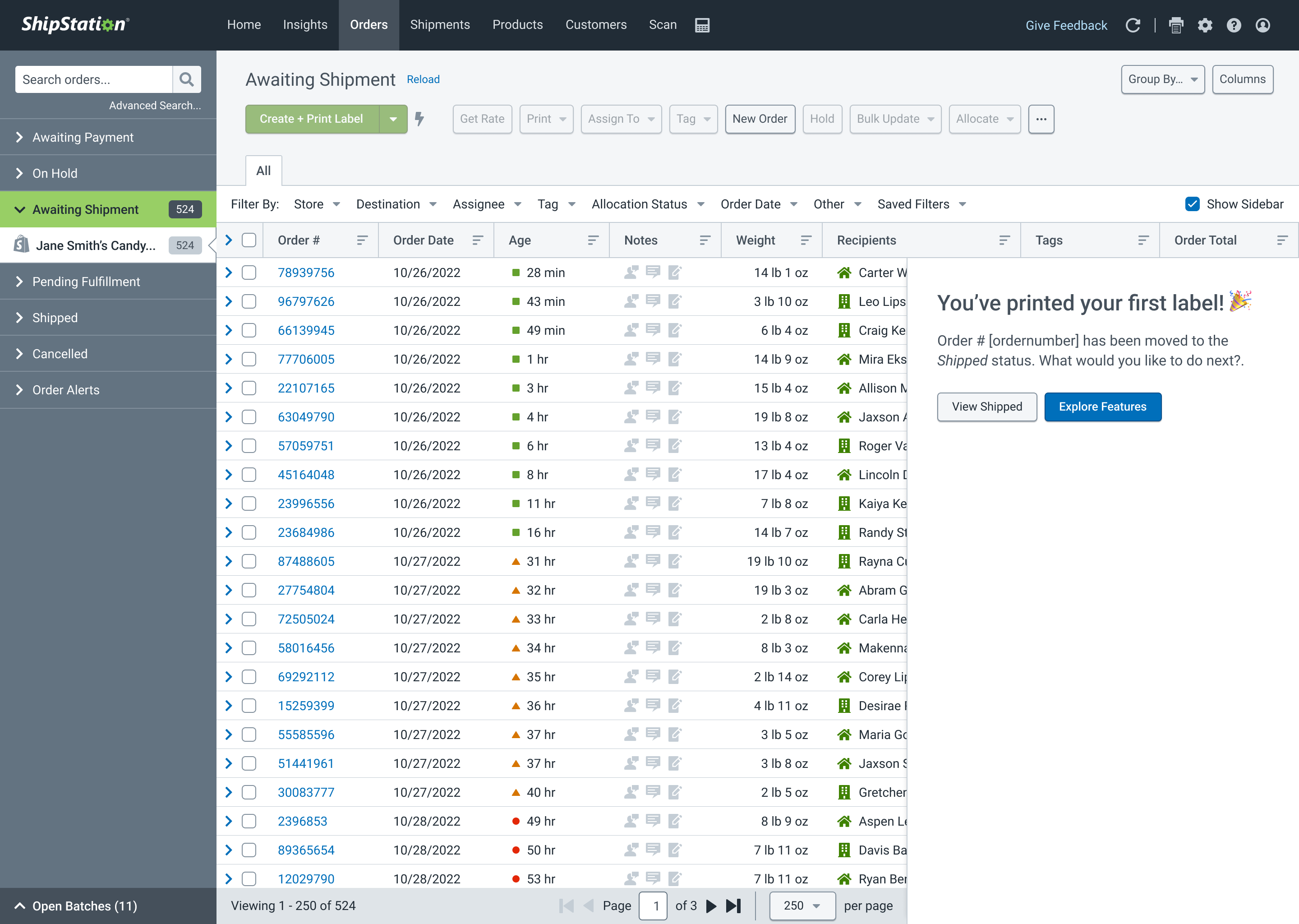
Sign-up and Onboarding
Auctane / ShipStation – Product Design Team Lead
I don't want to read—show me the visuals!
Situation
ShipStation, Auctane's leading fulfillment and shipping brand, was struggling to onboard new customers and get them to purchase their first shipping labels promptly. The existing sign-up and onboarding process was overloaded with unnecessary questions and abruptly transitioned to a short-lived setup page that offered too little help before disappearing entirely.
Task
As the Product Design Team Lead and manager, my role was to be a player/coach for a team of two junior designers. Our goal was to rethink the sign-up and onboarding process in an engaging, streamlined manner that not only prepared new users for their new power tool but also helped cut the time to the first label print in half. We would also engage a cross-functional team of engineers, marketing, and sales leaders to ensure internal needs were still met by this new workflow.
Action
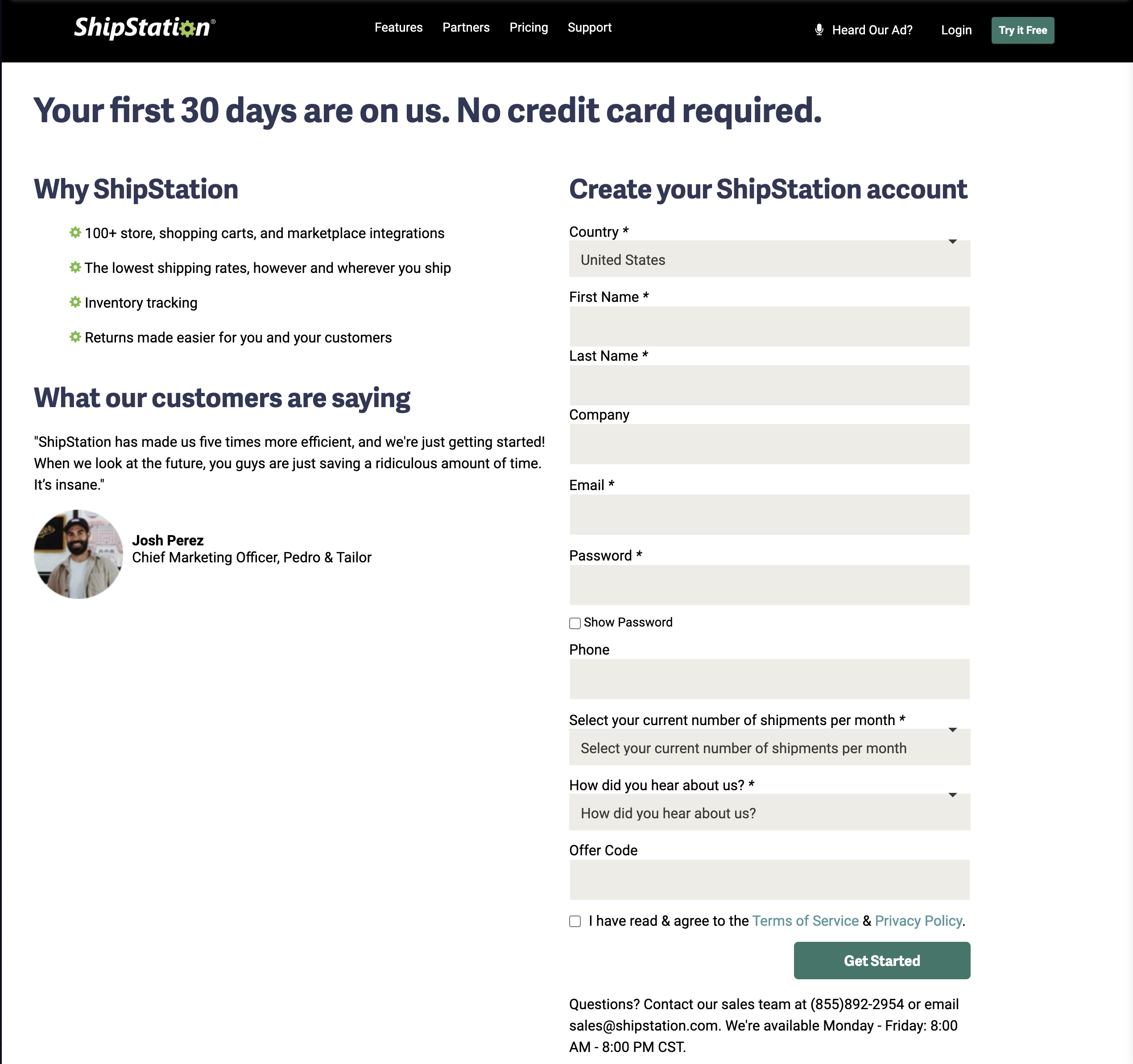
- Research and Evaluation: We identified that the initial sign-up form asked too many questions, causing study participants to question why we needed this information to create an account. Additional study feedback included frustration over repeatedly entering the same information users had already provided during sign-up once inside the app, including ignored personalization details. Participants also noted the lack of inline help, leading them to seek out knowledge base articles, search community forums, or contact support. On the technical side, we discovered that the sign-up form was managed by a developer on the marketing team, while the rest of onboarding (in-app) belonged to the product development team. This caused communication problems, both in person and in code.
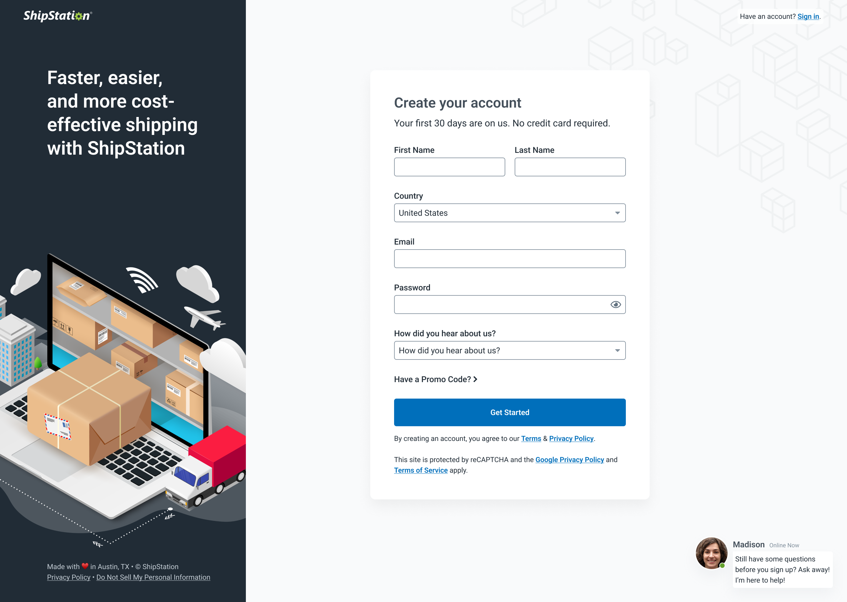
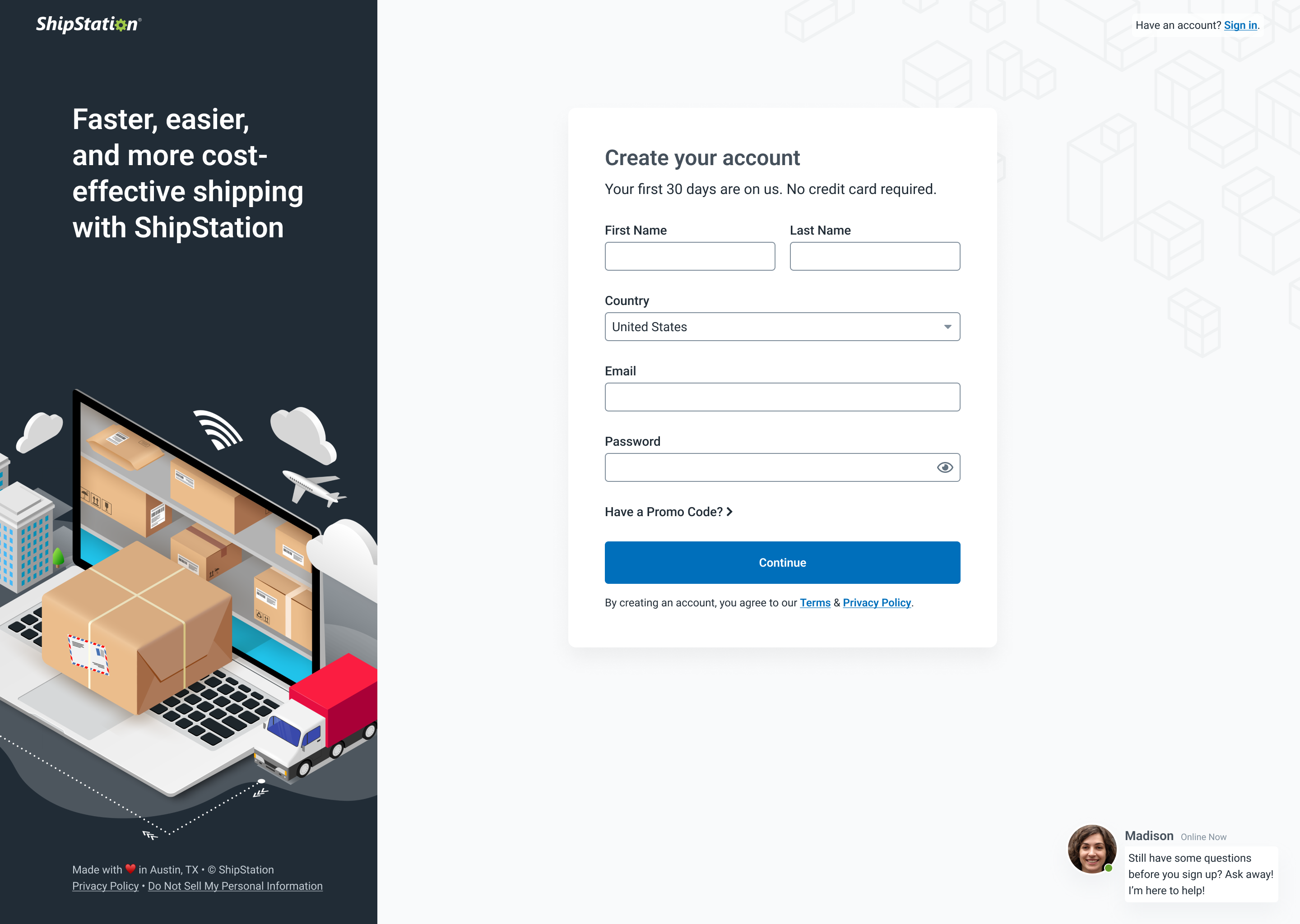
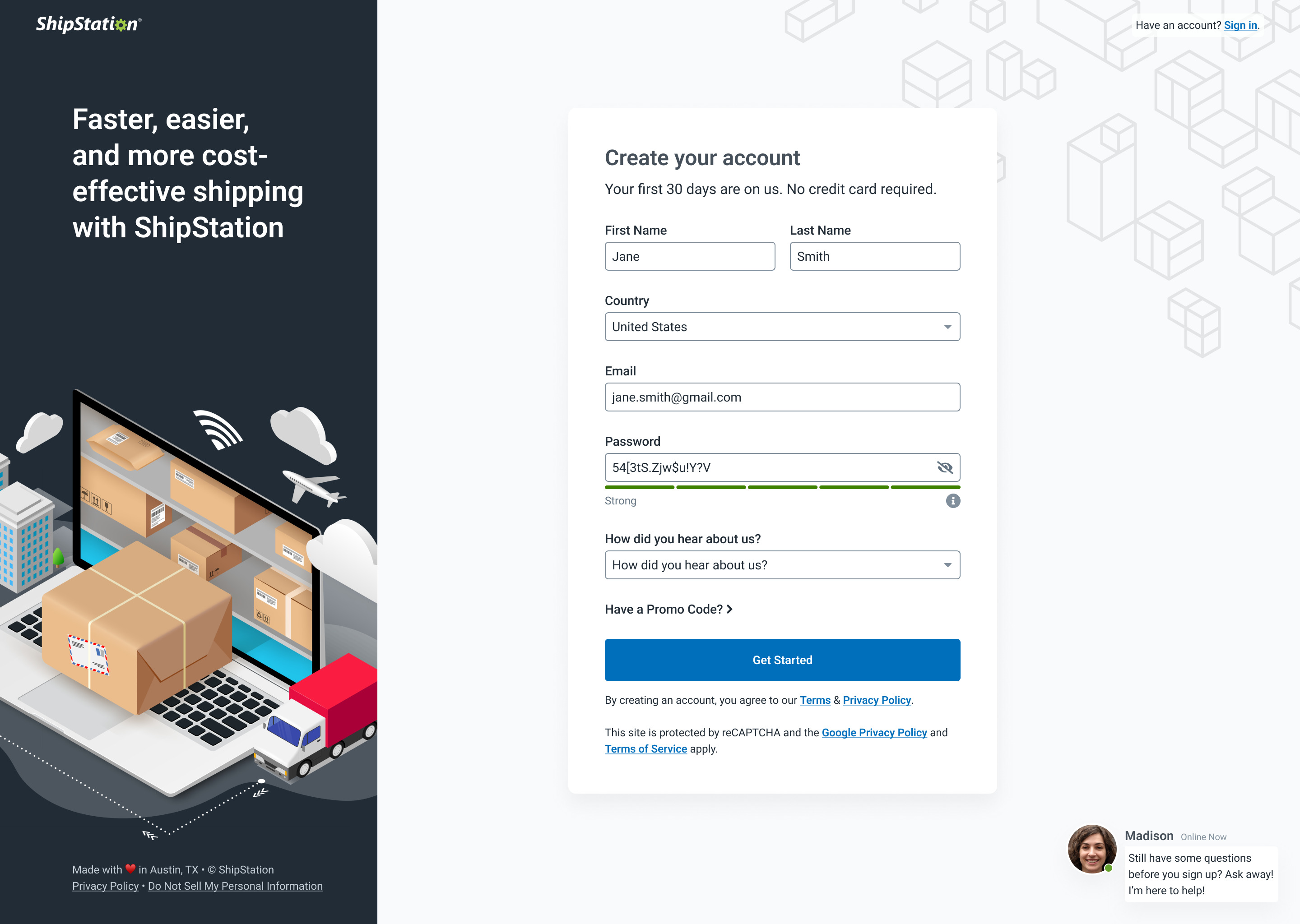
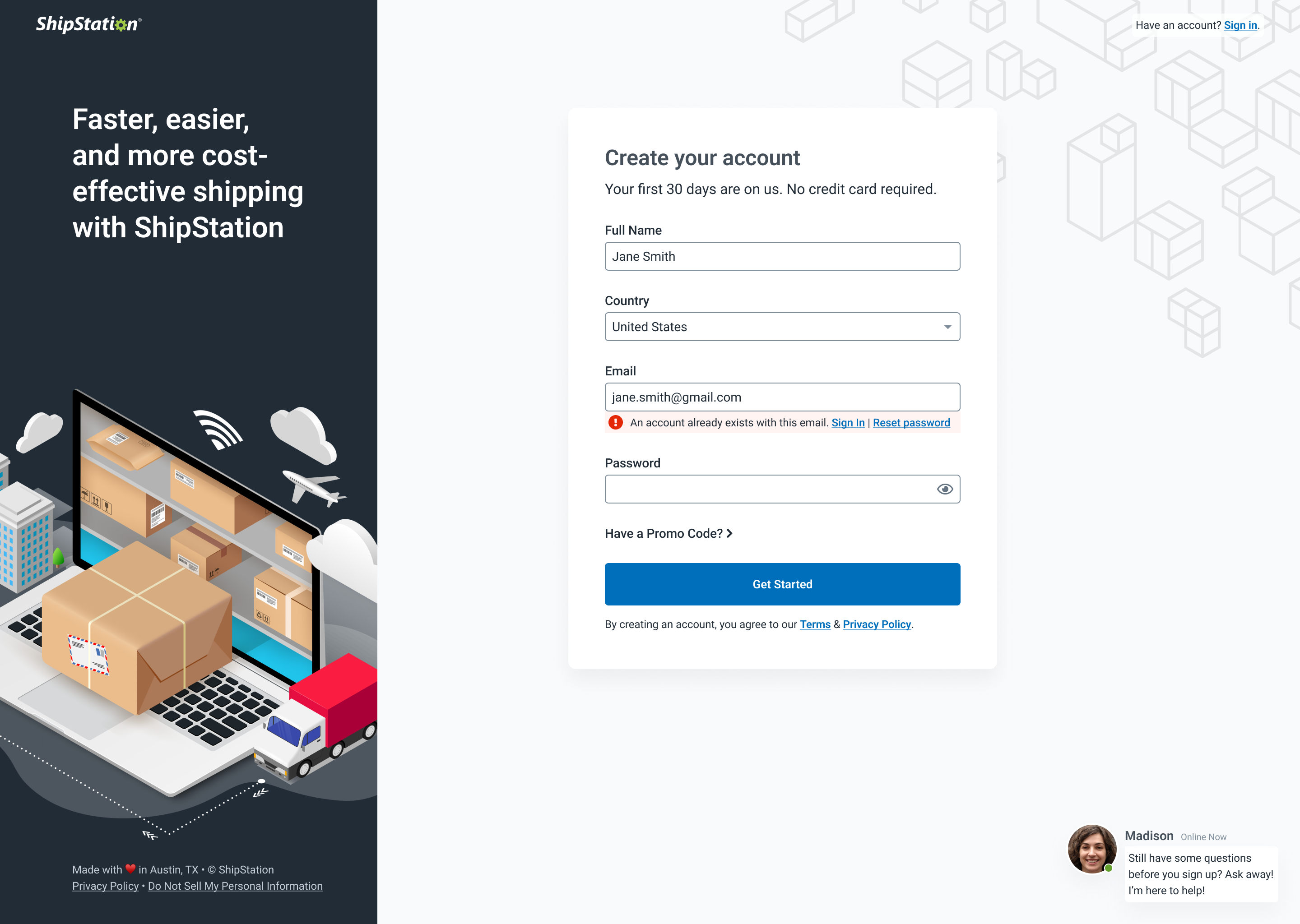
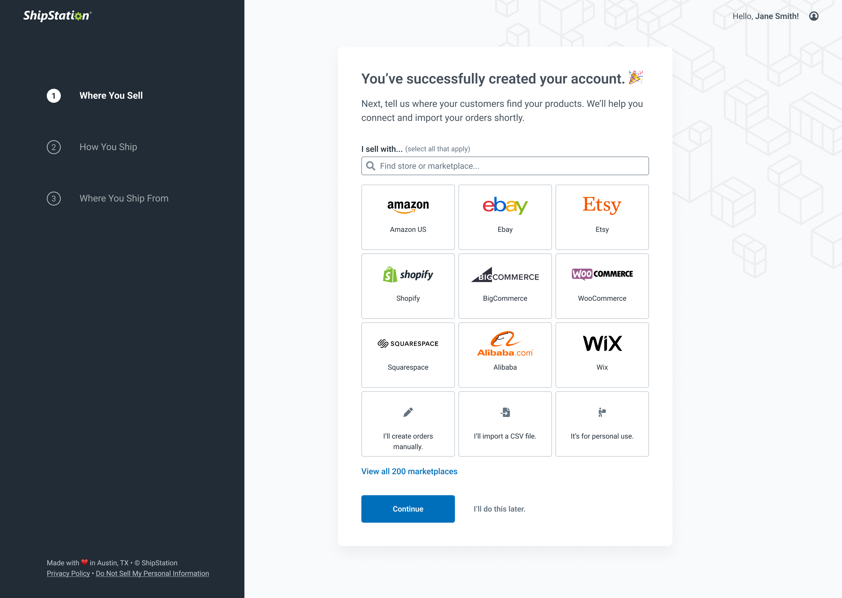
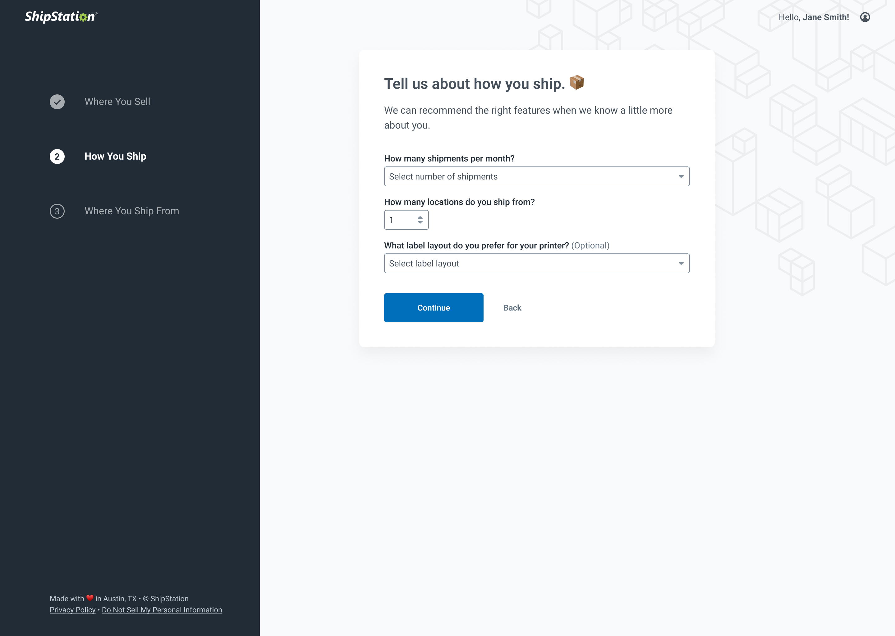
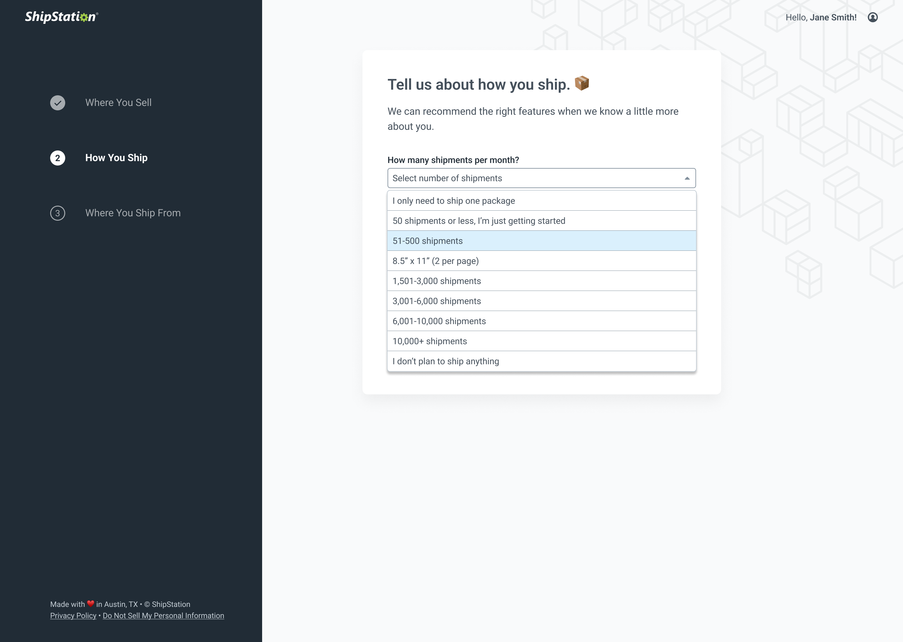
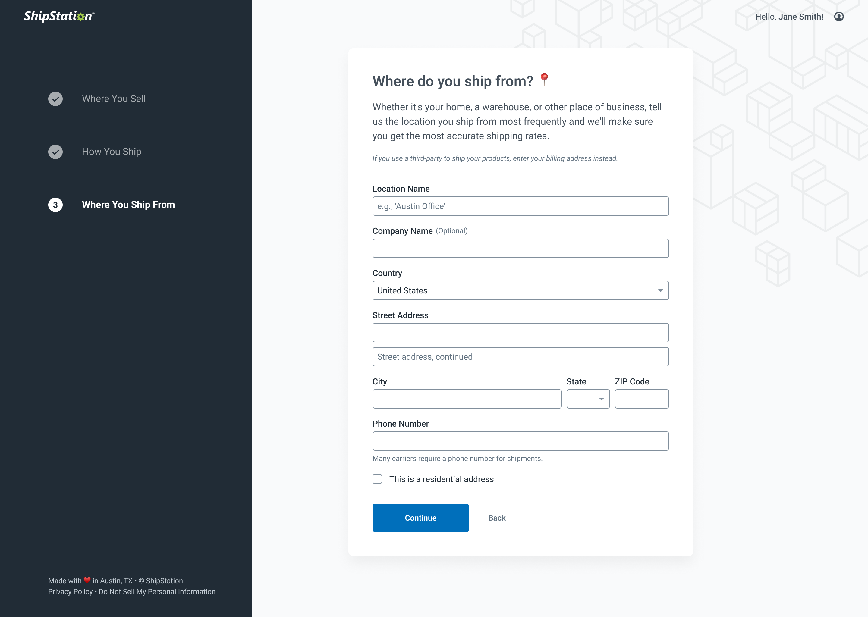
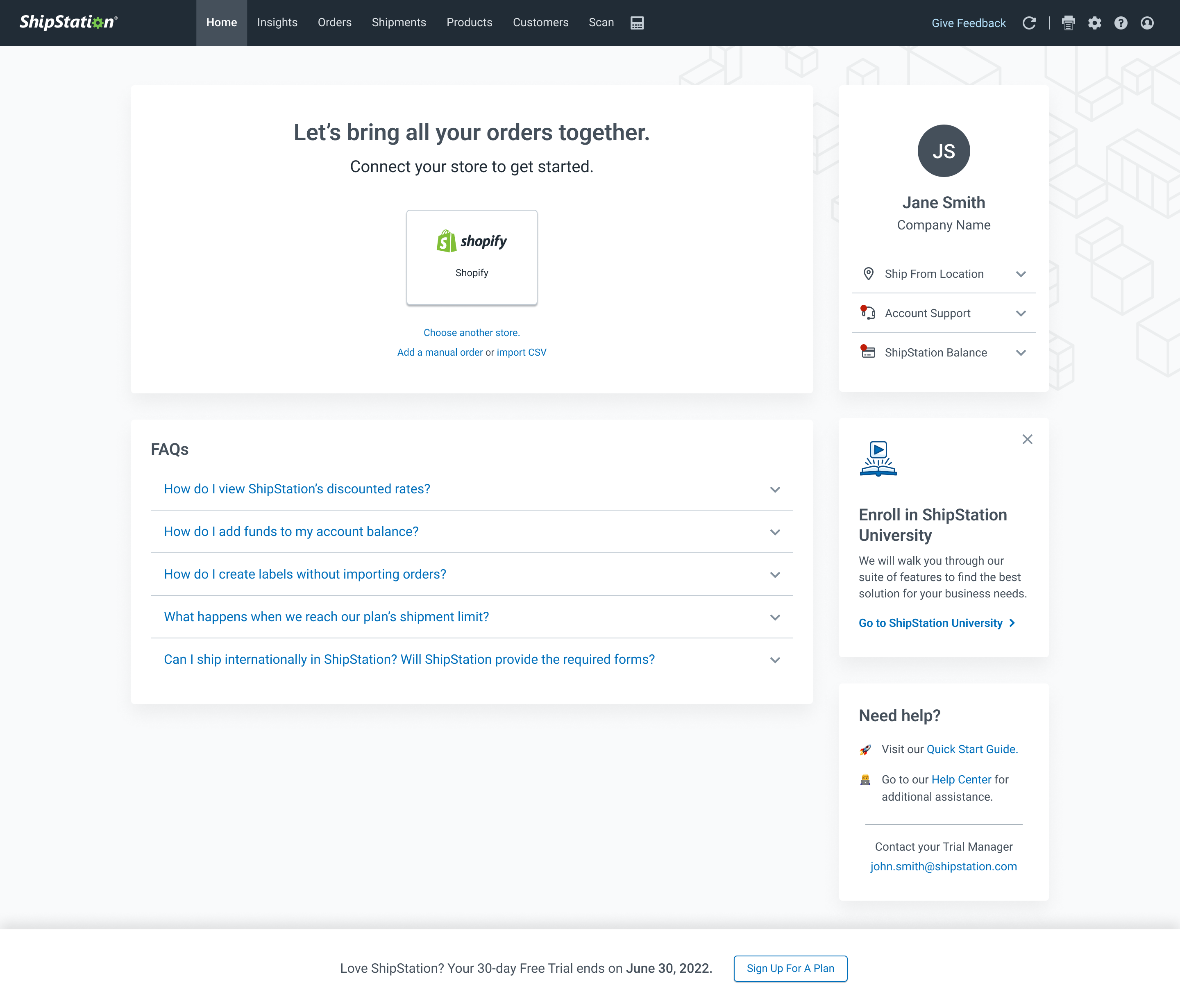
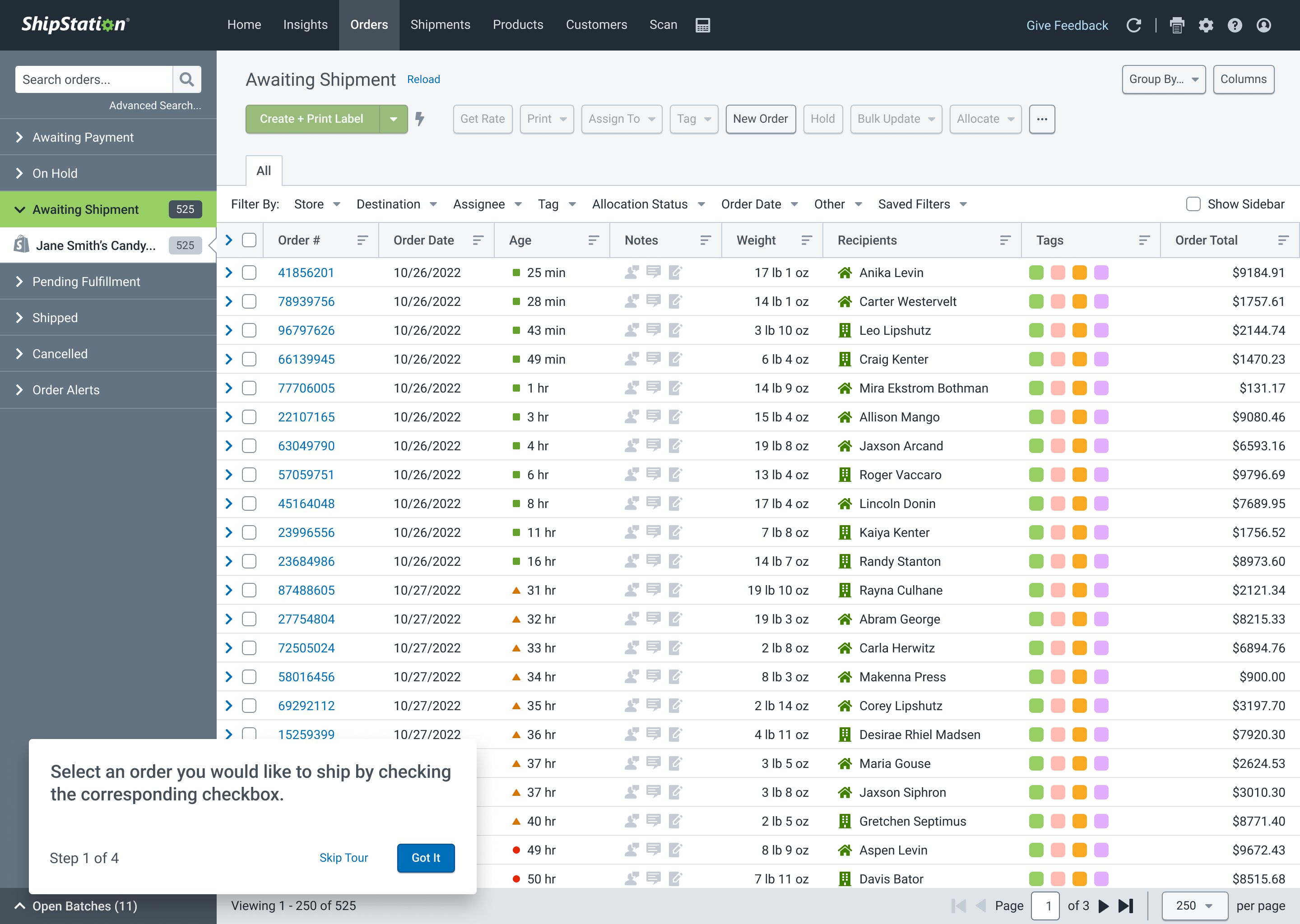
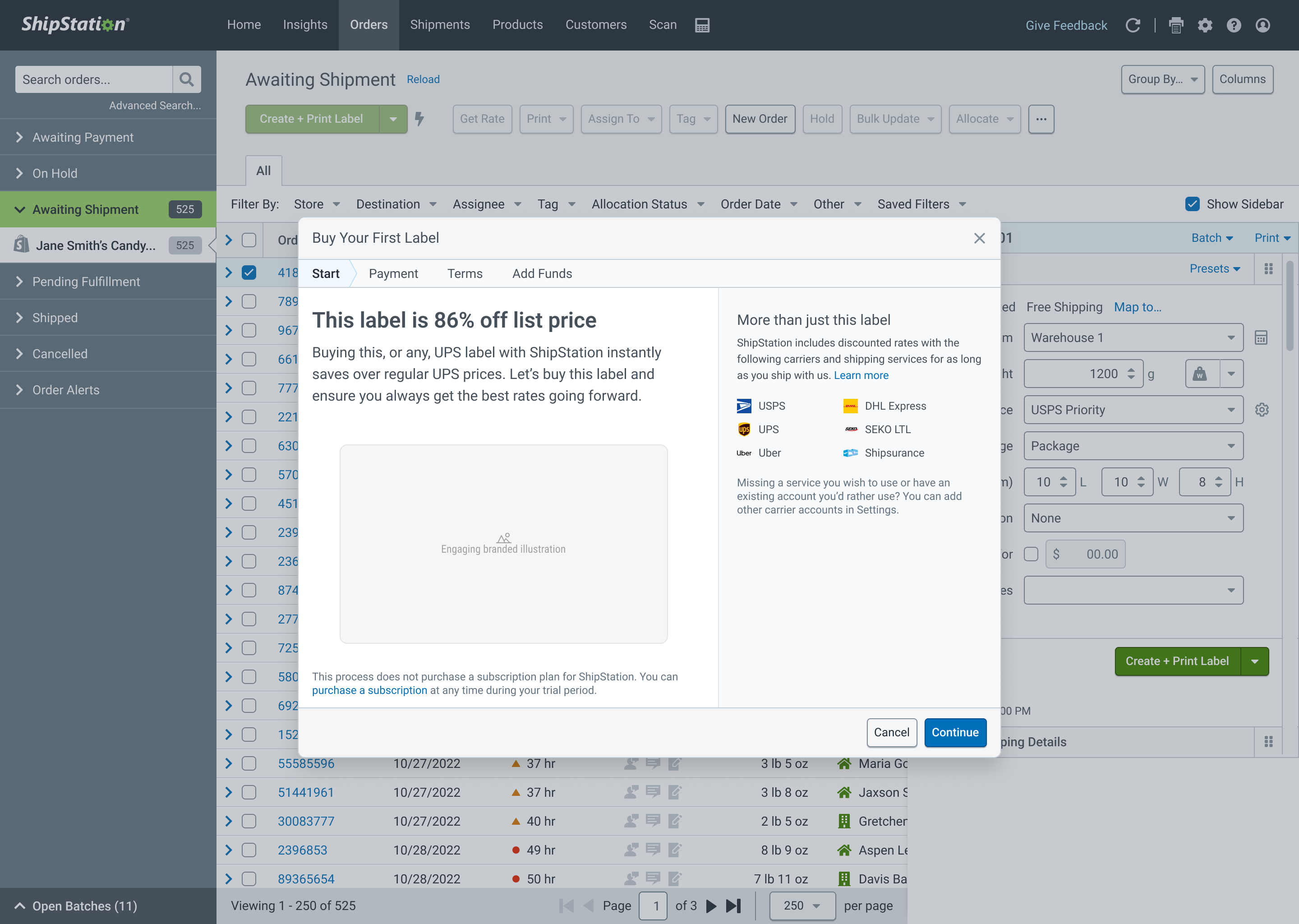
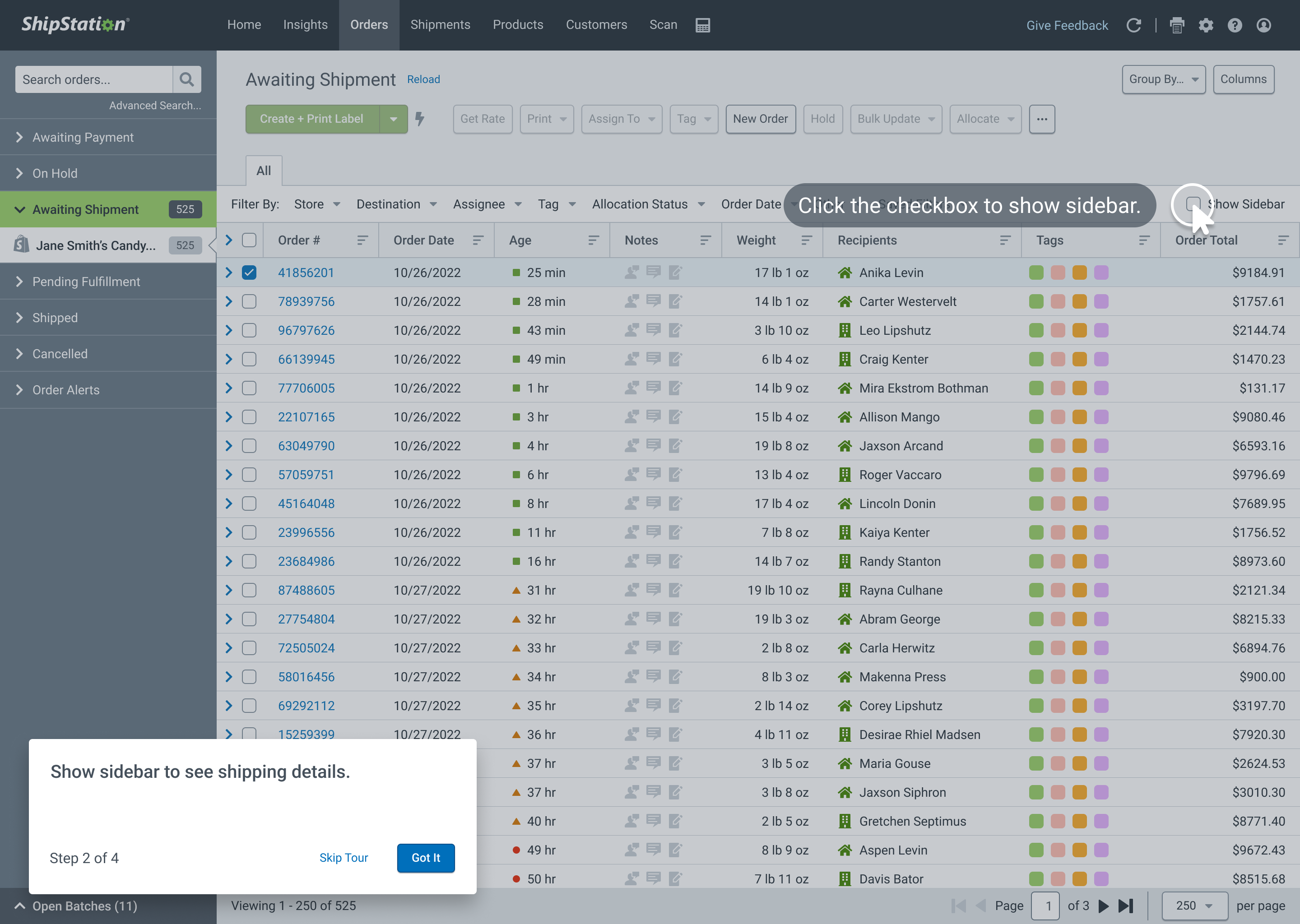
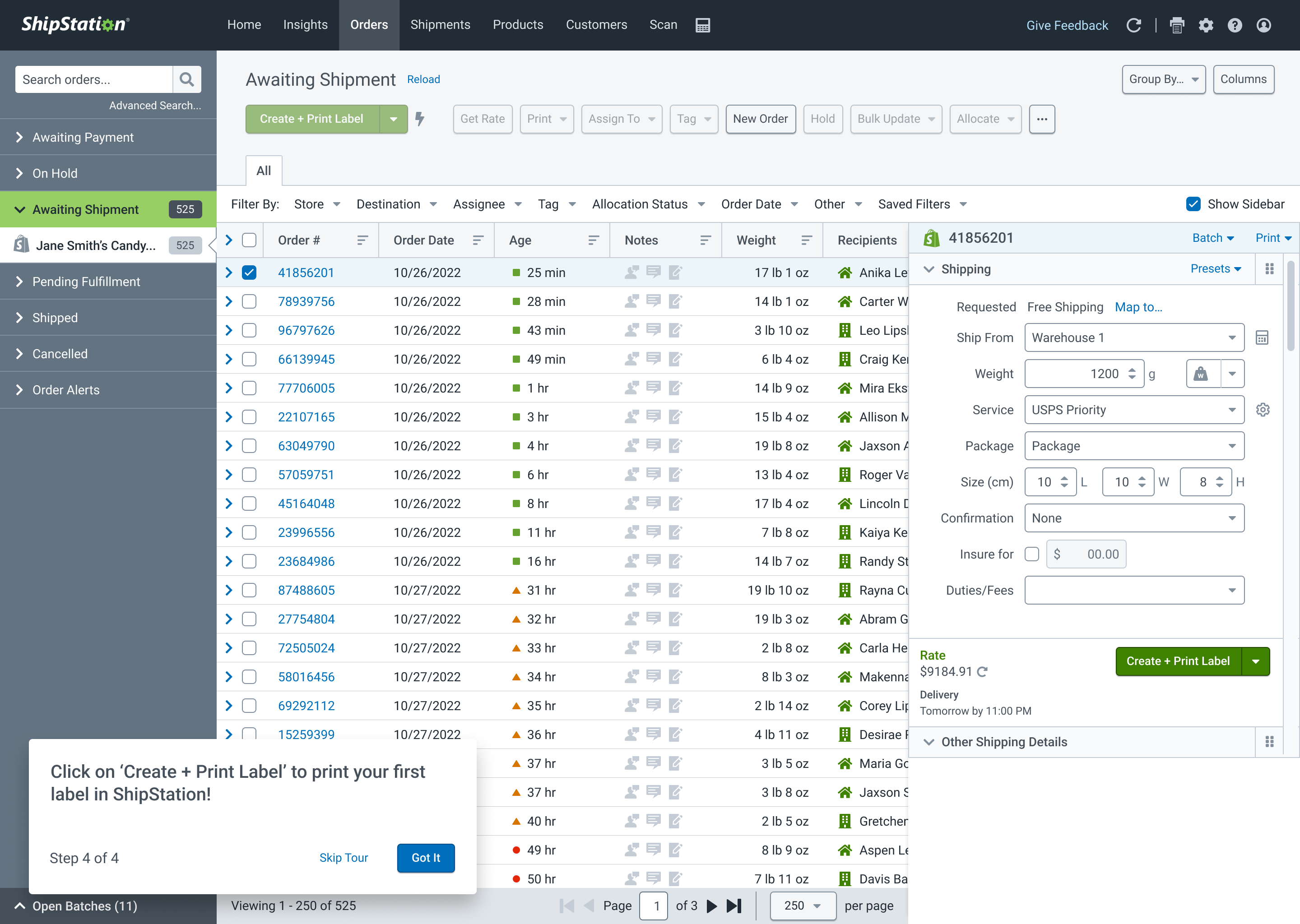
- Strategy: Working with product management and both groups of developers, I pushed for a more unified approach to building and maintaining the sign-up flow. We would transfer technical ownership after the initial sign-up page—hosted on a WordPress site—had gathered the minimum data, and subsequent steps would be managed by a dedicated workflow owned by the product development team. This workflow would be designed in a conversational manner, asking for specifics one at a time, always communicating why the information was needed and how supplying it benefited the new customer. Customers could leave and return to this workflow at any time, as the minimum details required to create the account had already been gathered. We worked directly with sales and marketing to ensure we gathered data they absolutely needed to identify leads with enough information to maintain efficient customer activation. We would also improve post-signup transitions with inline "coachmark" guidance.
- Design and Prototyping: I held frequent workshops with my team to minimize repetitive and unnecessary fields and steps during the workflow. Information gathered earlier would be pre-filled when appropriate, helping address the problem identified in user validation testing that "the person creating the account wasn't always the same person used for billing or contact details." We were surprised to learn that even in smaller businesses, the addresses for pickup and contact or billing were only shared 30% of the time, invalidating our "just reuse the same address" hypothesis, but providing enough reason to provide that data for autocomplete should the user find it useful. I helped my designers hone their designs to include thoughtful touches, like loading animations and improved copywriting, and helped them build their presentation skills for our frequent cross-functional check-ins.
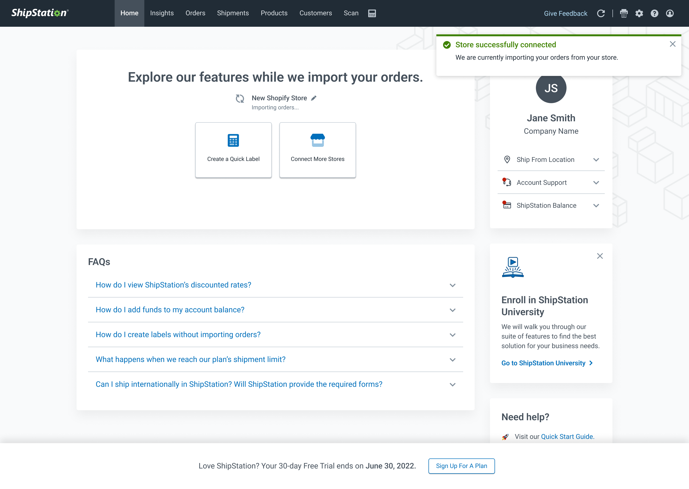
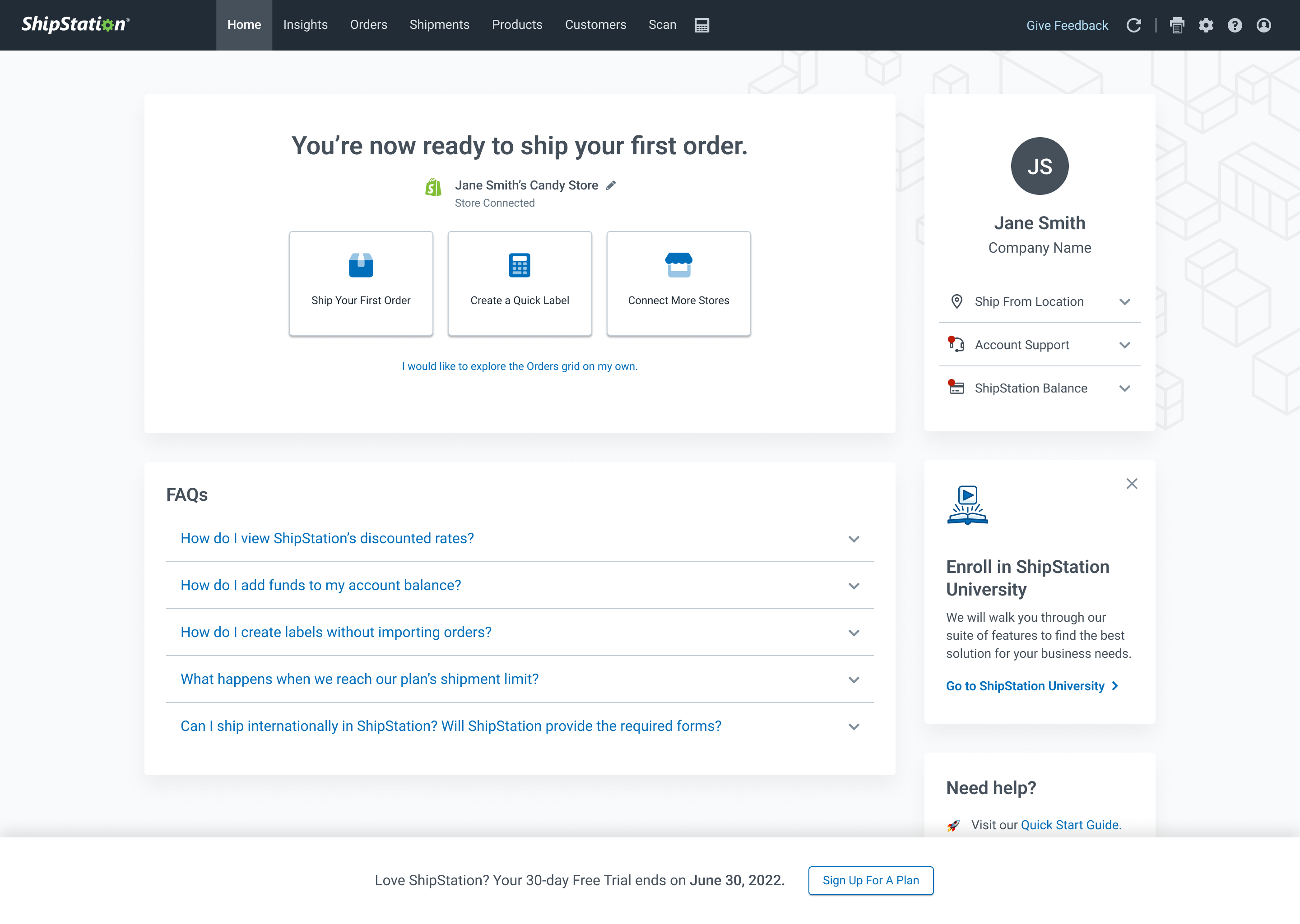
- Iterative Release and Validation: We worked closely with our engineering partners to roll out the new workflow iteratively, first releasing the conversational form workflow to a percentage of new sign-ups and using tools like Google Analytics and Looker to inspect the details of individual sessions to identify areas where people were struggling, making adjustments as needed. The improved initial sign-up form was then added to the marketing site via an A/B testing method, followed by a new in-app landing page and inline coaching messages to aid specific next steps for new users.
Result
The resulting workflow provided a drastic improvement:
- 84.6% increase in sign-up conversions
- 52.5% increase in store connections (crucial to active use and first label purchase)
- 52.2% increase in first-label printing
The improvements were not limited to the app metrics, though. We also introduced an improved process of collaboration and communication between design, product, and cross-functional stakeholders. I was also happy to see my designers' confidence and presentation skills make a dramatic improvement during the project.
Team makeup
Team Lead (me), Product Designer (x2), Product Manager, Engineers, Cross-Functional Stakeholders
Technology
Web-based SaaS platform
Creating an account started with 12 individual fields—9 of which were required (!!)—a hurdle that limited new user sign-ups.
“Yeah, I'm not giving you my phone number. You don't need that to make an account anywhere else!”
- Study Participant
Gallery
Other Projects
ShipStation InsightsData Visualization
Auctane Design LanguageDesign System

Amazon Restaurants order managementUX workflow and research for tablet PoS app
Product Catalog ManagementInnovation and user efficiency
Pixel Health and MonitoringSupport and efficiency
