
ShipStation Insights & Reporting
ShipStation – Product Design Lead
I just want to see the results… jump to the Gallery!
ShipStation, the leading e-commerce shipping and logistics platform, had been iframing an insights analytics section from their old platform. As a rewrite was necessary to move the functionality to the new platform, the product manager approached me about improving the design with a short turnaround. I was asked to keep the general structure of the section, but could make recommendations on how to make the data more useful.
Team makeup
Product Designer, Data Analyst, Software Development Engineers, Quality Assurance Engineer, Product Manager, Technical Writer
Discovering the Problem
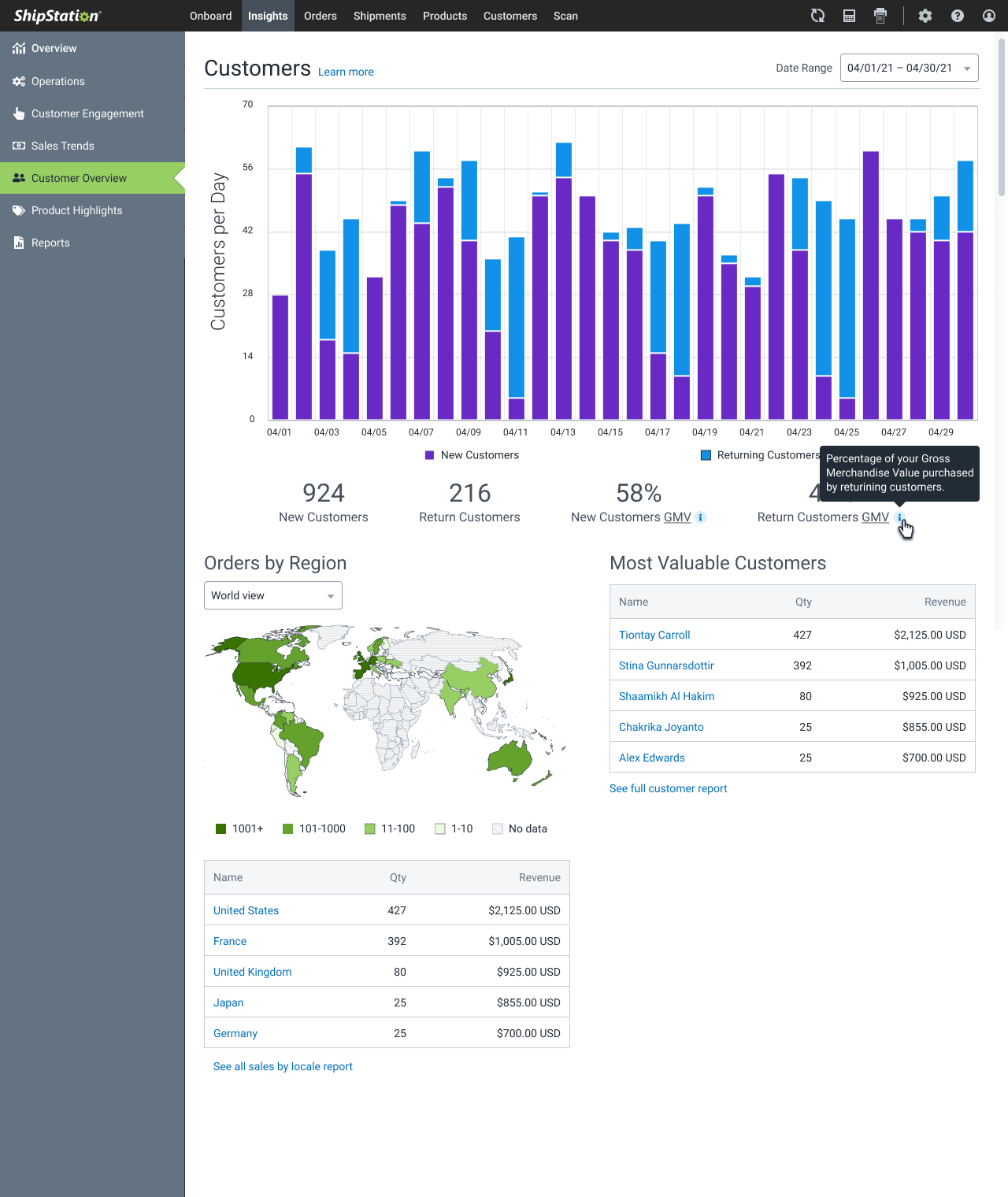
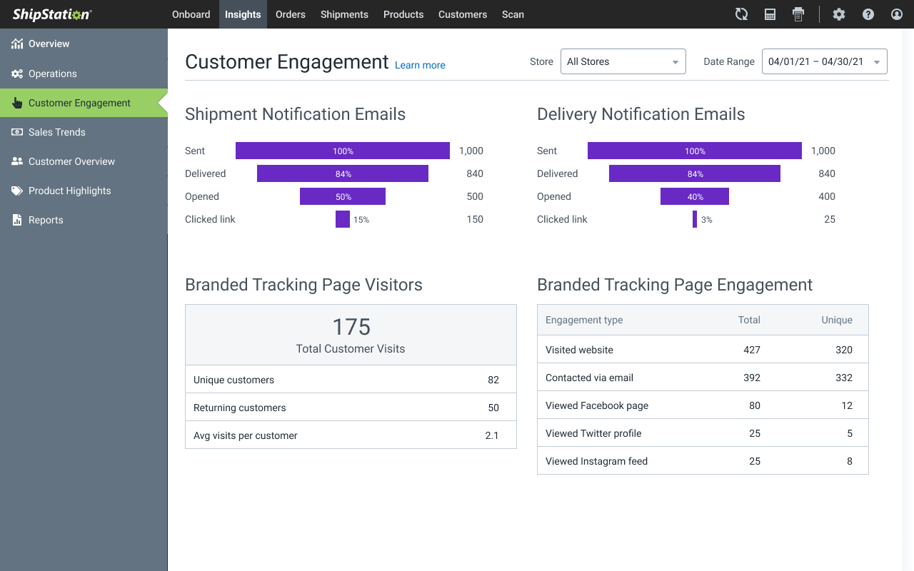
The feature had a history of complaints about confusion over what the information even meant, leading to low usage of each section, other than the user-definable report downloads. Beyond that, many customers complained that they struggled to read labels and metrics that had been color keyed to pie charts, and users with color vision deficiencies (CVD, aka color blindness) struggled to differentiate segments and chart colors.
Dashboard is a loaded word
Almost every SaaS platform has some sort of "dashboard" among their features. As a designer, I've lost count the number of times a business or product partner suggested we "simply need a dashboard." I would then press for specifics to understand what they actually meant. Often times, the response was something similar to "you know… some charts and stuff." Asking what they would like to chart, and what the significance or action associated with the information would be (you know, write a user story about it) sometimes resulted in a positive discovery session; more often than not, the response was "I'll get you some metrics… just start designing it." This is a dangerous path to take, as any form of charting needs purpose, clarity, and intended action or takeway. To design a page full of pretty graphs and charts for someone else to fill with random data generally leads to Chart Junk™ — pretty pictures that are essentially useless to the viewer.
Did you know there are 13 different types of information displays that are commonly referred to as a "Dashboard"?
- Status displays
- Metric introduction displays
- Metric diagnostic displays
- Alert displays
- KPI overview displays
- KPI detail displays
- Disaggregated item displays
- Aggregated item displays
- Item detail displays
- Canned analysis displays
- Persuasion displays
- Explanation displays
- Engagement displays
I am not a data analyst
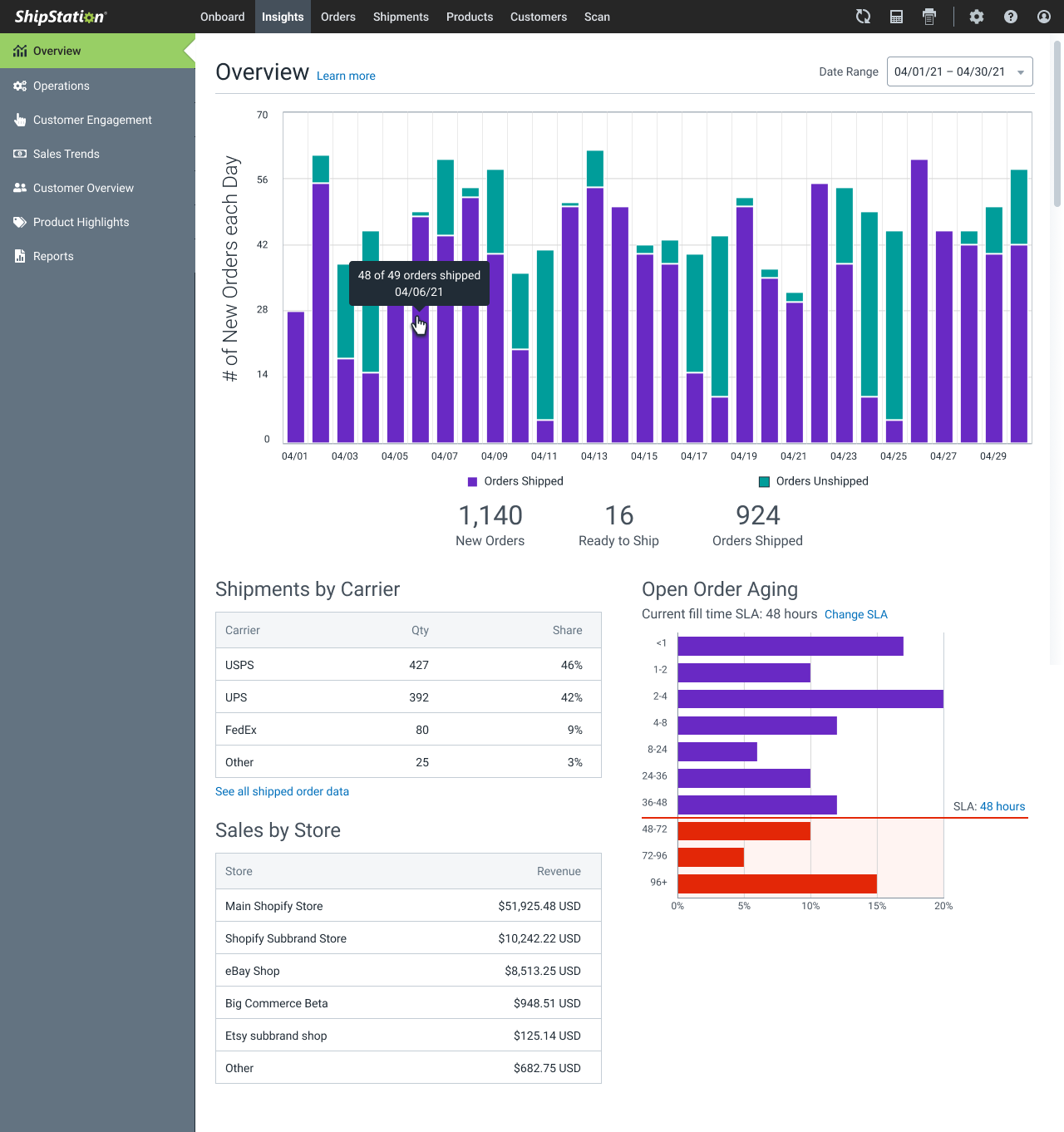
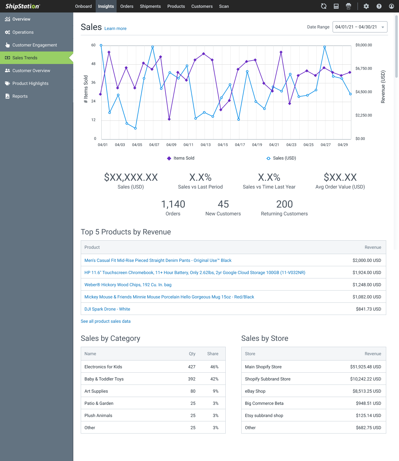
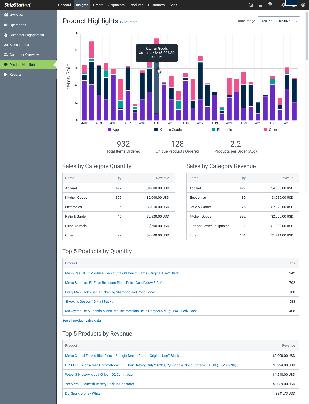
I'd like to think I was decent at math in school, but I'm not a wizard with statistical analysis of metrics. Luckily, I was able to bring the lead analyst into the project for his take on what we were doing wrong with the data, and what metrics and representations might be worth exploring. After a quick nerd session talking about Tufte, we compared the data as shown, highlighting charts that simply made no sense, with specific user feedback. He pointed out better metrics that he knew were being recorded and would provide better insight into the given chart or graph. For instance, in an order throughput chart, we had been comparing new orders and orders marked as shipped. Strangely, this was being shown as a stacked bar chart, creating a confusing indication that the chart was instead about the sum total of new orders and new outbound shipments. We agreed a better chart would be a line chart comparing incoming orders with outgoing shipments, and explored including a cumulative bar chart that would show the day's unshipped orders. Ultimately, the product manager asked if we could instead show how the day's new orders broke into shipped vs not, which is admittedly a simpler chart to parse.
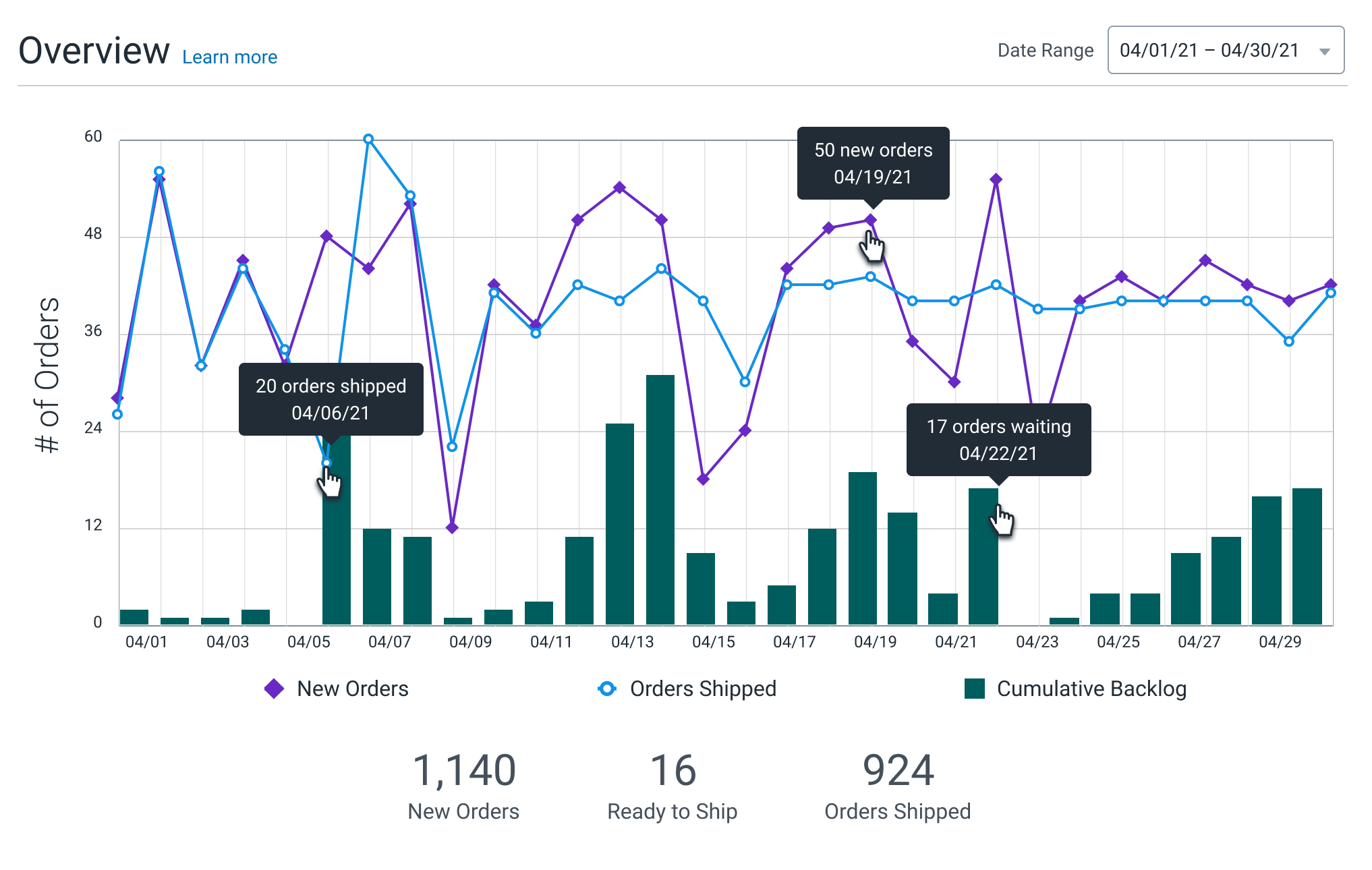
An example of the line chart comparing new orders to orders shipped, with a bar chart showing a rolling backlog of unshipped orders over the defined period of time.
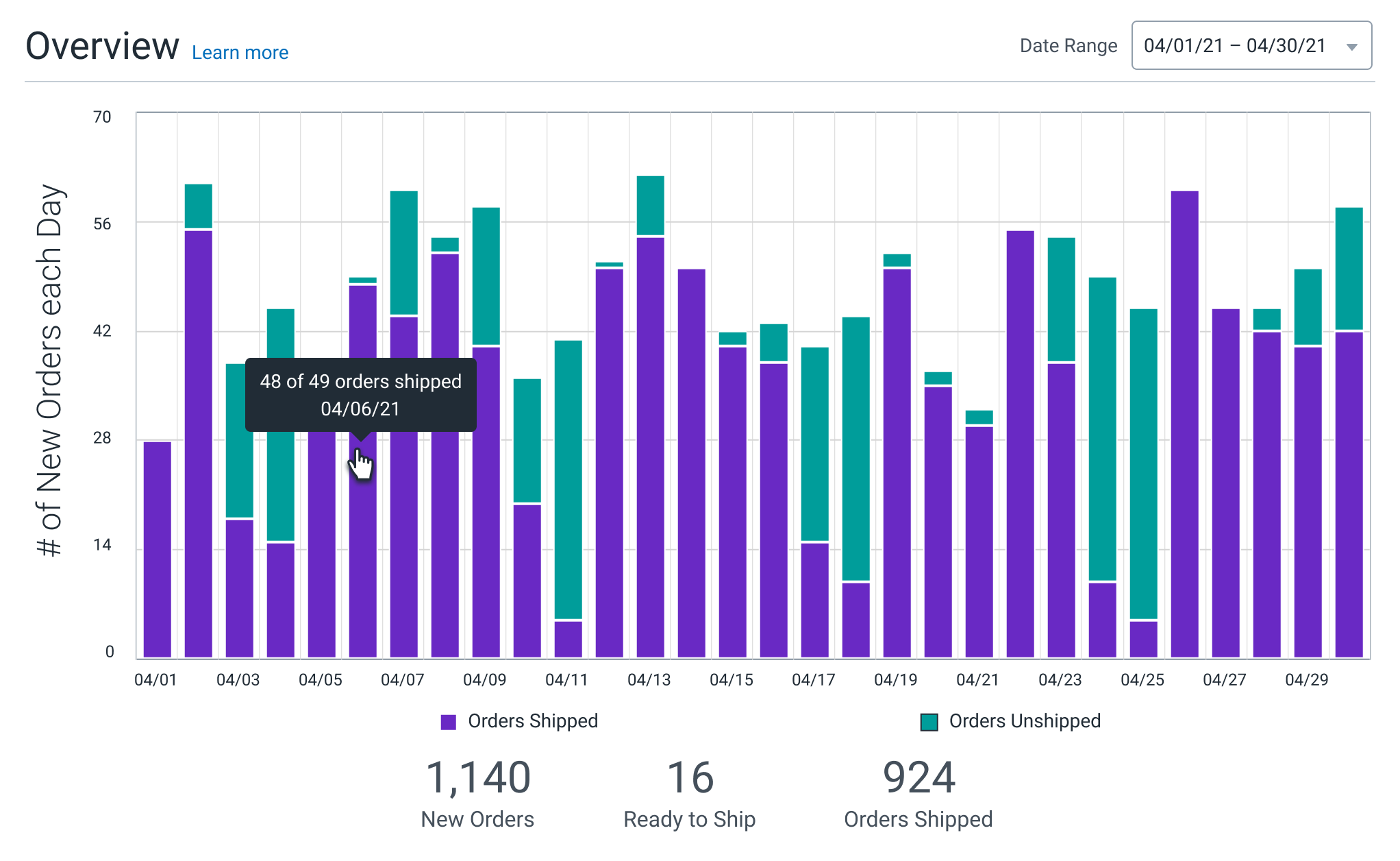
An example of stacked bar chart comparing new orders that were shipped vs those that were not shipped that day, over a period of time
Armed with the insights of an actual data analyst (including a extremely useful heuristic evaluation he and his team had done previously), it was time to tell a story.
A Story is the antithesis of Chart Junk
A key tenet of compelling design is telling a story to engage the user. This doesn't mean your designs become a children's picture book; they instead need to form a cohesive narrative of what's going on, who the main "characters" are, and provide a "moral of the story" to engage and dive action. Sometimes (as with set up and complex form workflows) this solution is very guided experience, but with data viz, it's supported by the previously mentioned needs of Purpose, Clarity, and Action/Takeaway. This can be applied across a whole app section, page, and even a single chart. The user is engaged by knowing what the data is, why it matters, and what to do about it. An unfortunate amount of our charts were failing at explaining why the data matters, often coupled with uncertainty as to what the data even was. More troubling, there were no actions or direct insights coupled with these charts.
The user is engaged by knowing what the data is,
why it matters,
and what to do about it.
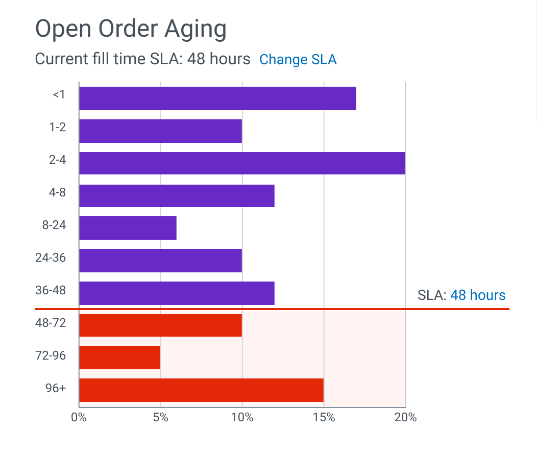
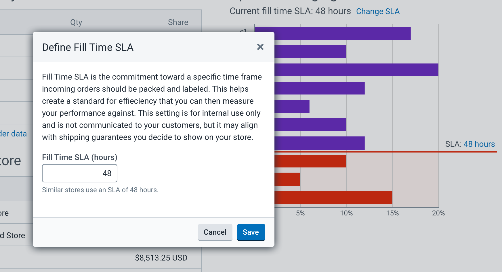
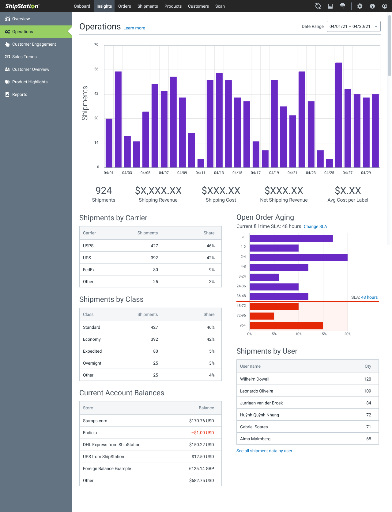
I found it helpful to focus on the core storyline of efficient throughput in packing and shipping the orders. This way, each piece of data presented would be tied back to the overarching theme. An existing chart showed a histogram of the average "Age" of an open order, i.e., the time an order takes from being placed to being packed and labeled for shipment. The sections of the histogram unfortunately maxed out at 24 hours. While a same day turnaround is an admirable goal for a shipping department, most customers worked on a 3-4 day turnaround, with specialty companies sometimes taking up to a month for an average order. They would see this chart and see a single line: 100% of orders aged at >24 hours. Not only did this chart need to reflect the realistic timeframe of the process, it needed an affordance to show where the company's expected turnaround would sit. For example, based on the average user, we knew we needed to expand the age ranges to a wider 96 hour period, and this user should be able to indicate that they expect most orders to be ready in less than 24 hours. A histogram with age ranges split between <1 hour and that >72 hour extreme would easily show the amount of orders in each age grouping, and using the user-defined expected turnaround, we could show how many orders were missing that expectation (and generally by how much). The user would now know that most of their orders shipped at around 12-18 hours, but there was a notable portion that sat 48-72 hours. They now knew how often they were missing the expectation, and also the rough counts/percentages of the outliers, which they could take to other charts (or data from other systems) to sort out what was causing the inefficiencies. In this example, the user found most of these 48-72 hour ages came from orders placed after the warehouse closed on Friday night and before start of work on Monday morning. They could now update messaging on their store site for customers to expect orders to ship in 24 hours, except on weekends (as they were closed).
Is the data accessible?
Access in data visualization is a complex subject, and could fill a book. When most designers hear accessibility, they default to color contrast, sometimes in a rudimentary way that only checks for contrast ratios of a foreground color to the page's (usually white) background. Keen designers will realize that they need to assure proper contrast between the colors used in the chart categories as well, likely getting overwhelmed by the complexity of doing so with more than 2-3 colors. Not to mention the considerations that need to be made for users with CVD, users that will likely be printing a visualization on a monochrome laser printer, or even users who will be showing that chart internally in a presentation—raise your hand if you've ever heard someone complain about the awful colors of the TVs/projectors used in corporate meeting spaces.
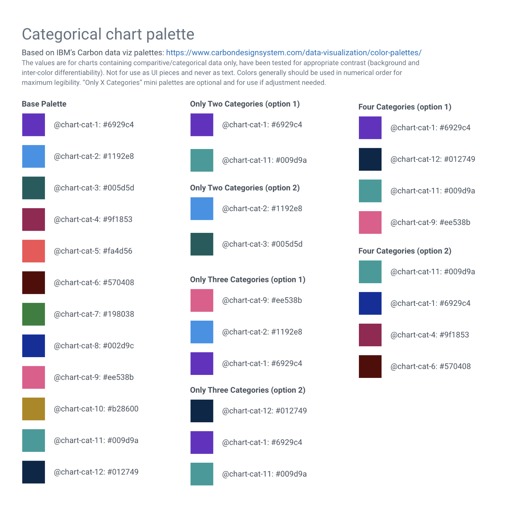
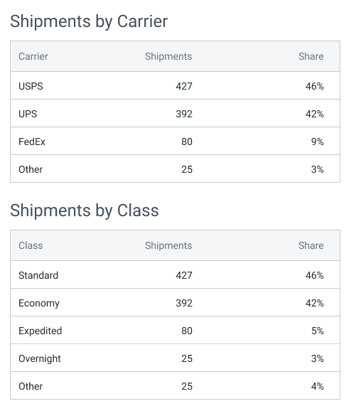
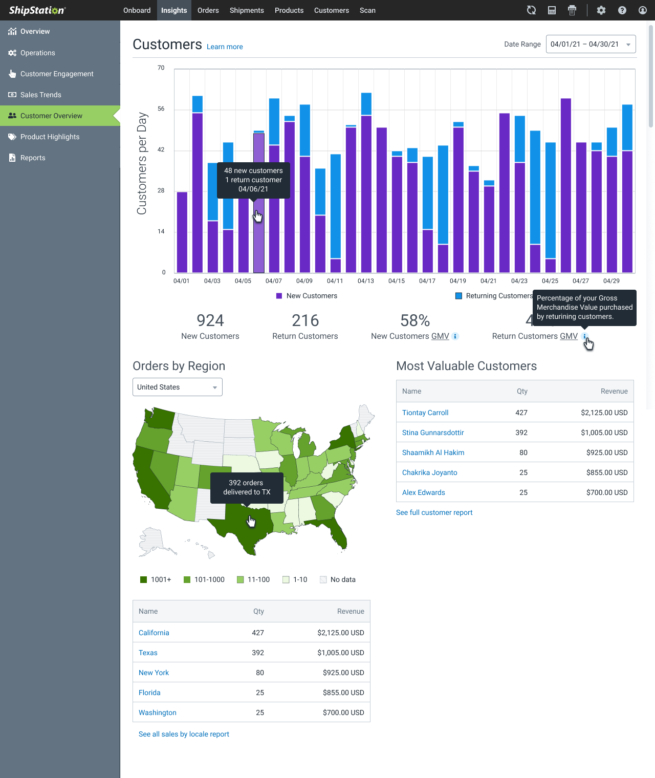
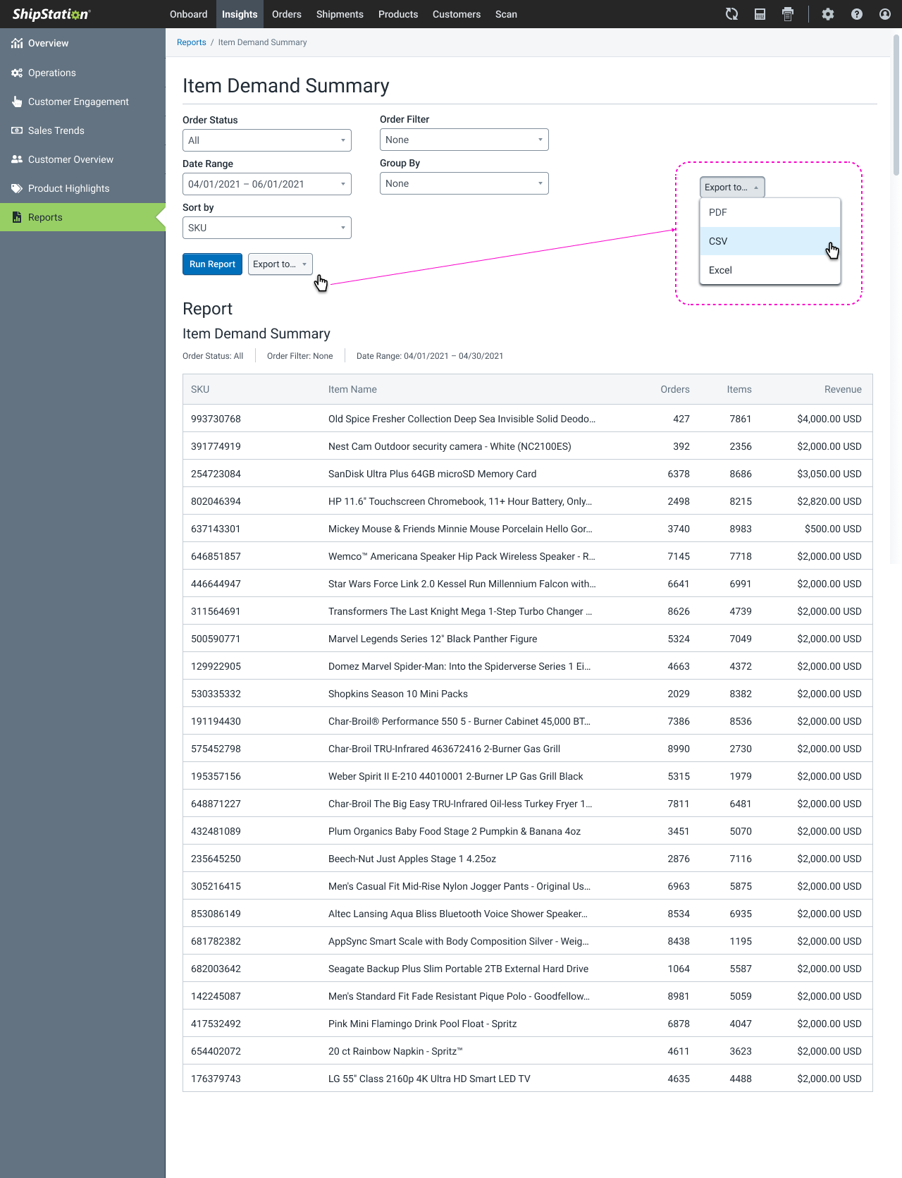
Accessibility and color are two of my passions, but given the tight timeline, I decided to use a preexisting data viz color palette from IBM's Carbon design system. I also incorporated non-color differentiation in chart examples, such as different line weights, patterns, and data node indication glyphs (circles, squares, triangles, etc). But more crucially, I recognized that the access to this data was less about the details of the chart visuals, and more in asking if something should be visualized at all. Many of the charts and metrics that were problematic became simple to consume when presented as a basic data table. Why decypher which blue in the donut chart is which category, and hover over it to see the numbers, when you can show that data in a simple table display?
One of the challenges of this approach is getting over our egos as designers, and managing the expectations of stakeholders. It is common for young designers to want to wow stakeholders with pretty visuals, especially when it comes to data visualization. Even if the designer knows better, some stakeholders expect pretty charts, and don't look any deeper at the detail of the data presented. I make it a point to tell stakeholders about the data, and the intended actions (as mentioned before) both during discovery and design review, to help them see why certain decisions were made. We all love something aesthetically pleasing, but only if it does the job we need it to do.
Gallery
The Takeaways - Even expert processes fail
After this design was delivered with all parties satisfied, the engineering estimates proved to be wildly off target, and unexpected technical hurdles caused an unfortunate amount of descoping. I can't control the engineering process, but in retrospect I would have preferred to incorporate the same engineers implementing the feature into the planning and design iteration process, rather than just their manager. This could have uncovered many of the technical blockers and requests for clarification or redesign/descope. Ideally, this project would have started with the fundemental questions around what our customers expected from these reporting functions, rather than just if we were showing the current data in a consumable way. Entire pages of the section could have been omitted, where we showed sales and product data that was redundant of reporting functionality provided by software they used more specifically for those functions, such as their ecommerce platform.
I could have challenged the timeline better than I did. I'm used to the false urgency of arbitrary, often spitballed deadlines. I'll work with stakeholders to understand what is driving the short timeline, what compromises can be made to open up time or bandwidth, and ensure the time compression isn't entirely warrantless. Often, the time crunch is resolved with strategies such as phased rollouts, agile technical "pre-work" being done during design iteration—Not to be mistaken with during design discovery, as such work usually impacts technical assumptions—, scope reduction, and utilization of existing solutions. While I had the discussions to learn the urgency, and used existing solutions as often as possible, I failed to realize the large amount of wiggle room that the engineering team was given with the project. Had we worked more tightly coupled, my timeline and the resultant product could both have improved.
With that said, the core goal of a better, more accessible solution excised from the old platform were met, and customer engagement and CSAT scores with the section saw respective jumps.
Other Projects
Auctane Design LanguageDesign System

Heuristic Evaluations People NoticeUX Research
Product Catalog ManagementInnovation and user efficiency
Pixel Health and MonitoringSupport and efficiency