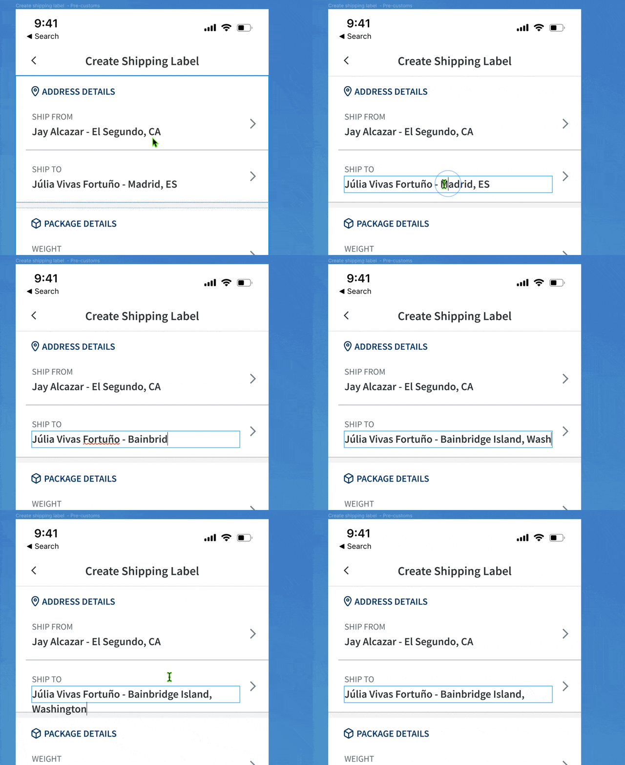
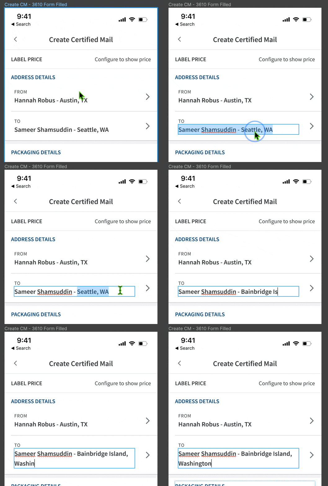
Mail with the Stamps.com Mobile App
Stamps.com – Lead Product Designer
I just want to see it… skip to the video walkthroughs!
Without a dedicated product designer for several years, Stamps.com had soft-launched a mobile app with the help of an agency. Unfortunately, work was halted and it sat in stasis without the feature that makes Stamps.com unique: printable US postage. Customer reviews were outspokenly negative about the missing mailing functionality and feature parity, and its rating on the app stores suffered. I was tasked with designing this functionality for configuring, purchasing, and printing Envelopes, NetStamps, and Certified Mail. I worked closely with a small engineering team to plan the design and development work in phases, starting with envelopes before moving on to NetStamps and certified mail.
Team makeup
Lead Product Designer, Software Development Engineer, Quality Assurance Engineer, Product Manager, Technical Writer, Marketing Manager
Technical specifics
App for iOS, iPadOS, Android. Hardware interactions.
Challenges
One of the main challenges was navigating the complexities of printing official USPS postage, as any errors could result in user frustration and even financial consequences. Printers behave inconsistently, leading to wasted envelopes and expensive mistakes when using specialty NetStamp paper and labels. Even a fancy AirPrint-capable color laser printer—like the one I was using—could change scale, have missing functionality when printing from mobile, or consistently jam when printing envelopes.
Additionally, the existing design system and components provided by an agency were fragile, outdated, and required reworking. I rebuilt the components to be robust, allowing them to scale, surface configuration options I built into them, and generally be a breeze to work with.
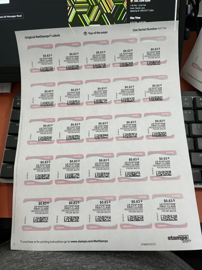
An entire sheet of NetStamps wasted due to a scaling issue with a printer.
Inspiration and Approach
Much of the workflow would utilize existing patterns used by the shipping label workflow, helping to reduce scope when possible, though each mailing type had unique challenges and requirements. Users—including myself—were routinely messing up envelope prints, but our web UI gave no real guidance, and our initial prompting for a test print was being lost in the high information density of the review before purchase. Queue the info-mercial quote… "There has to be a better way!"
Inspired by the wizard workflow in the Stamps Windows app, I proposed adding a test print step before the final purchase step to minimize errors and ensure user satisfaction. While adding steps to a workflow is often seen as counterintuitive—more clicks, more steps, more to do == bad, the mental model goes—focusing instead on the users' satisfaction and limiting customer support needs, rather than time to completion, leads to a better overall experience. By adding a test print step and refining the user flow, we were able to streamline the printing process and reduce errors.
I continuously improved the shared workflow for each type based on user feedback in each development phase, which helped improve the overall user experience and saved design time.
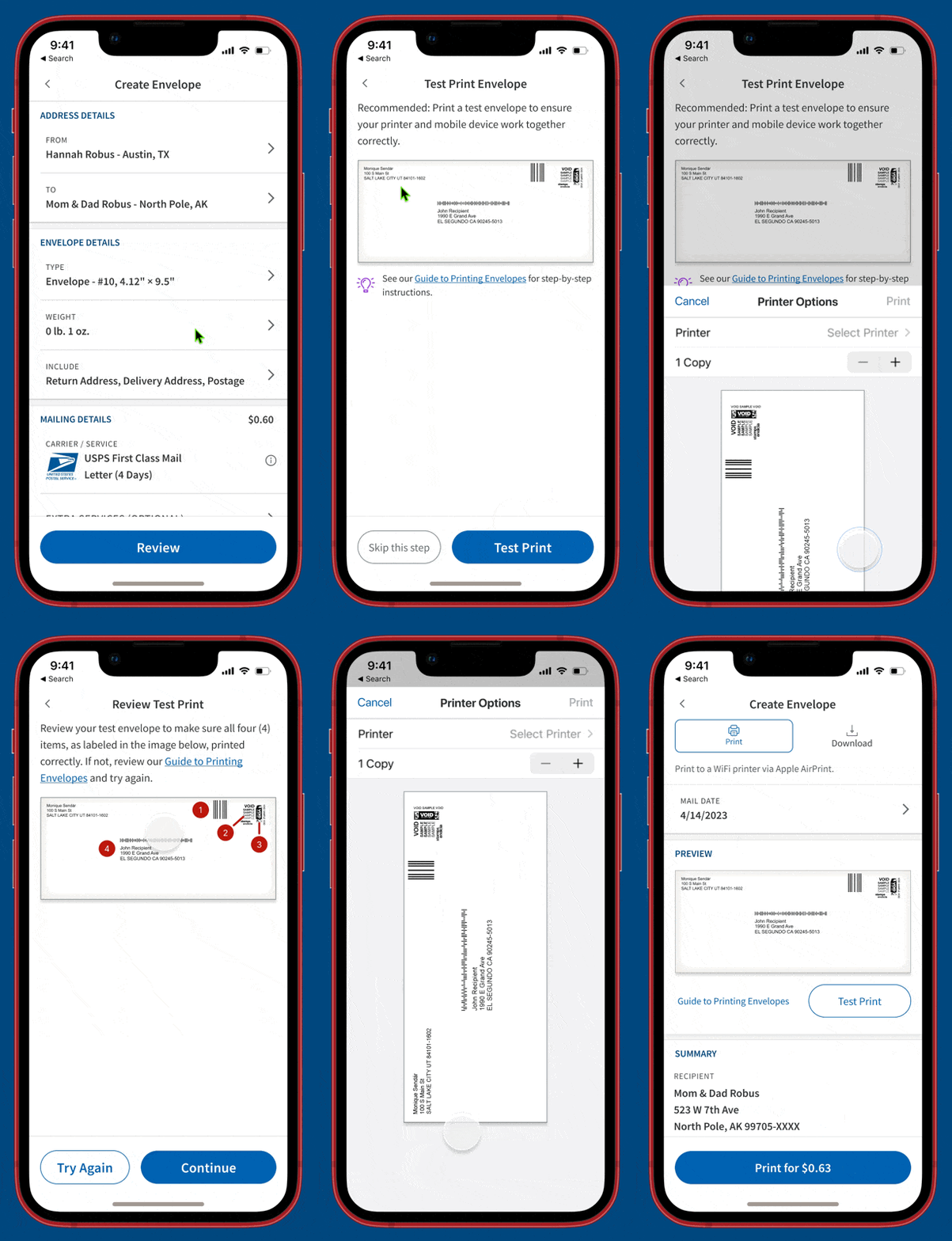
Video Walkthroughs
Creating an envelope
Creating NetStamps
Creating Certified Mail
Results
The phased rollout, along with added features like contact management, resulted in a shift from largely negative reviews to a wish list of desired features. The overall rating on the Apple app store increased to 4.1 out of 5 stars, with users praising the improved functionality of the app. Negative reviews now primarily focus on the company's billing policies rather than the app itself.
Overall, the project successfully addressed the initial limitations of the app and improved the user experience, leading to higher user satisfaction and positive reviews. It also queued up an improved iterative design and development process.
Other Projects
Auctane Design LanguageDesign System

ShipStation InsightsData Visualization

Heuristic Evaluations People NoticeUX Research
Product Catalog ManagementInnovation and user efficiency
Pixel Health and MonitoringSupport and efficiency
