
Amazon Local Merchant Support
As a UX designer and project co-lead, I moved our merchant support process from a ubiquitous phone number with enormous call lengths, to a merchant-empowering workflow that eliminated the need for most calls, and cut other average call times by as much as 45 minutes.
Background
Our head of merchant support approached me and my content strategy partner about a problem her team was facing. They were being inundated with calls, often for issues that could be handled by automated systems already in place or through an entry in the help section of the merchant portal. What's worse, each call came in cold, meaning the specialist would have to run through a standard dialogue to discover the merchant's problem before they could begin to try to fix it, or write a bug ticket. Merchants routinely called the 800 number — perched proudly at the top of each portal page — to reset their password, which could, ideally be done online. Call lengths varied wildly, but rarely lasted less than 5-10 minutes. Some topics took over an hour to walk-through, which is why there was extensive documentation in Help. "We've got to get these calls down… I don't have budget to hire more people, and they're burning out."

Turning the easy action into the easier solution
Displaying our support phone number on every page seemed like a good idea when Amazon Local started. Our merchant tools were basic, and we didn't even have a help section in the portal. The VP was adamant about it: we're being easy… transparent! It did, however, do exactly what the larger Amazon.com retail site avoided at all costs: make calling support much easier than easily finding the solution yourself.
“Can we just get rid of the phone number on the pages, and add a call button to the help section?”
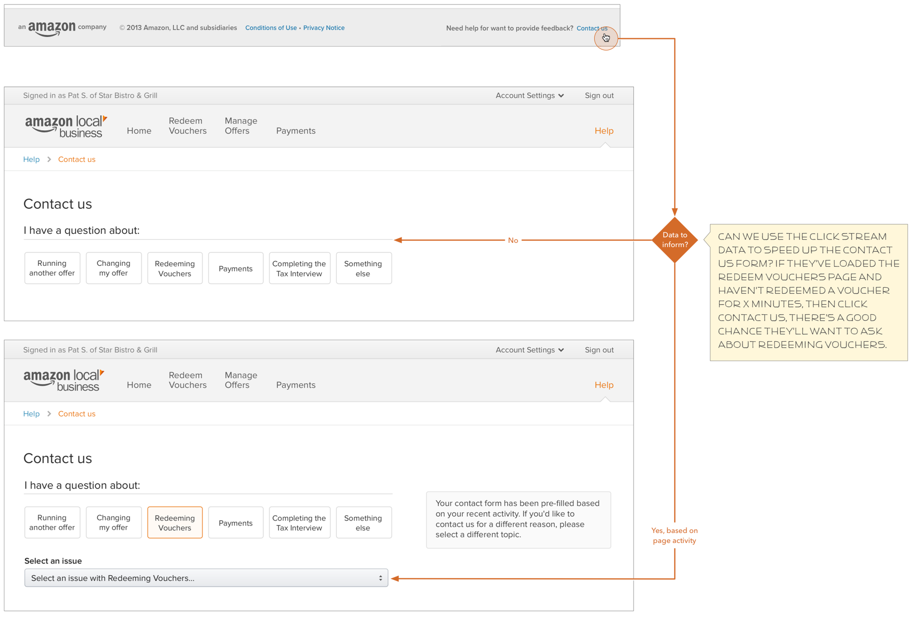
The concept seemed better: the merchant would have to at least go to the help section, and might check out a help topic before hitting a button to call. But nothing guaranteed that. And what would happen when you chose the call button? "Dot com has a system to type in your phone number, and then we call you. Maybe we can use that?" the merchant support manager offered. "It can even send the click trail of the pages the merchant clicked before asking for a call, so the call isn't entirely cold."
We sketched some ideas, but our content strategist wasn't happy. How were we going to get them to actually check for a non-phone call solution, e.g., the help documentation she managed? I was getting annoyed with the idea of trying to fit a phone form into each page when it hit me: this is a bigger system and needs to be treated as such.
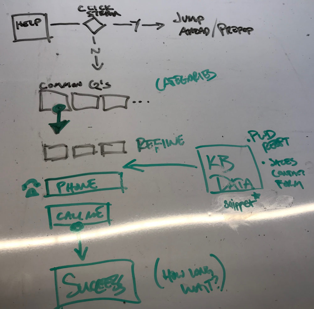
“I hate phone trees”
After we took the tool to a dedicated screen, I started toying with ideas for weeding out unnecessary calls. What if we asked them questions about what they need help with? "I like the idea, but I hate phone trees… so hard to tell where you are, and dumping someone in a recording that says 'Go back to the site' is pretty rude," came back quickly. But what if that tree of questions happened in on the site… in this phone form?
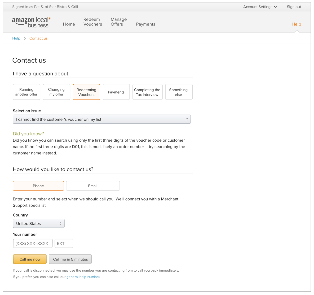
We worked through the most common support questions, based on the support team's metrics. There were just too many… we needed to get the options closer to 7 (plus or minus 2) to avoid confusion. We created top level categories, and started diagramming out the paths of questions to each common topic, with an "I don't know" skip-ahead option. Not every question is known and easily articulated. At each common support trail-end, we decided to display a "Did you know?" snippet, leading to the support documentation that would allow the merchant to solve their own problems, and in the cases such as changing a password, we would surface the password reset tool.
We knew that this information wouldn't always solve the problem: new angles and questions in each category were bound to happen, and even the automated tools like password reset were bound to break. We ensured that no matter what path, the user could always skip ahead and request a call. This way, even if our documentation and tools couldn't answer the question, the support specialist on the phone would have the click trail and the topic from the decision tree to help them prepare for the call.
We were sure this would cut down time in calls, and if we were lucky, might cut down the number of calls. When the system was implemented, we were (confidently) amazed: call volume dropped to a fraction of previous numbers, and call times became much more manageable.
"I love this… I don't have to waste time figuring out why they called, and I always feel ready," one support specialist told me. The support manager later told me that the topic that routinely took an hour was now handled in about 15-20 minutes, due to the way the system prepped the specialist and gave the merchant preliminary steps to prepare for the call.
"I don't know how we did this before the system."
Other Projects
Auctane Design LanguageDesign System
ShipStation InsightsData Visualization

Heuristic Evaluations People NoticeUX Research
Product Catalog ManagementInnovation and user efficiency
Pixel Health and MonitoringSupport and efficiency

Amazon Restaurants order managementUX workflow and research for tablet PoS app

Aperture Design SystemDesign System
In-Page Review SubmissionConsumer-Generated Content Workflow
Bazaarvoice DesignOpsDesign operations lead for design tools and systems
Bazaarvoice Portal SSOEnterprise workflow design and research