
Aperture Design System
As a UX designer, design operations and design systems lead, I pulled together our fledgling design language and an existing component library into a consistent, documented Design System, with core principles, design tokens, and component definitions.
The problem
One of the goals of the Bazaarvoice Portal project was to provide a consistent experience for all Bazaarvoice client tools. Given the scattered nature of the existing tools and platforms, we needed to provide a single design source of truth for the reworked versions of tools that would be moving in to the Portal platform.
Leadership at the time was unconvinced of the ROI of a shared design system, and time and effort allotted for design of the core components was truncated. To compound things further, engineering leadership formed a tiger team to build out the components entirely in parallel with the design efforts; unfortunately, communication was limited and the team worked off of an incomplete and outdated version of the UX team's working file.
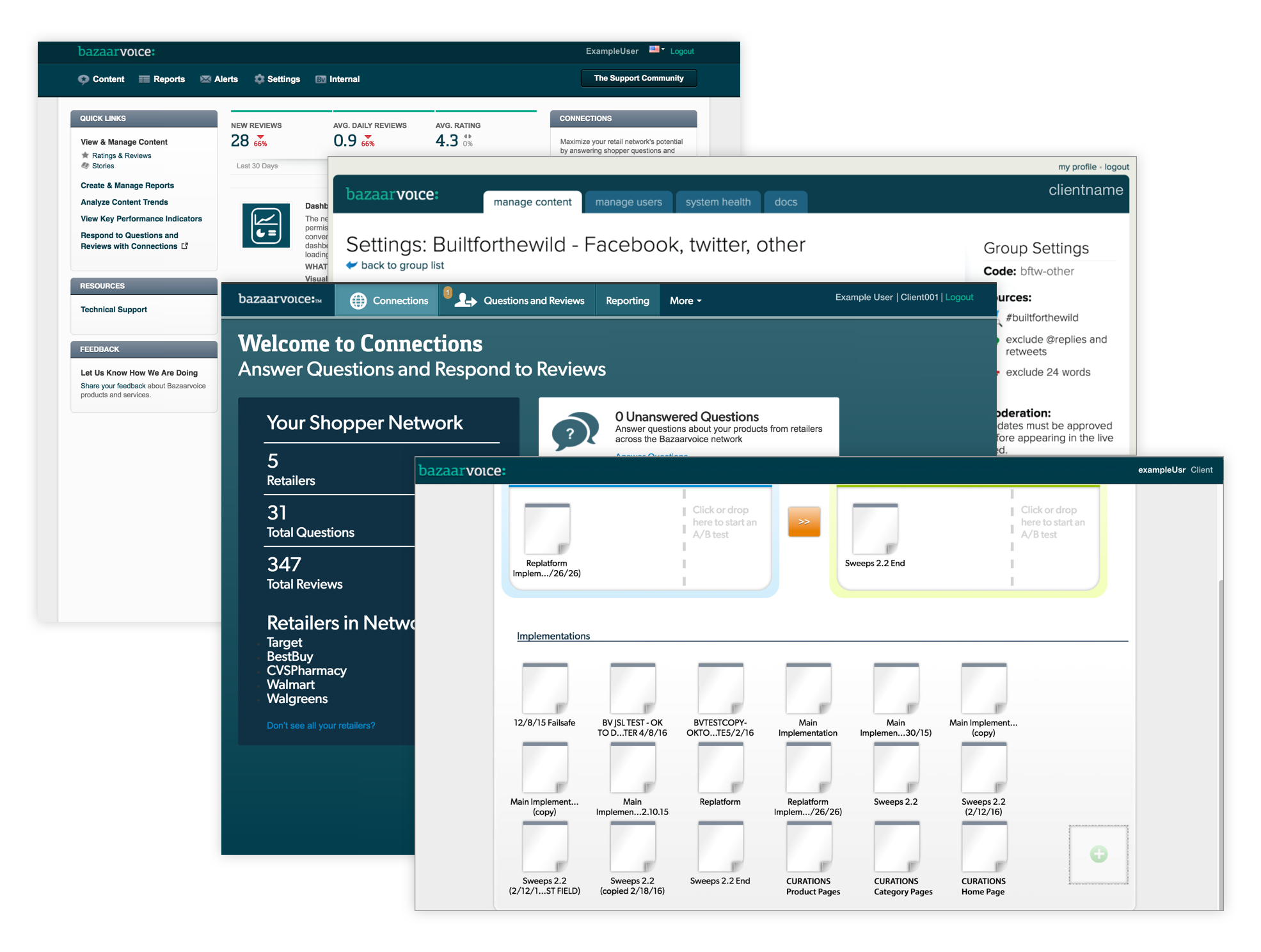
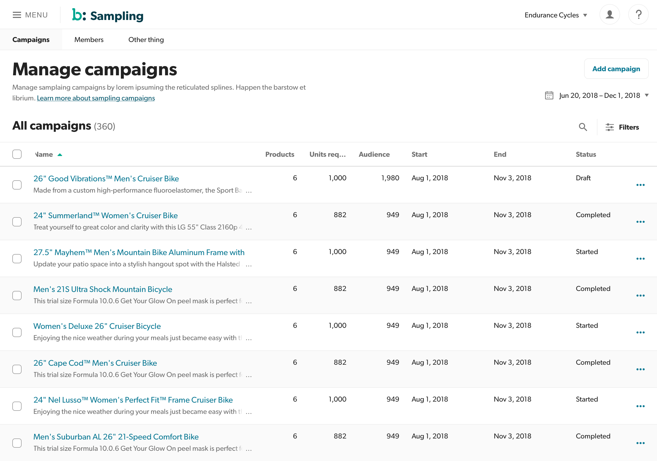
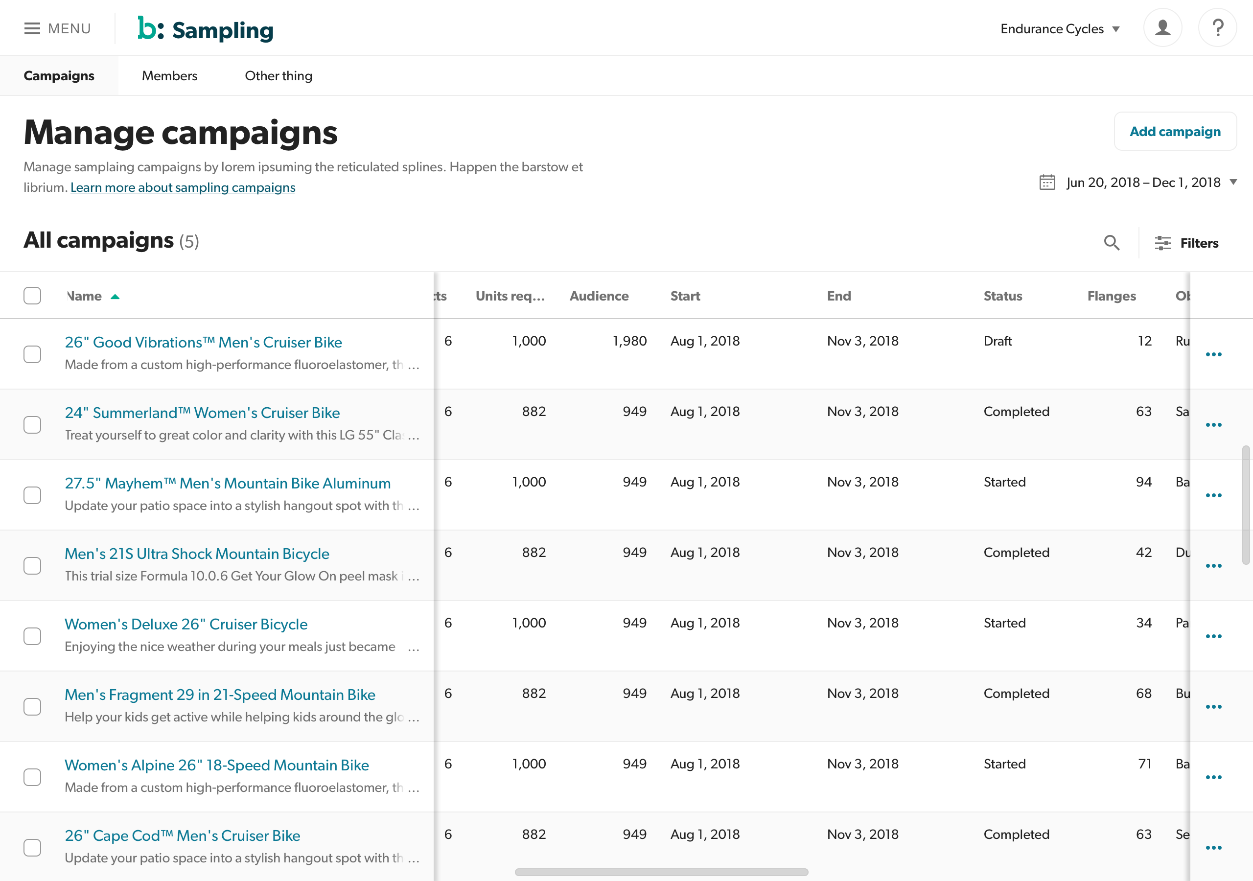
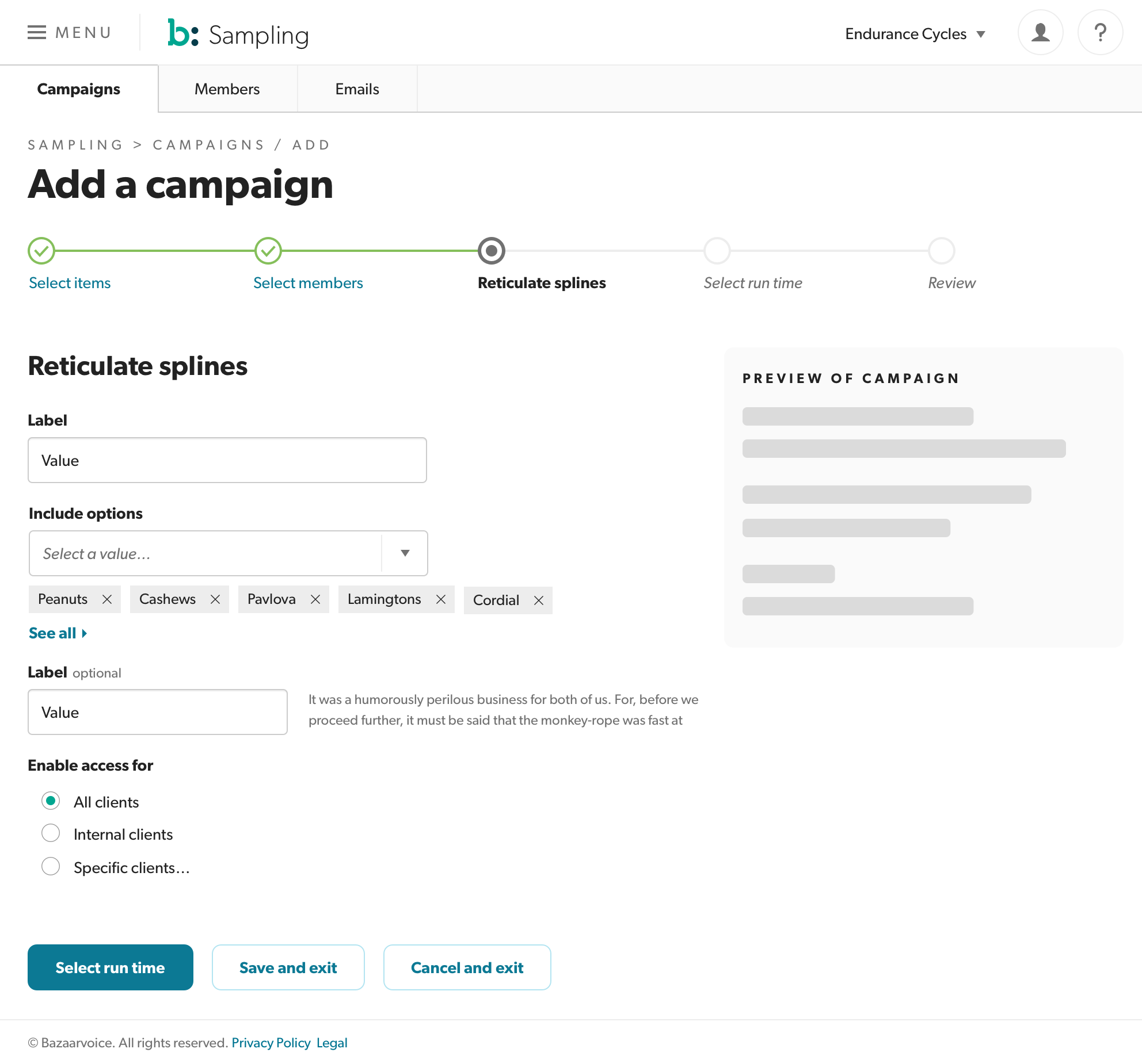
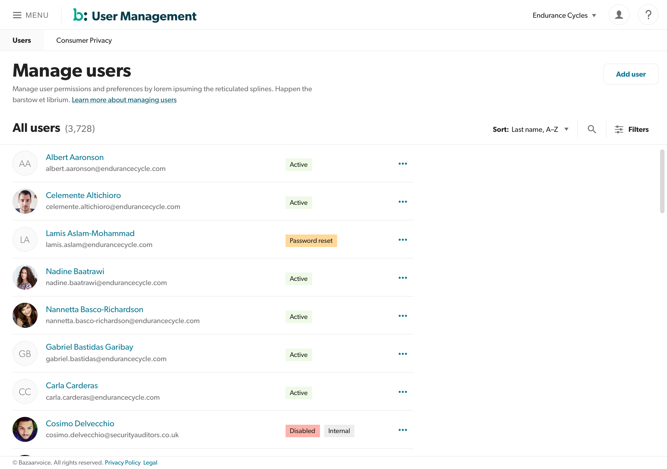
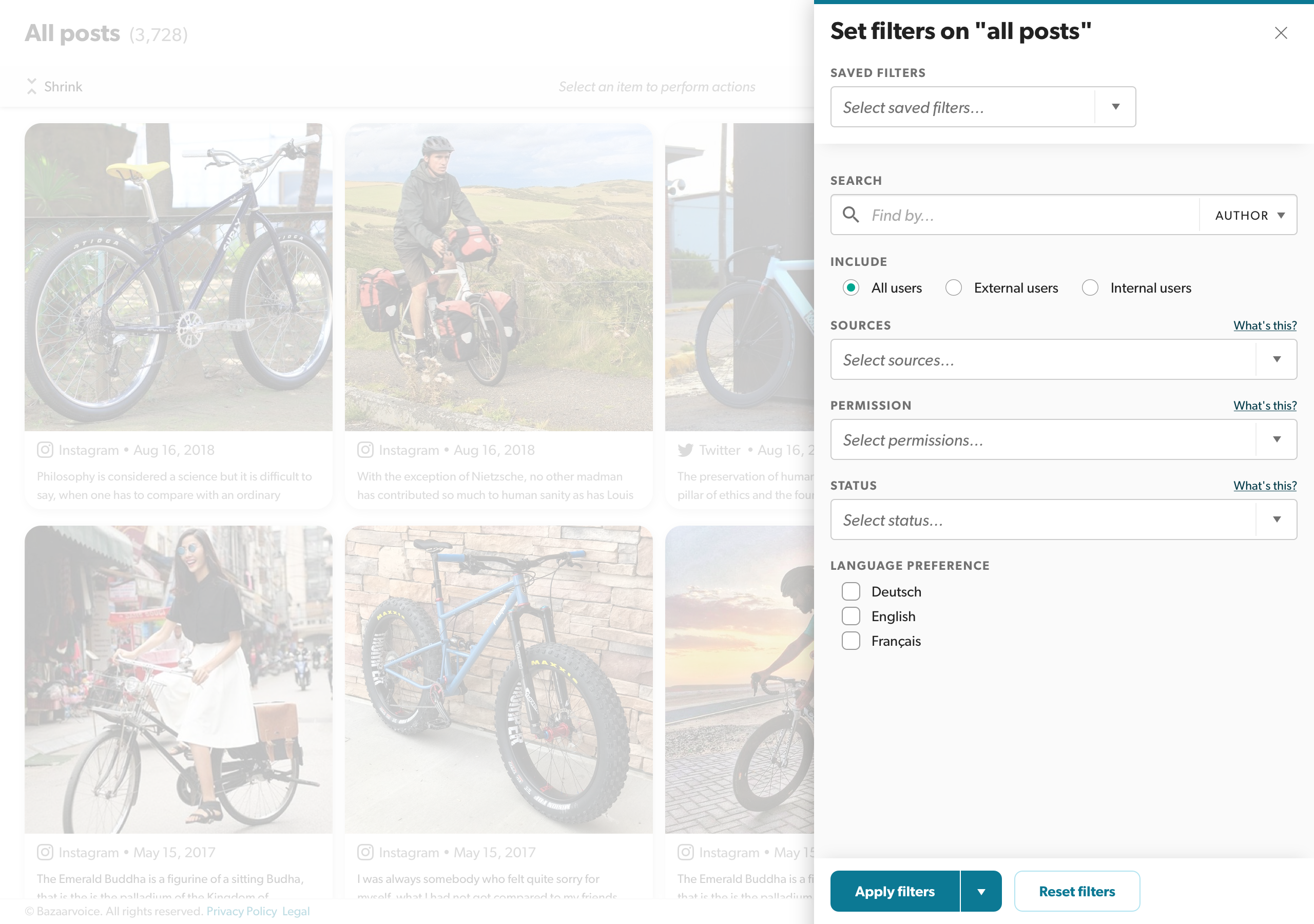
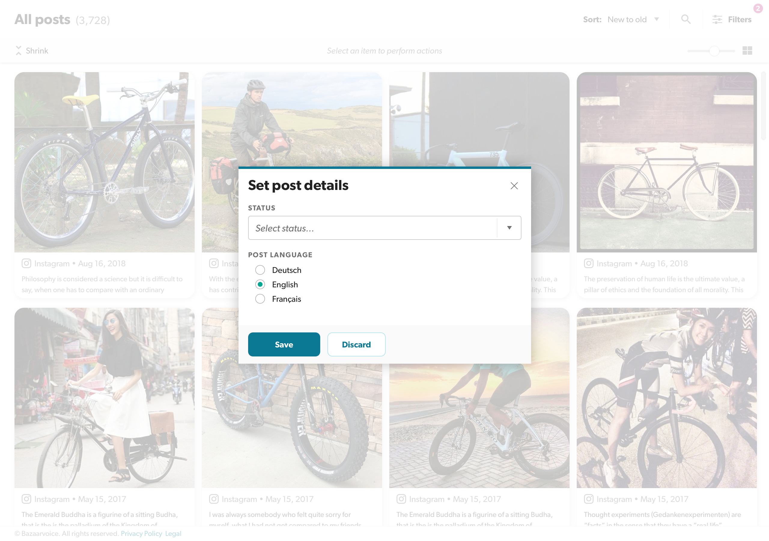
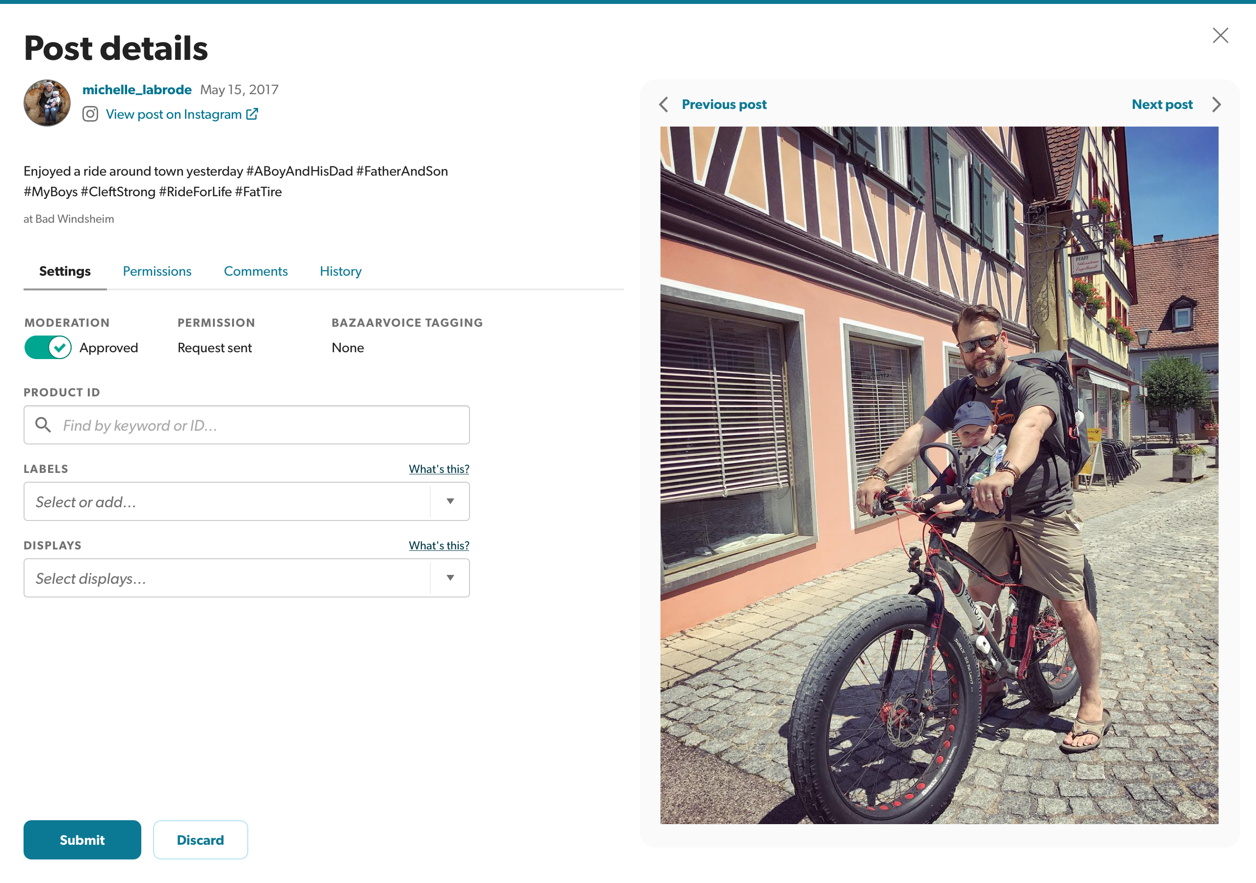
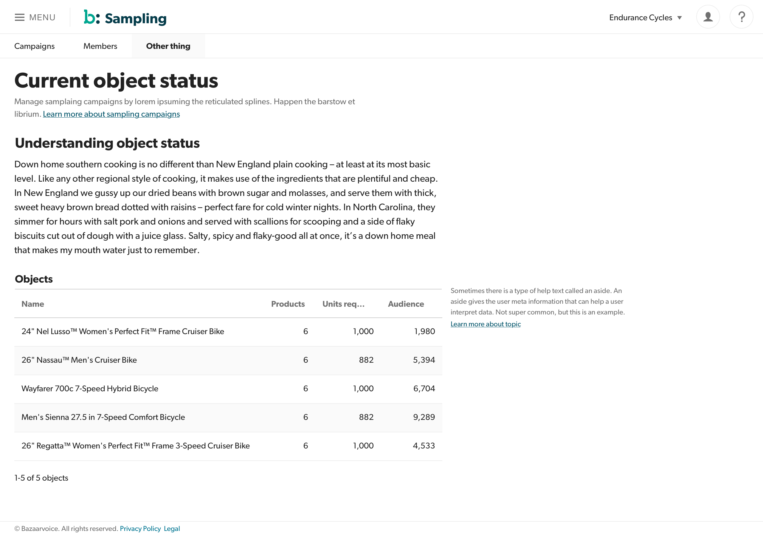
The result was a component library, released and subsequently managed by the Portal engineering team, who had no front-end or full-stack engineers. The tiger team disbanded and went back to their respective product teams. As time progressed, designers took their own license on patterns and design tokens (spacing, color, typography, etc), and their engineering counterparts built new components, often fragile and overly-complex, and added them to the component library, now called Aperture. The result was a mess of conflicting styles and duplicate, often broken, components. There were 5 different table components! It was madness, and it was making our new "unified" experience feel even worse than our previous disparate, but reasonably solid, solutions.
There was no consistent design language in BV's products.
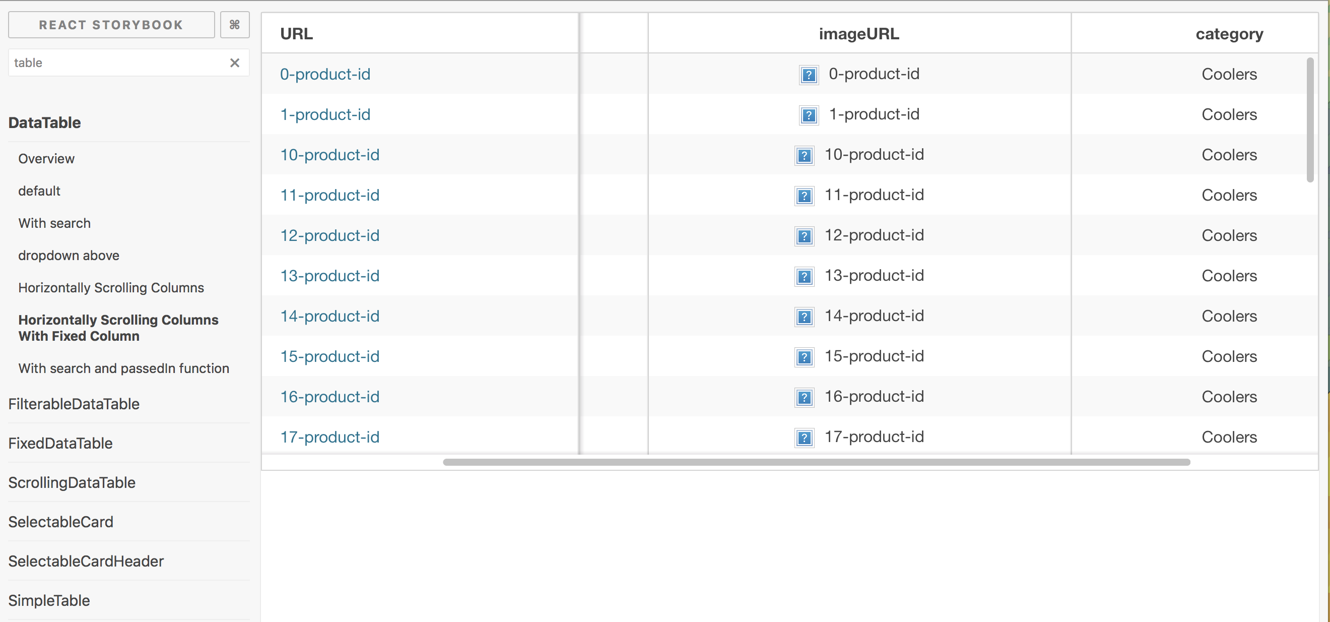
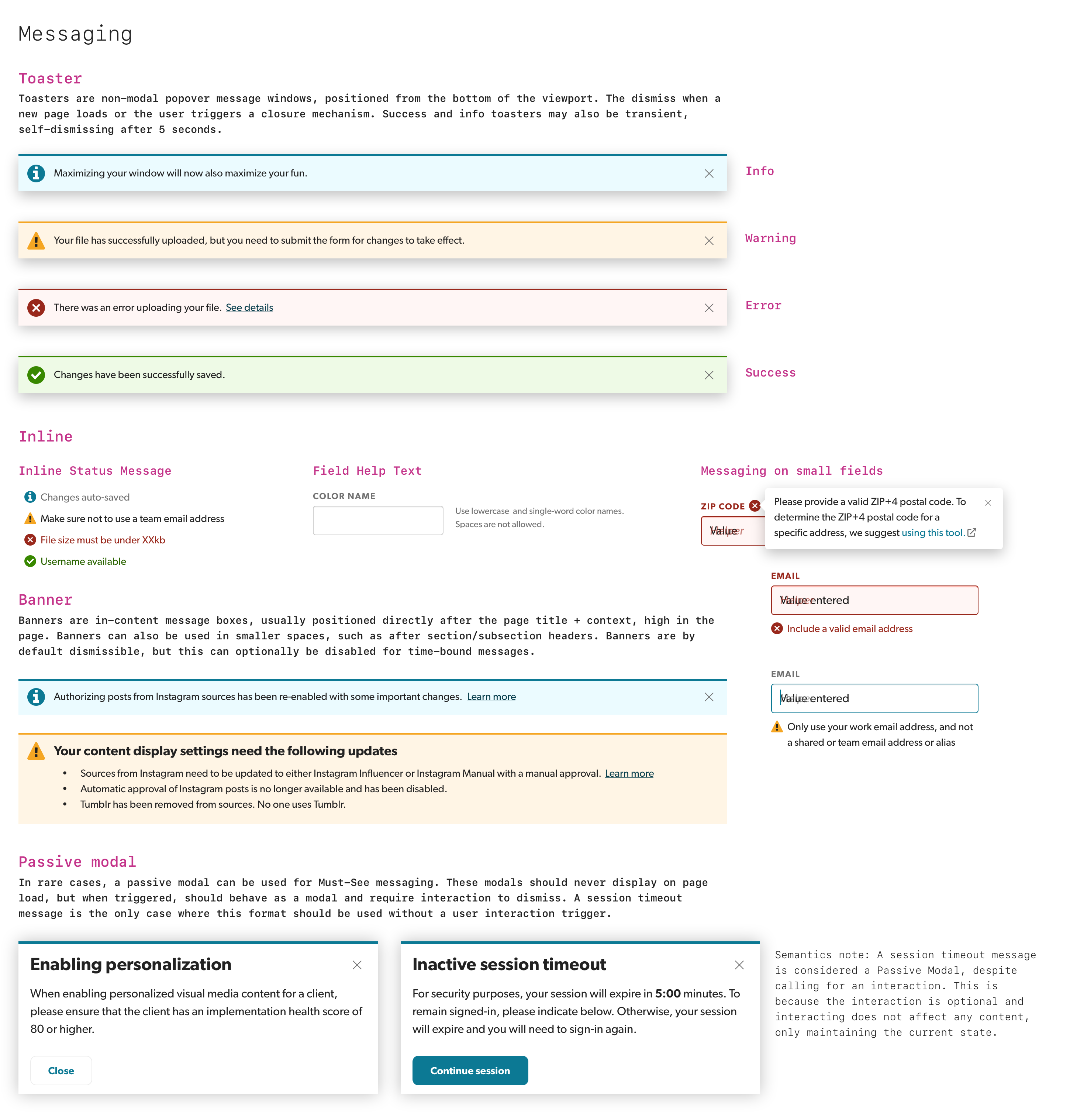
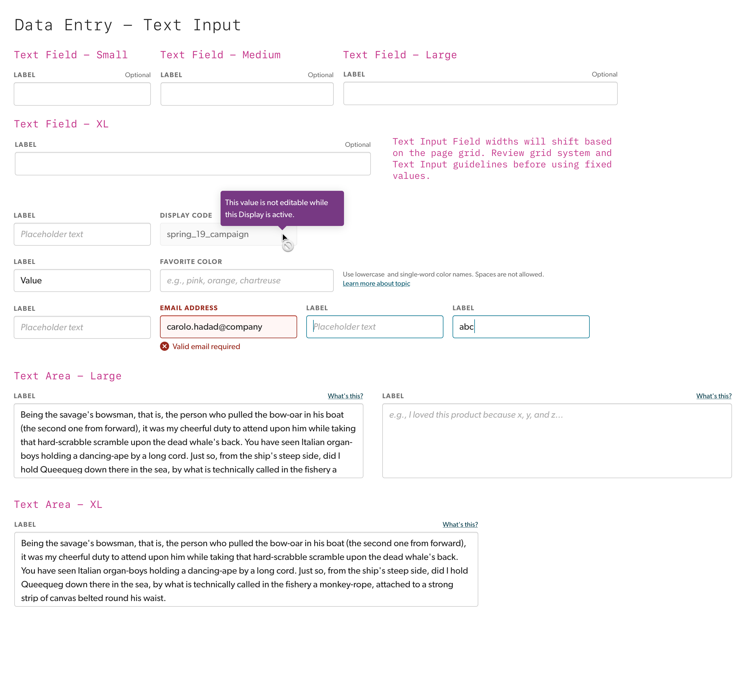
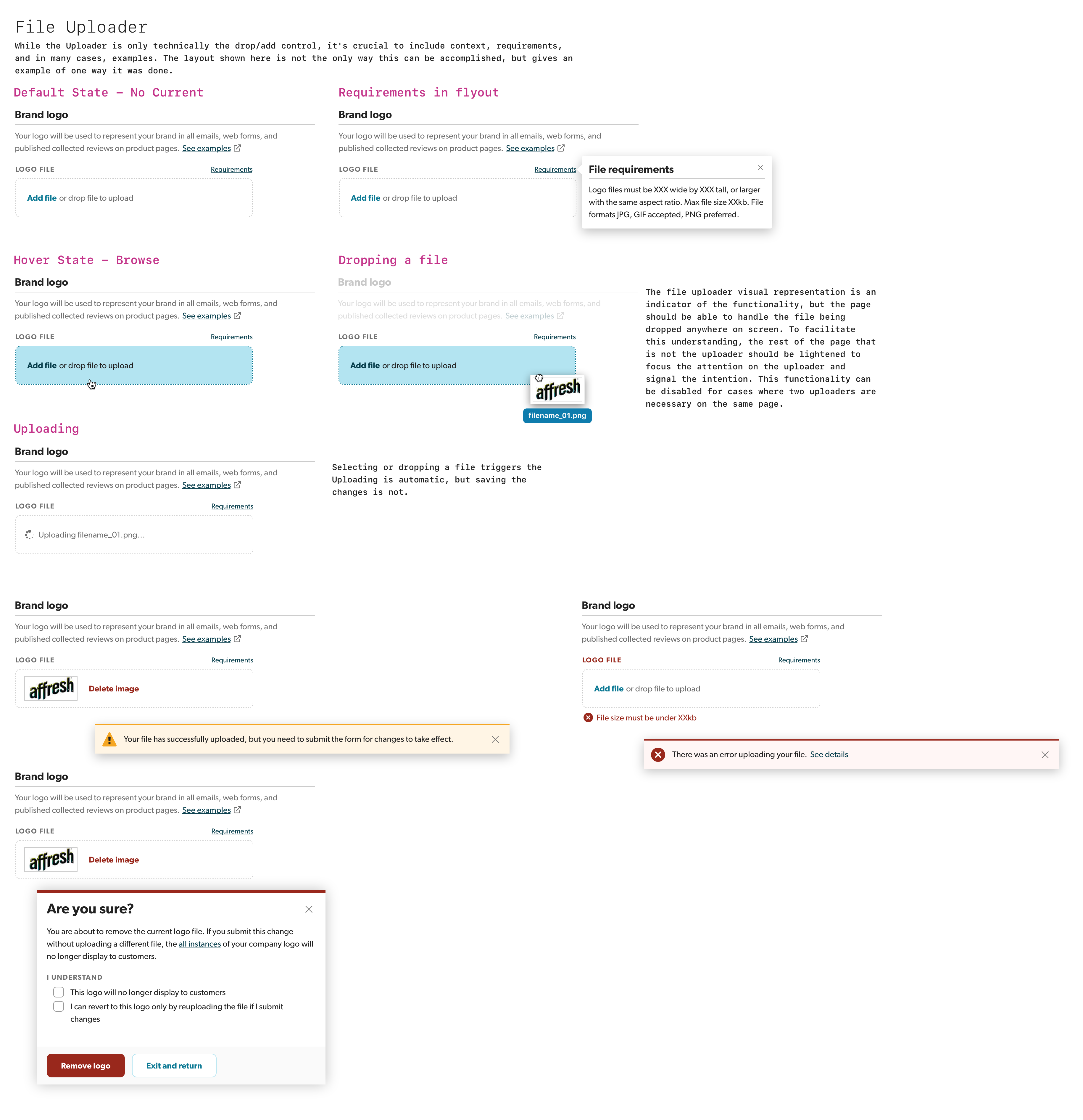
The only shared documentation our engineers referenced was a Storybook containing unmaintained and inconsistent components and patterns.
Unifying the design language
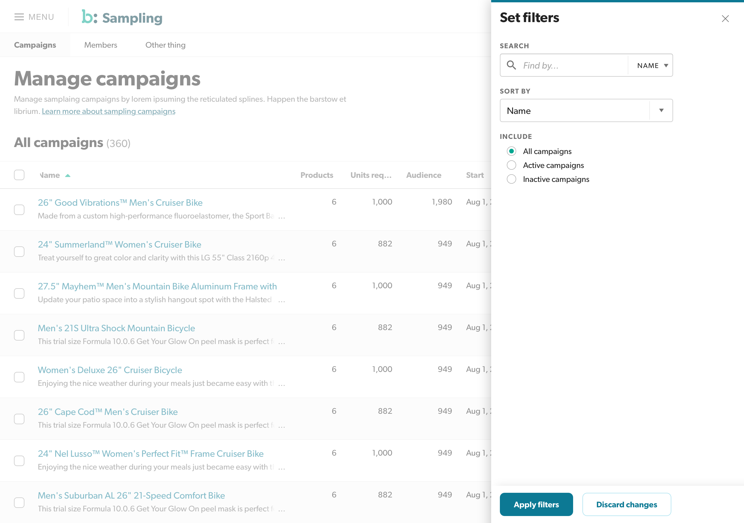
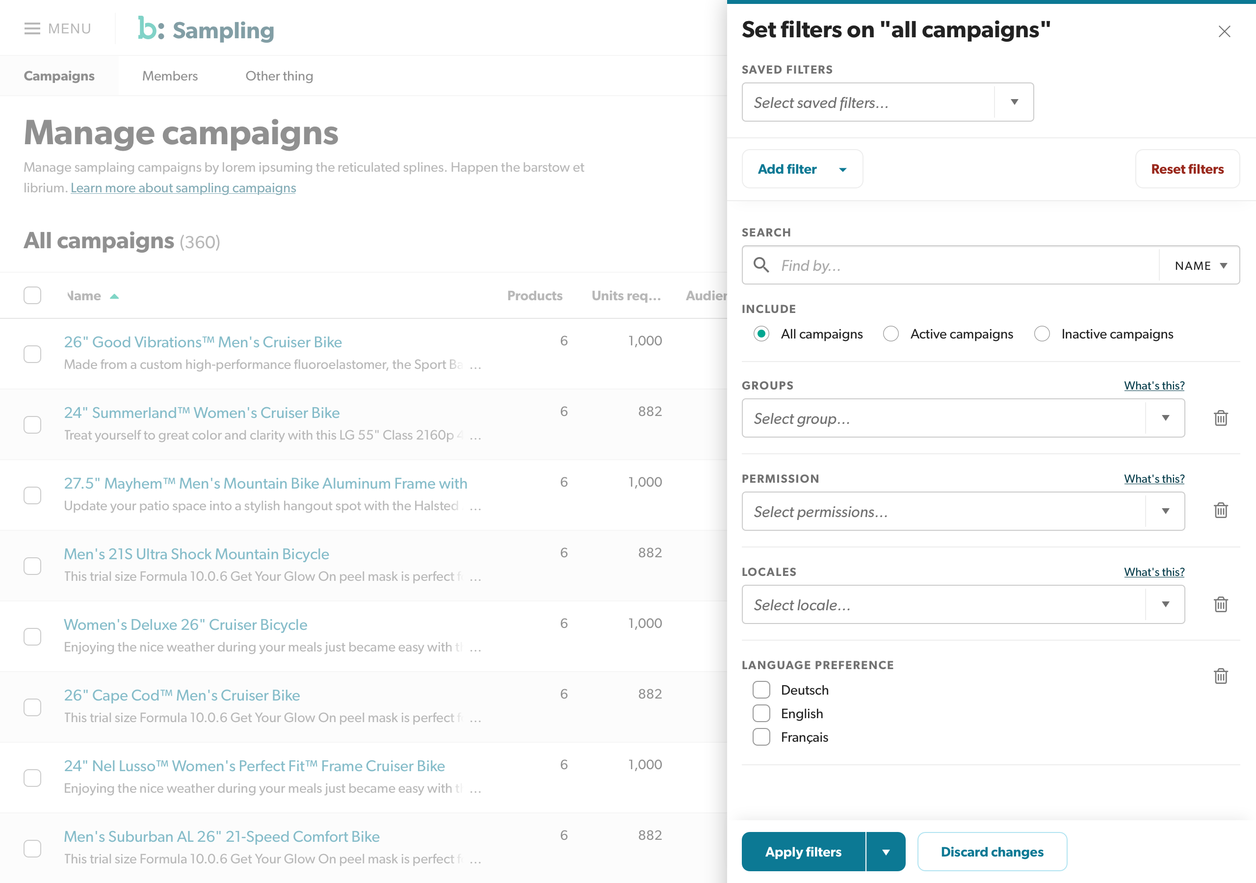
I was asked to take control of managing Aperture as part of my Portal role. In order to stem the flow of disparity in the components, I had to unify the design language and the direction of the UX team. I performed visual and component-level audits of our existing tools, as well as the design deliverables our team had been providing. I held weekly meetings with the team to discuss the origins of their divergent paths, and the logic behind their choices. As we progressed, we started to converge on more consistent patterns and styles that the team (mostly) agreed upon. In the meantime, we discovered some problematic patterns, including our original plan for navigation, and worked together to fix them. Once we had a reasonably solid base, I realized, through continued review of work, that our shared understanding of the patterns and styles wasn't consistent. People went back to their old habits; they copied incorrect styles and layers from old Sketch files.
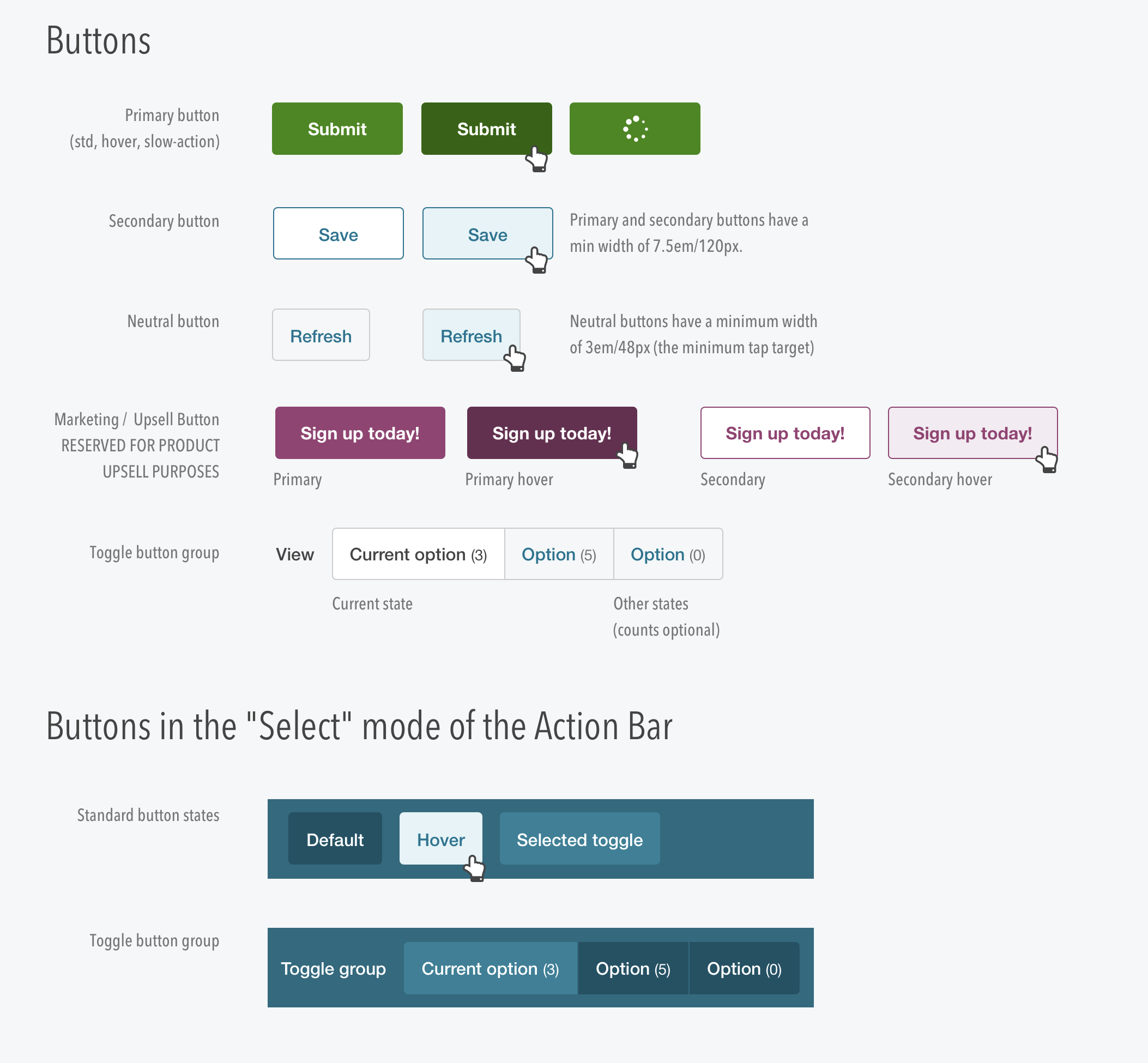
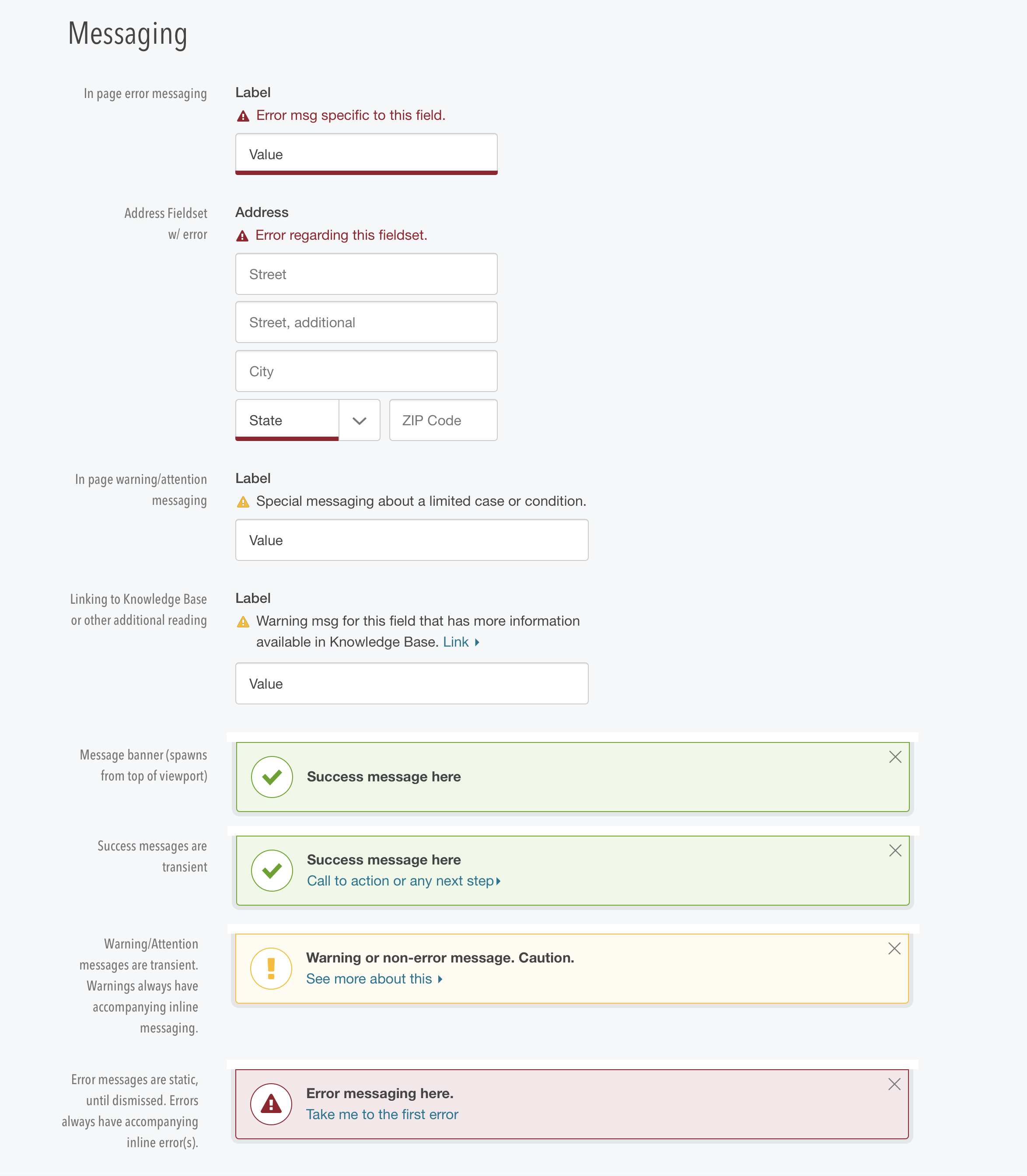
To help correct this, I searched for a way to share design patterns, and specifically, a consistent Sketch "cheatsheet" with my team. Passing a file around proved difficult, so I found a way to manage the specific shared resources via plugins. I went through every pattern and our previously agreed upon styles and built up a library of design components in Sketch, and added them to the sharing tool. The team started using these shared components and unity in design language started to take shape.
After a third-party plugin we relied on corrupted our shared assets, I took it upon myself to rebuild the assets using Sketch's newly announced Shared Symbol Libraries. This required me to teach myself not only how to use Symbols effectively (we'd worked on simple groups of layers before), but how to harden symbols to work seamlessly in different projects, and be flexible and easy to use to help gain adoption among the team.
Gaining traction
As the team started using a consistent set of design assets, their efficiency improved dramatically. One UX designer, who came from an engineering background and lacked strong visual skills, commented that he loved the new system, and it sped his work up. "I love this. Now I don't need to worry about the little nuances and can focus on the customer!"
I worked with the stewards of the Aperture technical component library to hold weekly syncs with the front-end engineers from each team, and form a system of design and engineering reviews for new apps entering the Portal platform, to help ensure consistency in both the UI and the code that powered it. Our component library started to improve in consistency and experience.
“I love this. Now I don't need to worry about the little nuances and can focus on the customer!”
Evolution
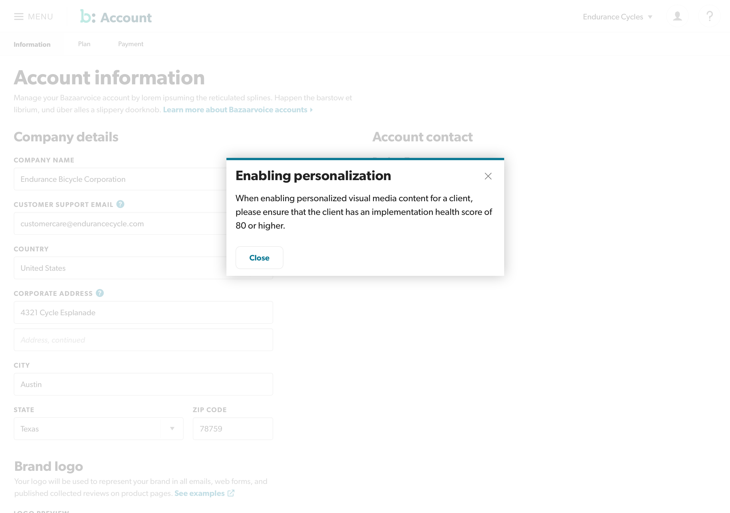
As our UX team shifted and changed, our testing and scrutiny of the design language focused. It was agreed that the core assumptions behind the initial styles and patterns needed work. One of the first sweeping changes I made was to address our accessibility from the design perspective. I performed in-depth review and analysis of each component, and discovered issues with insufficient color contrast, due to team inexperience with accessibility and bad assumptions about WCAG standards. I refined and updated the styles to meet WCAG AA standards in our shared library, which I managed for the team, and worked with the engineering team to bring our work to a more inclusive level.
There were some broken pieces, and our components relied on ad-hoc contributions from engineers whose time was focused on delivering their own apps, and not our fledgling design system. What's more, as teams expanded and shrank, the turnover resulted in lost institutional knowledge, and simple visual reference wasn't quite cutting it. I lobbied product and engineering leaders for a focused and dedicated team to help take Aperture from a set of shaky components and Sketch files to a full design system. With promise of a dedicated engineering team and the help of a new product partner, fully bought-in on the ROI of design systems, I began the intensive work of cleaning up the entire design system, modernizing the display experience, and most importantly, documenting every pattern, guideline, and design token. After a few solid quarters of focused work, a new Aperture Design System was documented and prepped, ready for the new engineering team that had been formed.
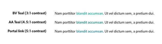
There was a push to match marketing's brand colors and fonts. The brand teal was inappropriate for normal text sizes, so I adjusted the color to match contrst requirements and provided an alternative blue link color based on our brand navy hue. I've written about how this is done in an article about accessible color contrast.
UX and engineering reacted positively, excited that they didn't have to rely on assumptions and inferences to get their work consistent. With a newly distributed team in Austin, Chicago, and Belfast, my teammates were ecstatic. One UX designer messaged me to relay his happiness: "This is great! I don't have to sort out [this pattern] and try to tell them how it works in Belfast… you've already done it and I can just point them here."
As we hired new designers onto our UX team, the design system documentation eased their ramp time and on-boarding understanding. "This is so detailed. I have [great skills and experience] but I could never have done this," said a newly hired senior UX designer with over 20 years experience. "Do people know how much you've done?!"
“Do people know how much you've done?!”
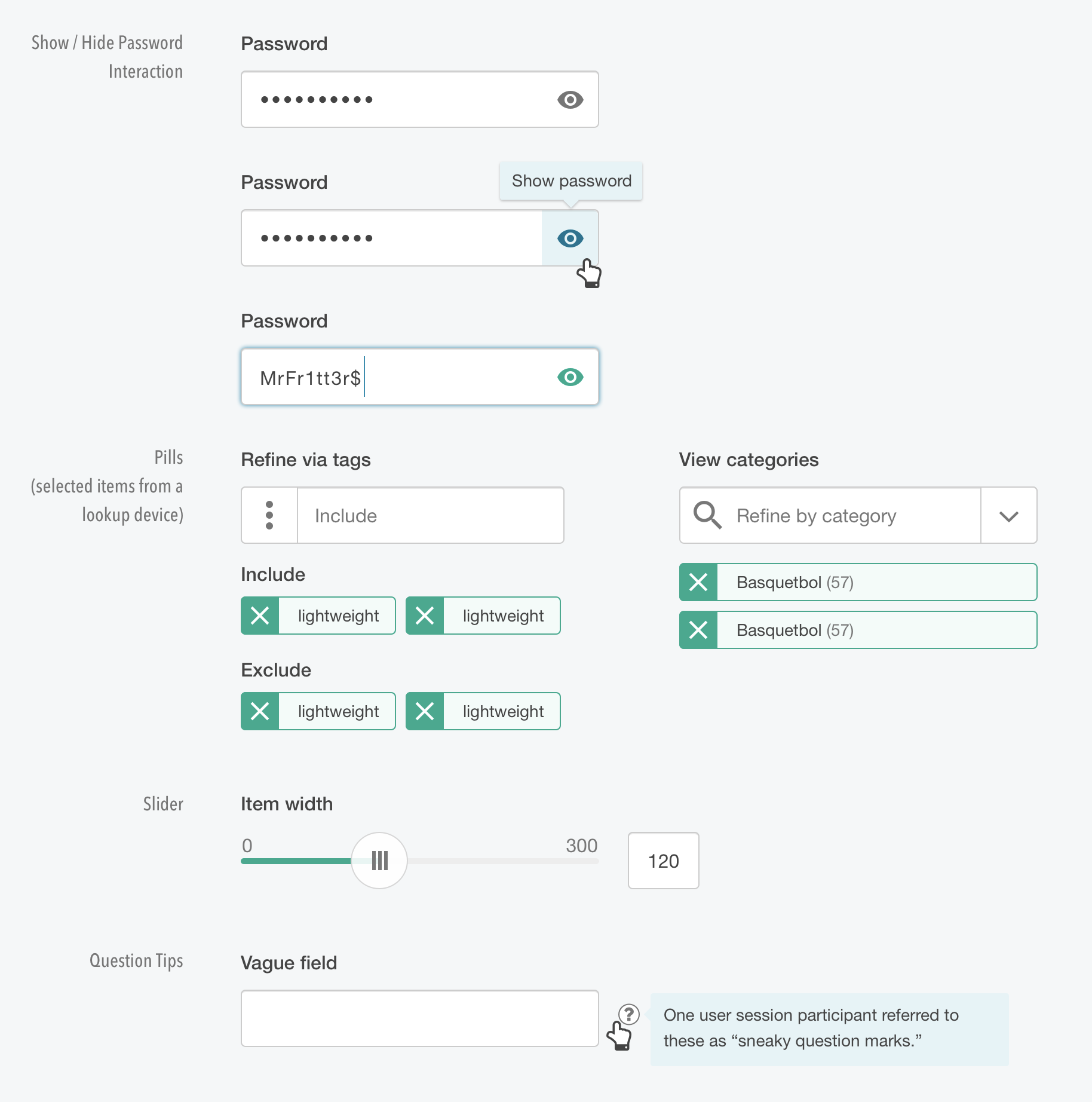
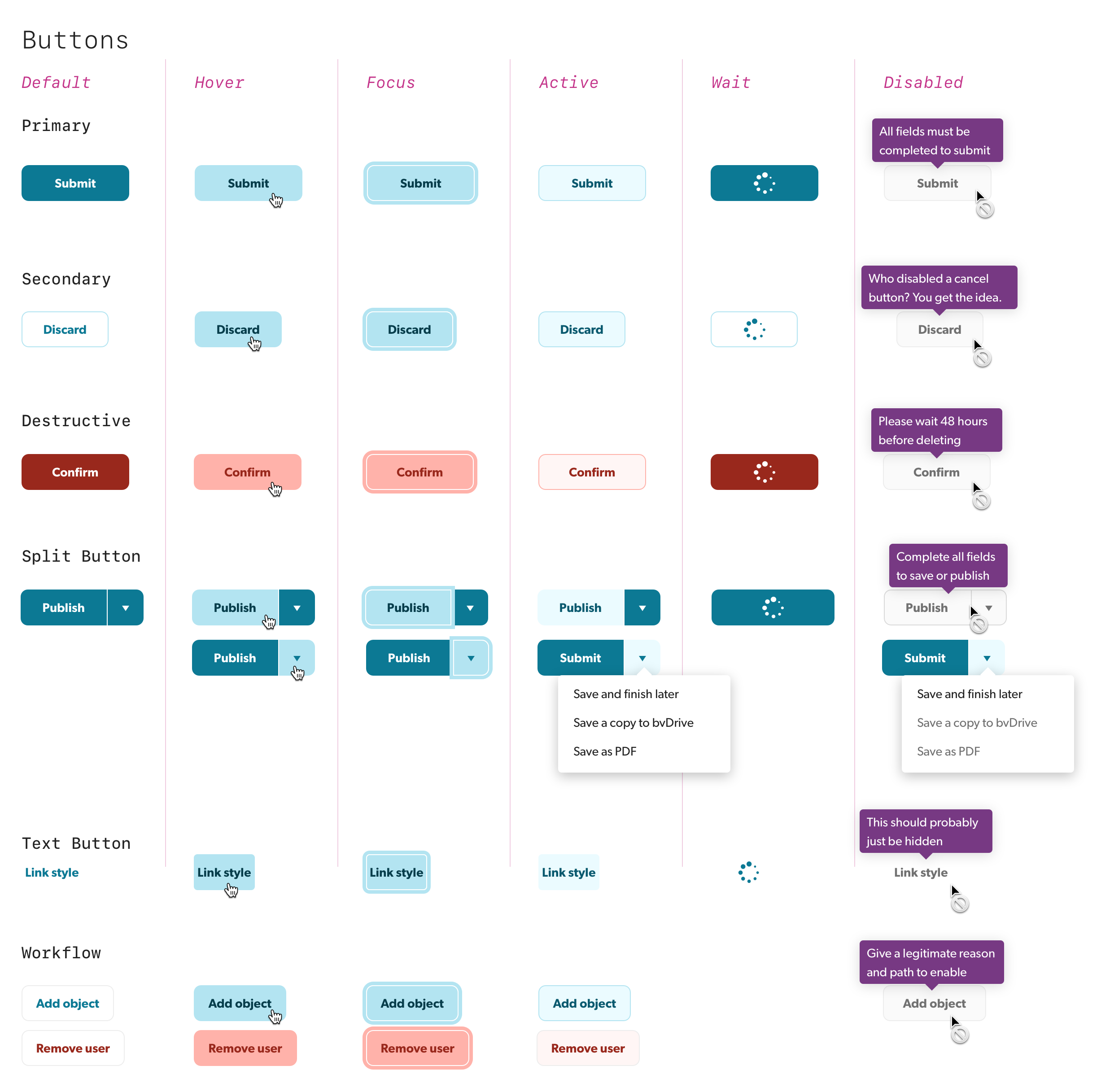
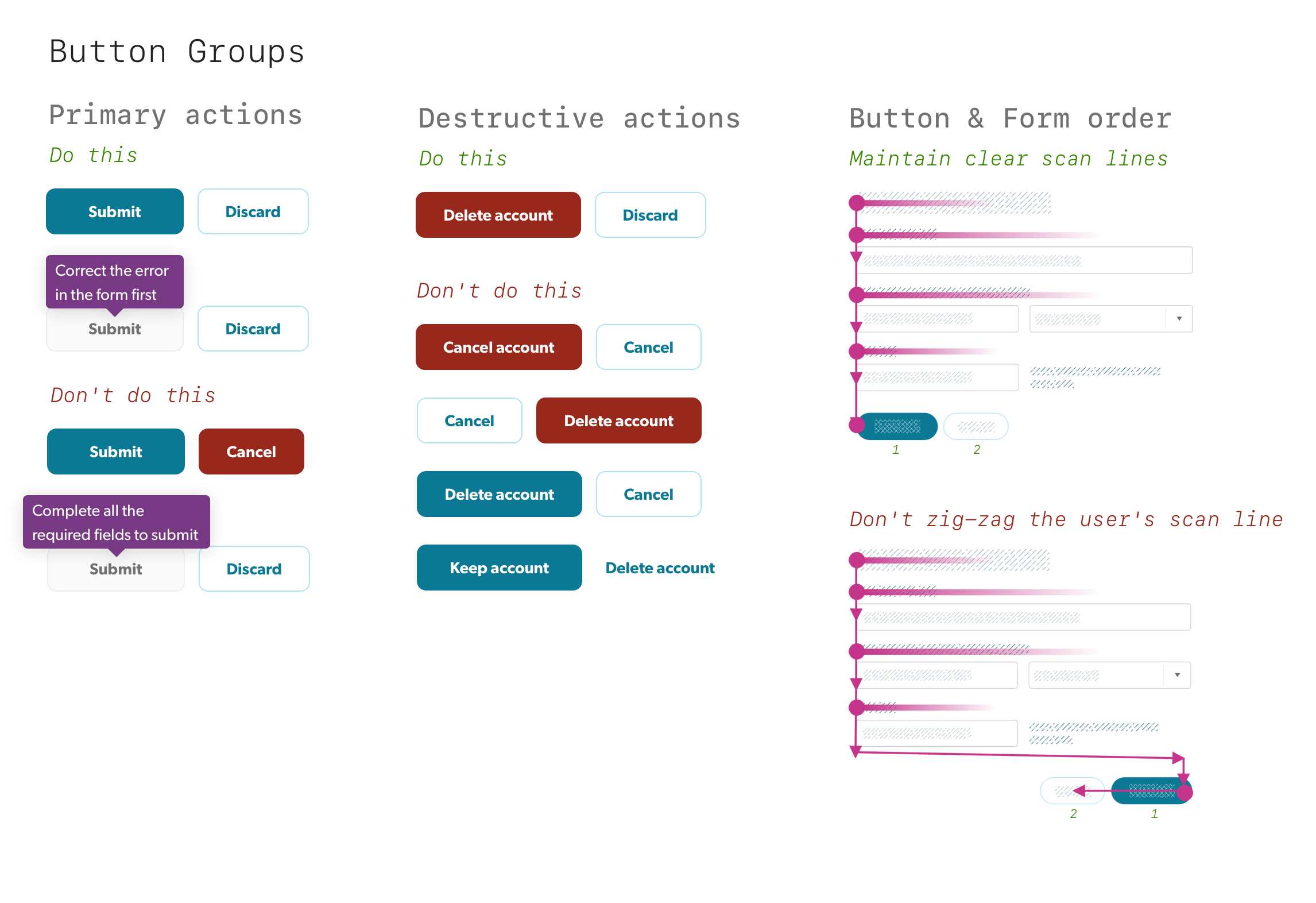
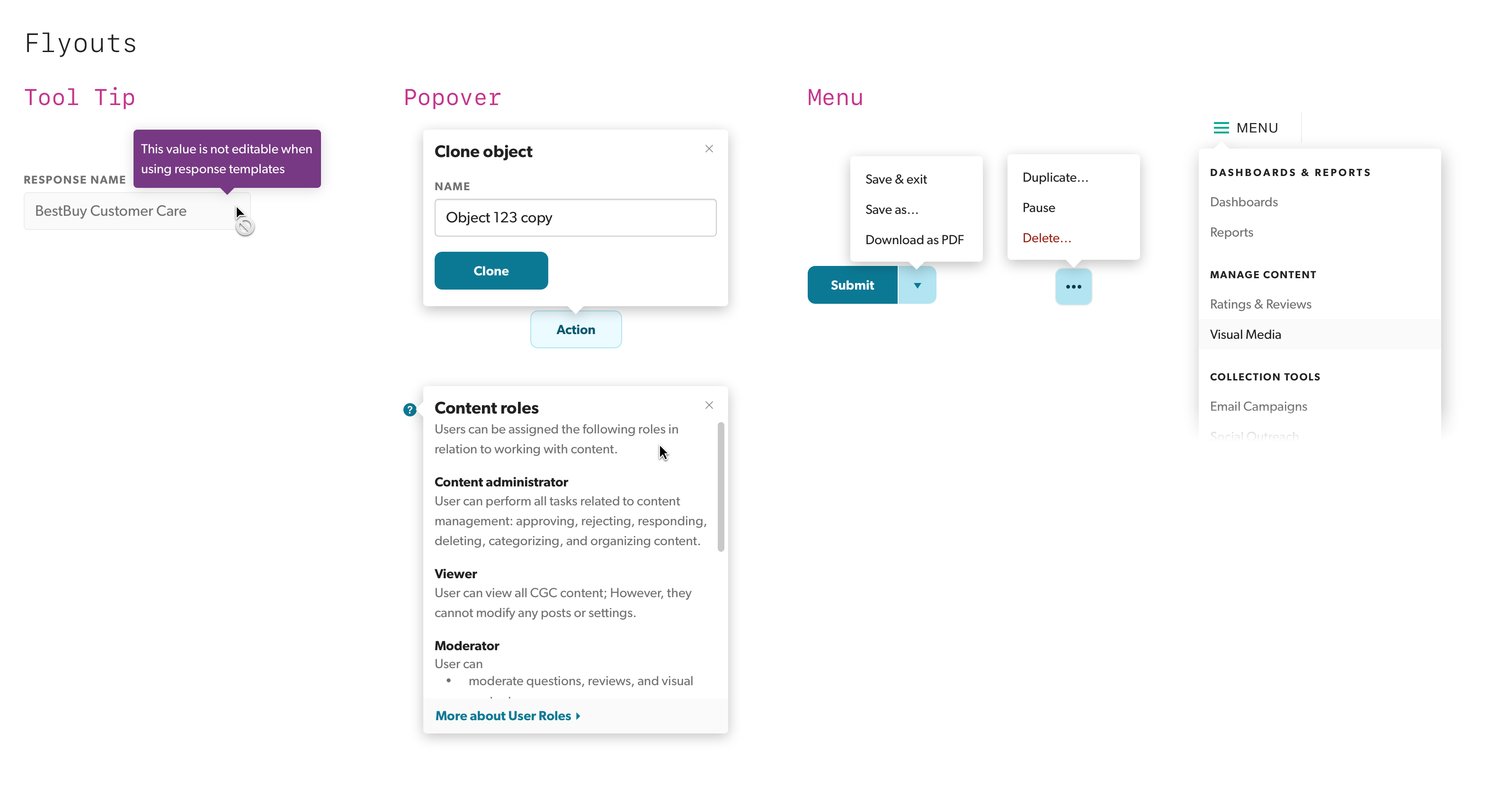
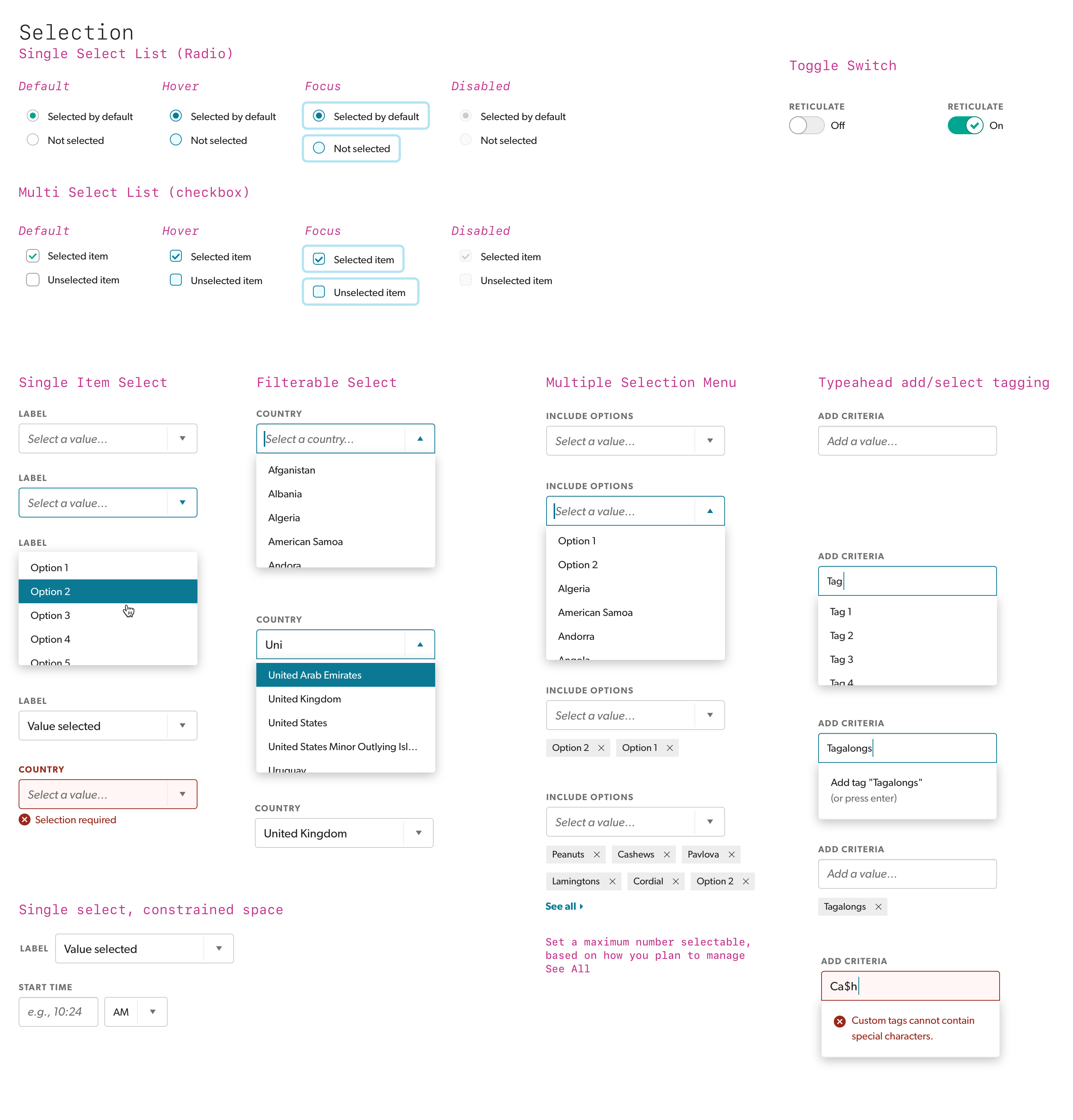
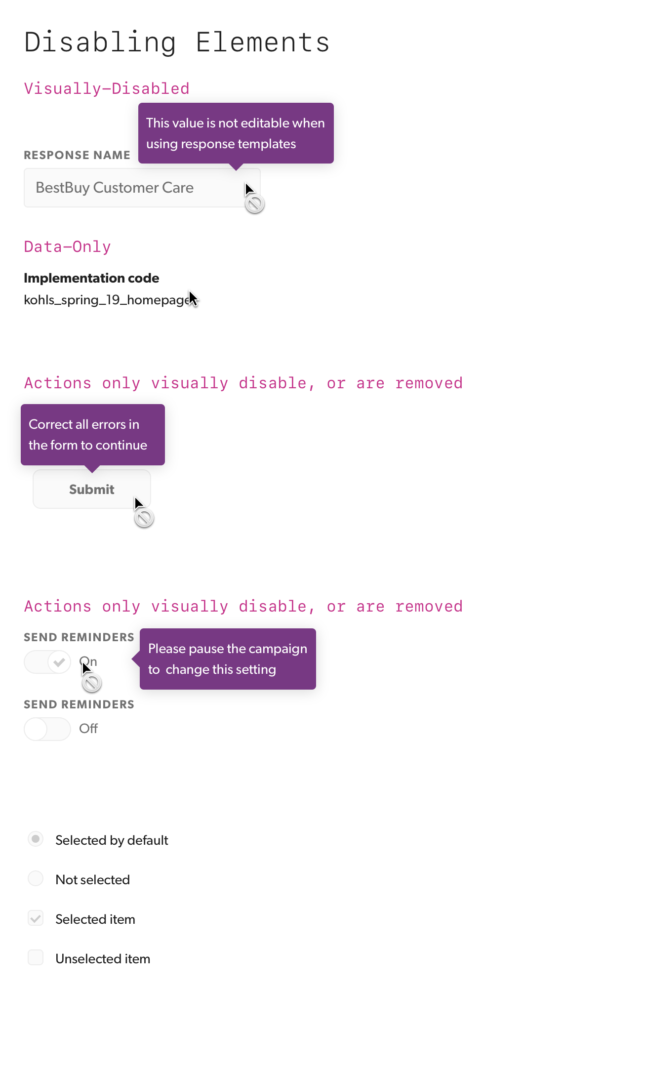
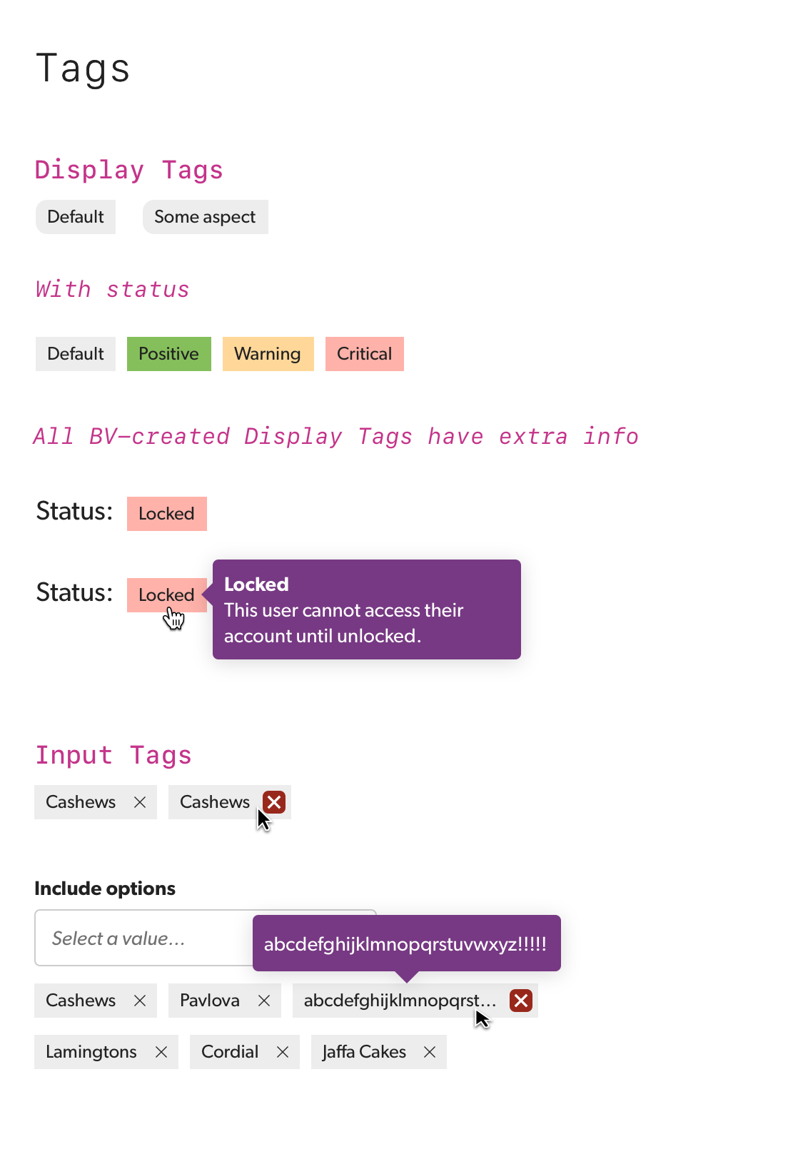
Examples
Other Projects
Auctane Design LanguageDesign System
ShipStation InsightsData Visualization

Heuristic Evaluations People NoticeUX Research
Product Catalog ManagementInnovation and user efficiency
Pixel Health and MonitoringSupport and efficiency

Amazon Restaurants order managementUX workflow and research for tablet PoS app

Amazon Local Merchant SupportUser workflow and support efficiency
In-Page Review SubmissionConsumer-Generated Content Workflow
Bazaarvoice DesignOpsDesign operations lead for design tools and systems
Bazaarvoice Portal SSOEnterprise workflow design and research