In-Page Review Submission
As the UX designer, I worked to discover if a workflow similar to an alternative review submission process (driven by email) would work in a new context (driven from a web page) by designing variants, testing with users, and adapting the workflow based on findings.
Background
Bazaarvoice is the leader in consumer-generated content, bringing the concept of moderated and syndicated consumer product reviews as a service to the market in 2005. With the recent successes—in regard to performance and usability—of in-email reviews and Multi-Product Submission (MPS), we needed to turn our attention to a relatively untouched review collection channel, reviews submitted from a Product Detail Page (PDP) or other client-controlled page (category, profile, order history pages, for example). Our current workflow and mechanism had been largely unchanged for years, and core assumptions about how people shop and interact with our clients online had changed dramatically, from at home desktop based shopping and research to ad-hoc, mobile-based shopping, et al. In addition, moving to a new flexible configuration technology platform was planned, and would affect how in-page review submission was triggered displayed. It was time to apply the lessons learned from MPS to other submission workflows.
Initial concepts and prototypes
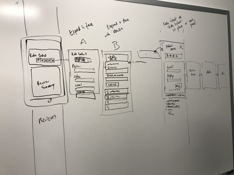
Working with our content collection product manager, we performed a survey of newer review gathering techniques (outside of the product-based category Bazaarvoice focuses on) happening on and off-line, and compared to our discoveries with the MPS workflow. We whiteboarded several ideas and settled on a general concept: a step-wise workflow with progressive saving of data and easier submission of a partially complete review, to raise submission rates of worthwhile data to the retailer or brand. There were three main variant pathways to test:
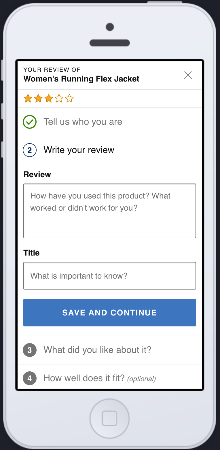
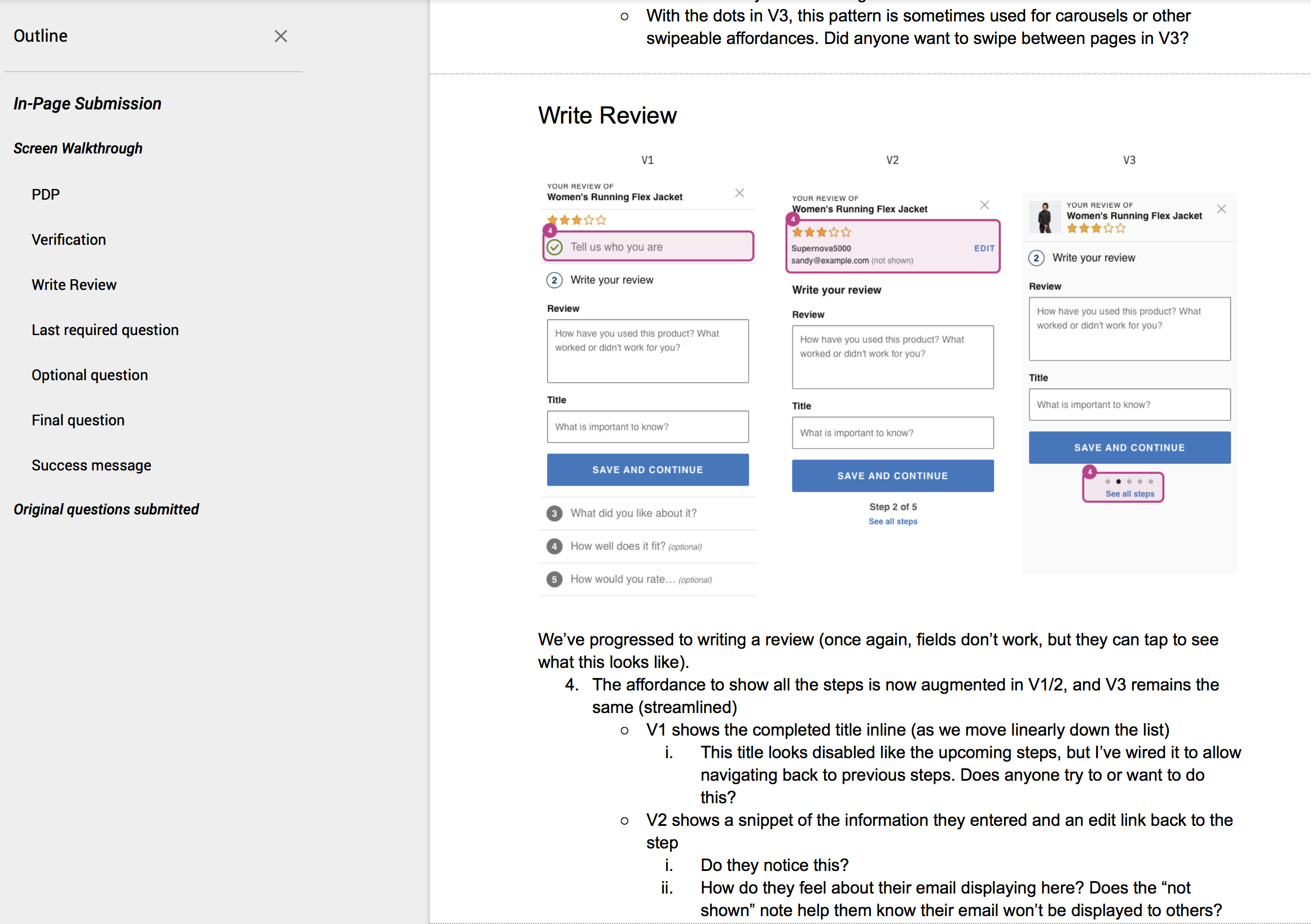
- A workflow based largely on the MPS setup, adapted to add the additional authenticity verification steps, and displaying all steps inline
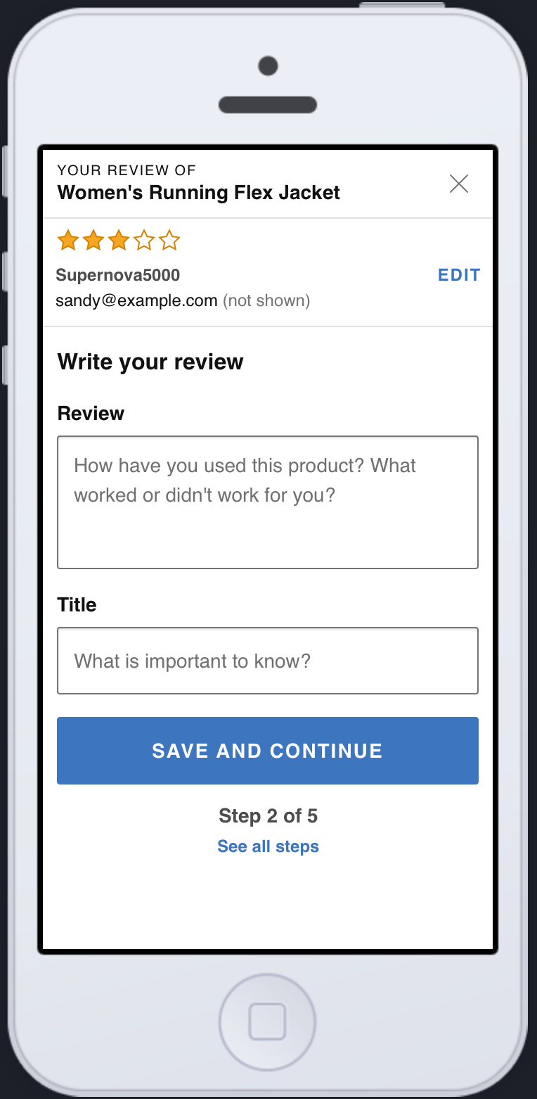
- A middle-ground between variants 1 and 3, keeping next steps in a secondary view, but showing a running list of each step completed, with clear affordances for editing.
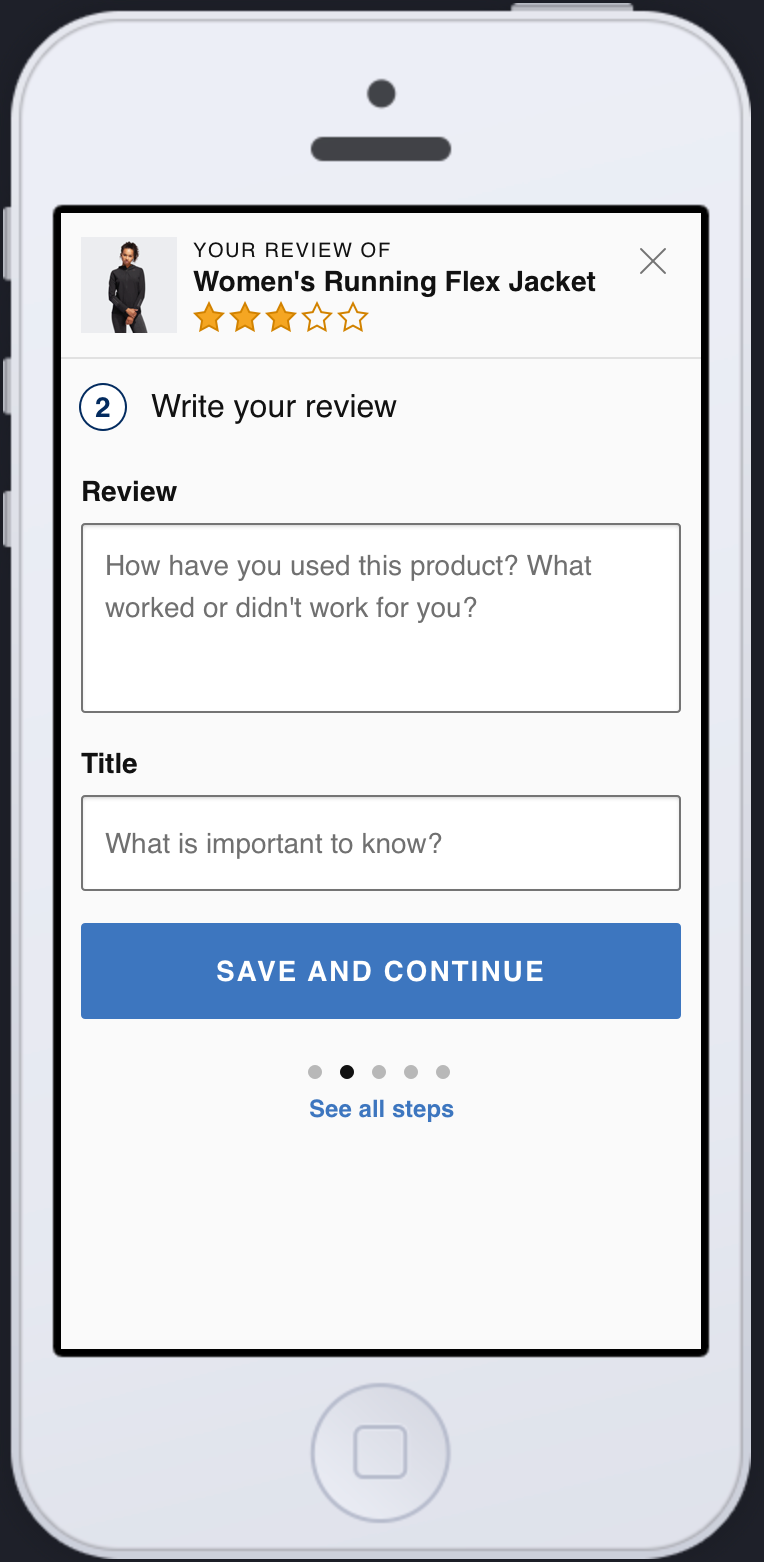
- A workflow with a minimal display, focused on the questions themselves and minimizing distractions by placing them inside secondary views.
User study and results
I prepped for our user study by designing out prototypes for each variant, with full interactivity (to the limits of our prototyping tool, which unfortunately did not allow interactive text fields and sliders) and side paths—e.g., skipping steps, navigating back to previous steps, and opening additional views and messaging. I worked with our user research team to prepare the study, and provided the researchers a detailed walkthrough document, with annotated images and specific questions we wanted to answer. They recruited 10 study participants from a broad socioeconomic spectrum, all frequent online shoppers. Our final study managed 7 full sessions (participant drop-off is inevitable) and our research team returned their findings shortly thereafter.
The general take aways contained in the user study results provided a clear path. Variant 2 had the best reception, striking a balance between the overt display of variant 1 and the spartan nature of variant 3. The list of previous steps with snapshots of entered data and a clear path to edit proved to be overwhelmingly popular. Participants did like the product image placement in variant 3, as well as a few small elements of both variants 1 & 3, which would be incorporated into the next stage design.
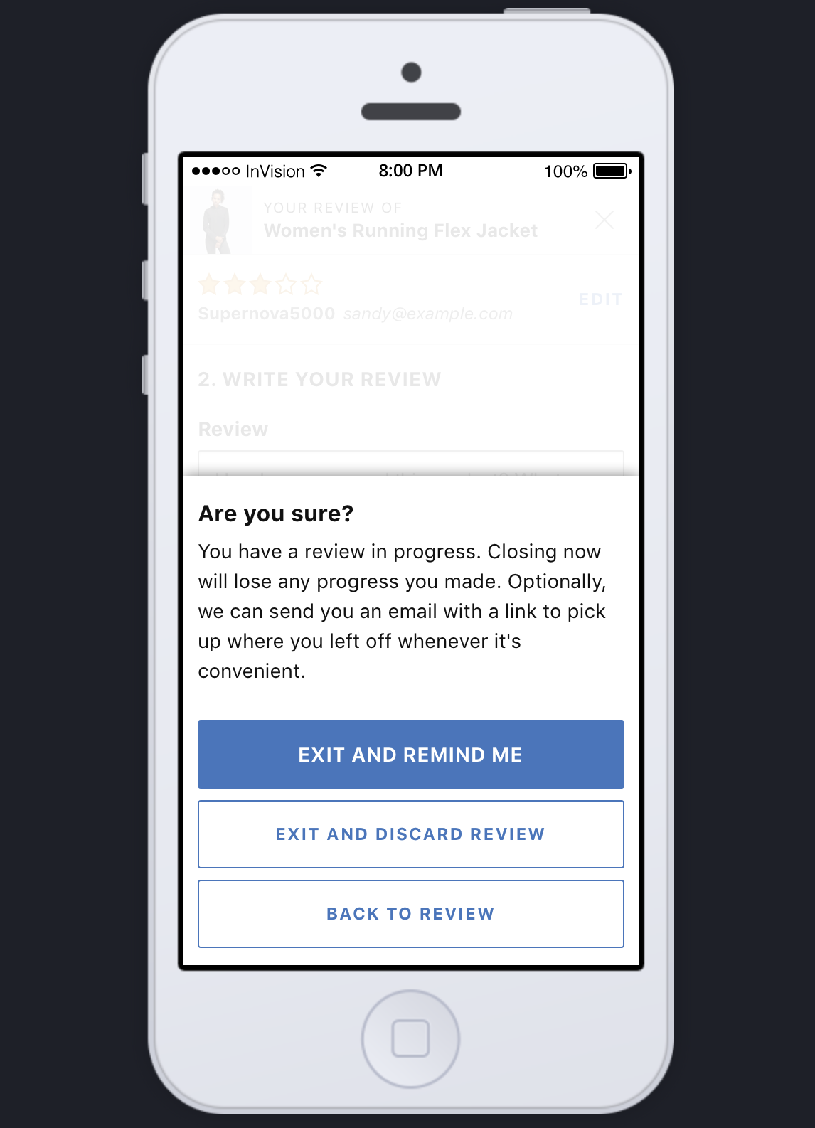
One aspect that we didn't design specifically for—but tailored the study to ask about—was how comfortable the users were with automatically submitting incomplete or not-explicitly-submitted reviews. One of the key concepts that made in-email submission and MPS so appealing is the ability to gather more bits of data (more specifically ratings) instead of accepting only 100% complete review submissions. This process has proven effective, but benefits from pre-identified users being associated with a basic star rating submission, before continuing on to a full review. The In-Page flow requires more explicit identity verification steps, which raised the participants' attention to explicitly submitting their data, as opposed to background submission with—to the users—a surprising email about verifying the review, even if they hadn't tapped a final submit button. This was in spite of the small inline notices about when they could stop answering questions and our intention to email them. There was significant opposition to progressive / aggressive review submission, but the participants did see how this method could be helpful in guiding them to complete a review if they stopped early. The need for more explicit notification of intent resulted in adding in a direct warning upon exit, with affordances to either abandon the review, return to the review, or (our ideal case) exit with a link sent to complete the review later. In line with this change, the messaging of this warning would shift once the user finished the required fields; it would inform the user they had done enough, and could choose to submit the review now (ideal), return to the form, or discard and abandon the review.
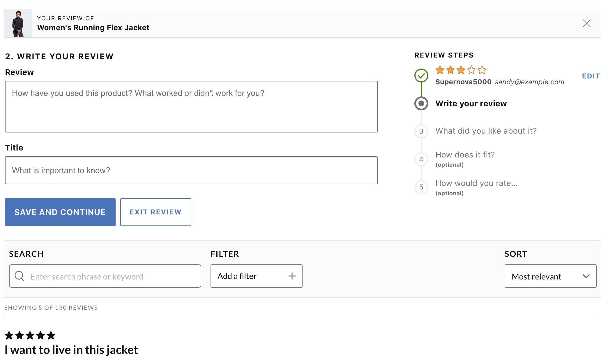
After updating the mobile workflow, I took the results and adapted them to a desktop display. Often, when designing responsively, we'll just stretch and reshuffle pieces of the mobile version, but there was a key difference between a mobile and desktop context in play here. We'd used a secondary view (full screen popover) in our mobile workflow to focus the user on the task. Our study showed that the user didn't need access to the rest of the product detail page (PDP) during the process, and the clean, step-focused workflow was ideal. However, in desktop, popping the same workflow in a modal window was not ideal; it didn't benefit from the same focus (given the percentage of the screen devoted to the flow) and our historic understanding of the problems in our current in-page submission workflow, which (by default) presents a large form in a popover modal window—issues with size, focus, needs for scrolling, and accessibility considerations. Desktop, did however, give us a better canvas to build a similar workflow within the actual page, utilizing greater width to display the step history (so greatly appreciated in Variant 2 in the study) aside the current step, without concerns of excessively long forms or scrolling to take in the necessary information.
Future considerations
- We discussed the need to test for user form fatigue—essentially, how many questions will a person tolerate before they drop-off the review submission process. Client Success tend to anecdotally reference an old study, purporting that users are not bothered by long forms—so ask away, clients! This study was done ~2013 in a desktop context with a long form (also, as the only content of the page) and a shorter variant. This is likely entirely outdated, given the move to mobile shopping / personal tasks, the shifting context of where and how the form is presented, and the impact of GDPR and other privacy considerations around why and what questions a company may reasonably ask or require.
- We plan to test the desktop variant outright (as it is new work based on mobile results), and both variants in their current form using a different prototyping tool that allows for more realistic form field interactions. We agreed there was a level of interaction missing from this study due to the flat-file/hotspots nature of interaction with an Invision prototype, and any future studies should at least include requiring the users to enter data, interact with sliders and controls, especially when testing for form fatigue.
- We should apply the changes from this workflow to improve the default setup for MPS, and also how this might improve review submission in our Sampling product.
Other Projects
Auctane Design LanguageDesign System

ShipStation InsightsData Visualization

Heuristic Evaluations People NoticeUX Research
Product Catalog ManagementInnovation and user efficiency
Pixel Health and MonitoringSupport and efficiency

Amazon Restaurants order managementUX workflow and research for tablet PoS app

Aperture Design SystemDesign System

Amazon Local Merchant SupportUser workflow and support efficiency

Bazaarvoice DesignOpsDesign operations lead for design tools and systems

Bazaarvoice Portal SSOEnterprise workflow design and research
